Building Web Sites All-in-One For Dummies® (54 page)
Read Building Web Sites All-in-One For Dummies® Online
Authors: Claudia Snell

Working with Colors (Web Safe versus NotâWeb Safe)
When you create a Web site, you strive to create an aesthetically pleasing blend of images, text, and graphics, such as banners and navigation menus. Your design must be harmonious: a careful blend of what the client supplies you and what you create. If your client supplies you with images for the site, you can often choose a pleasing color palette by sampling colors from one of the images. If your client has a logo that readily identifies the business, you might be able to create a pleasing color palette by sampling colors from the logo.
Limit your design palette to four colors. Figure 1-2 shows a Web site with colors and design elements chosen from the client's logo. It's hard to tell in the black-and-white reproduction of the page, but if you go to
www.antonioswinterhaven.com
, you can see that the site uses a harmonious selection of burgundy and black.
Figure 1-2:
Choosing a color palette from a client's logo.

When you design a Web site, the colors must be specified in hexadecimal format, which contains six characters. For example, white is hexadecimal #FFFFFF, and black is hexadecimal #000000. The first two characters comprise the red color component of the RGB (red, green, and blue) color model, the third and fourth characters are the green component, and the fifth and sixth are the blue color component. To designate 256 hues of a color in hexadecimal format, you specify a value from #00 to #FF. Therefore, pure red is #FF0000, pure green is #00FF00, and pure blue is #0000FF.
Common sense tells you that text color is very important. If you create a site with text that's hard to read, you're not doing yourself â or your client â any good. If you take the Santa Claus approach and slap red text on a green background, you have a recipe for disaster. Traditionally, Web sites have used black text on a white background. Some designers use a shade of gray for text (for example, #333333 or #666666). If you go any lighter than the latter, though, text is hard to read.
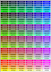
The Web-safe palette, which has been around since the early days of the Internet, consists of 216 colors that any video card can display, on any monitor, by any platform. The Web-safe color palette is the default color palette of applications such as Adobe Dreamweaver, Adobe Fireworks, and Adobe Flash. The Web-safe palette is shown in Figure 1-3. We know what you're thinking â that figure is in black and white (well, actually grayscale). If you want to see the Web-safe palette in live, living, and glorious color, create a new Web page in Dreamweaver. Before adding anything to the page, open the Property inspector, click Page Properties, and then click the Background color swatch. Walla, the Web-safe, 216-color palette appears.
 Most modern computers have video cards and monitors capable of displaying millions of colors. Therefore, sticking with the Web-safe palette isn't imperative. If you like to err on the side of caution, most Web applications enable you to create a reasonable facsimile of the desired color by picking its closest counterpart from the Web-safe palette.
Many designers are using pure-white text (#FFFFFF) on a black or dark gray background. If you use this color palette, increase the line height to a percentage of 130 to 150 percent of the text. This increases the space between lines and makes the text easier to read. Figure 1-4 shows a Web page with white text with a line height of 150 percent on a gray background.
Figure 1-3:
The Web-safe, 216-color palette.

Figure 1-4:
Increase the line-height percentage when you use white text on a black or gray background.

Creativity Tools â Color Charts and More
When you design a site from scratch, visualizing what colors will look like can be difficult. Fortunately, you can easily experiment with different colors in Fireworks or Dreamweaver when you lay out the elements of your design, such as the banner, navigation menu, text, and so on. But when you're under the gun to create a site quickly, it helps to have a bit of inspiration or a tool to help you in your quest. The following list shows some books you can use to inspire your creativity, aid you in choosing colors, and show you some inspiring design ideas:
â¢
Creativity for Graphic Designers: A Real-World Guide to Idea Generation,
by Mark Oldach (North Light Books):
This book isn't filled with eye candy. Instead, it guides you through processes you can use to come up with ideas. The author also explains the process of creating a good design.
â¢
Artist's Way: A Spiritual Path to Higher Creativity,
by Julia Cameron (Tarcher):
The book was written in 1992, yet it still contains a wealth of information on being creative. The author leads you through a comprehensive, 12-week course on recovering your creativity from things such as limiting beliefs, self-sabotage, jealousy, and other things that deter your creativity. The 10th anniversary edition of this popular book is available at most booksellers.
â¢
How To Think Like Leonardo da Vinci: Seven Steps to Genius Every Day,
by Michael Gelb (Dell):
This insightful book lists seven principles found in Leonardo da Vinci's thinking and creative process and shows how to tap into these principles and use them in your own work.
â¢
Color Index: Over 1100 Color Combinations, CMYK and RGB Formulas, For Print and Web Media,
by Jim Krause (How Design Books):
Keep this handy reference on a bookshelf near your computer. The book is divided into several sections that show color combinations for print and Web. Each color combination shows a graphic using the colors and swatches that list the components needed to create the color using the CMYK and RGB color models. The swatches in the Web design section are designated in hexadecimal format and the RGB color model.
â¢
Color: A Course in Mastering the Art of Mixing Colors,
by Betty Edwards (Tarcher):
This book delves into color theory. Although much of the information is geared towards artists, you can use the information to create harmonious colors for your Web designs. The author gives you an understanding of primary, secondary, and tertiary colors; and shows you how to use the color wheel to understand color values and intensity.
 If you're really color challenged, consider purchasing an application such as ColorSchemer (
www.colorschemer.com
). ColorSchemer features a color wheel and a Photo Schemer section, which enables you to create a color palette using colors from a photo. As of this writing, Color Schemer Studio retails for $49.99.
 You can also find some interesting color schemes at Adobe's Kuler Web site (
http://kuler.Adobe.com
). Here you'll find color combinations created by Web designers and graphic artists. If you have an Adobe ID, you can log in and create your own color combinations by modifying an existing one, or uploading a photo as reference.
Font/Type Issues on Web Sites
If you've been designing Web sites for a while, you know that not everyone has the same fonts on their computers that you have on yours. When you design a site, you must take this into consideration. If you design a site with a nonstandard font that's not installed on the client's machine, the page will look fine to you, but it won't display like you designed it. Several fonts are commonly used for Web sites because they can be used on Web sites that are displayed cross-platform. Your universal font friends are Arial, Times New Roman, Courier New, Courier Mono, Helvetica, and Verdana.
In addition, you can specify serif or sans serif as the font.
Serif
refers to the decoration at the end of strokes that make up letters or characters, such as the diagonal at the end of the angular ascenders of a capital A. When a font is sans serif, there is no decoration at the end of strokes or letters. Figure 1-5 shows a sans serif and a serif font.
Figure 1-5:
To serif, or not to serif? That is the question.

