Building Web Sites All-in-One For Dummies® (51 page)
Read Building Web Sites All-in-One For Dummies® Online
Authors: Claudia Snell

Figure 9-4:
Insert an image and include the
alt
attribute.

Using Dreamweaver to check your site's accessibility
Dreamweaver has tools to check your code, including code validators and site-testing reports that can check the accessibility of your page or site. The accessibility reports show the areas of your code that might cause problems for individuals with disabilities.
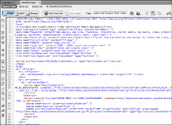
 Before you start running reports in Dreamweaver, you might want to turn on line numbers in your Code view. The line numbers in the Code window help you find your place in the code. To turn on line numbers, choose ViewâCode View OptionsâLine Numbers. The line numbers appear in the left margin of the Code window, as shown in Figure 9-5.
Figure 9-5:
Enable line numbers in the Code window.

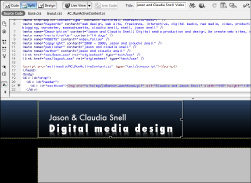
Using Dreamweaver in Split mode (as shown in Figure 9-6) enables you to see the code and the design at the same time. Being able to see both code and design helps you make sure you don't code something that looks bad. It also lets you keep an eye on your code to make sure that it doesn't get messy when you use the WYSIWYG tools. To turn on Split screen mode in Dreamweaver, click the Split button.
Figure 9-6:
Use Split mode to see the code and the design at the same time.

Running reports
Dreamweaver provides different methods for checking a site's accessibility:
â¢
One page at a time:
To check the accessibility of the page you're working on, save your document and choose FileâCheck PageâAccessibility. The Report window opens with the results.
â¢
More than one page, a folder, or the site:
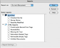
Another way to use the Accessibility report utility is to save your document and choose SiteâReports. The
Reports dialog box appears (see Figure 9-7).
From this dialog box, you can also choose to run the report on just the page you're working on, several selected pages, a whole folder, or the whole site via a drop-down menu at the top. Then, do the following:
a. Select the reports you want to run.
 For accessibility testing, enable the Accessibility and the Missing Alt Text check boxes.
b. Click Run.
The Site Reports window opens with the results.
Figure 9-7:
Check several pages by running reports.

Fixing mistakes
With the results of your report in hand, you can correct mistakes quickly and easily. The Results window shows code line numbers, the severity of the issue, and some brief information about the issue and where you can research it further.
â¢
An X:
Issues marked with red Xs are things that have completely failed and need to be corrected.
â¢
A ?:
Issues with question marks are things that might or might not be an issue and require human judgment to determine whether corrections need to be made.
An example of this type of error is
Color is not essential
. The report has no way of knowing whether the page is conveying information via color only, so it reminds you to make sure your page makes sense even without the colors.
To view the piece of code that's causing an issue, double-click the issue description's text in the Results window. The code is highlighted for you.
Chapter 10: Publishing the Web Site
In This Chapter
Preparing to launch the site
Uploading the site
What to do after the launch
Designing Web sites is a creative process that can be lots of fun. Fun doesn't put bread on the table or a Web site on your hard drive, though, and it isn't going to pay the bills, either. After you build it, you have to upload it before visitors swarm your client's site. Before that blessed event can happen, make sure you have your ducks in a row. In other words, make sure it ain't broke â and if it is broke, fix it. Nothing is worse than uploading a site with bugs and ending up with egg all over your face. After all: You're the designer, so the yolk's on you. In this chapter, we show you how to exterminate any bugs that might be lurking in your code, how to upload the site to the hosting server, and what to do after the launch.
Look before You Leap: What to Do Before Launch
Your client is all over you like white-on-rice to make the site live, but if you do so before making sure everything is up to snuff, you do yourself and your client a disservice. First and foremost, you damage your reputation, both with the client and potential clients, if you put a site out there that contains code errors, broken links, and so on. In the upcoming sections, we show you a few things you need to consider before uploading the site to the client's server.
Develop a checklist
When you create a checklist that you can refer to before you launch the site, you can be sure you won't forget to double-check anything. You can even use the list for all the sites you launch. Write it once; use it countless times. Like reusable code, reusable lists are a wonderful thing. Your list should include the following items:
â¢
Check each and every link.
Nothing is more embarrassing than creating a Web site with links that work on some pages but not on others. You can safeguard against this happening if you create a template that includes the navigation links, and then use this for each page you create. While you're checking links, make sure you have the target right. If the site has links to pages outside your client's domain, good practice mandates opening them in another window.
 If you're using Dreamweaver to create your pages, choose SiteâCheck Links Sitewide. Press Ctrl+F8 (Windows) or
Ã
+F8 (Mac), and Dreamweaver lists any broken links in the Results panel.
â¢
Does your fancy code work?
If any of the pages in your site are PHP, ASP, or DHTML, make sure each script works as expected.
â¢
Does the site load quickly?
Savvy Web surfers are an impatient lot and won't wait for a site to download. If you did your homework and optimized all your images and other interactive content, the site should download in fewer than 12 seconds. And that's 12 seconds for the worst-case scenario in your client's intended audience. If your site loads in 12 seconds for users with a cable hookup but some of the intended audience use DSL, you have to go back to the drawing board.
 If you feel that your Web pages are not running on all twelve cylinders, consider using Yahoo's YSlow. This is a tool that is integrated with Firefox's Firebug Web development tool. For more information on YSlow, visit
http://developer.yahoo.com/yslow/
.
â¢
Does the site include a call to action?
If your client is selling merchandise or services, Marketing 101 dictates that the site should ask the visitor to do something: a
call to action.
At the very least, the site should include some type of special offer that tempts the visitor into clicking the checkout button. Another call to action might be a form that requests contact information for a mailing list or newsletter.
â¢
Is the site easy to navigate?
Make sure that site visitors don't need a PhD to figure out the navigation menu. Try to avoid being cute and designing an
avant garde
menu that uses only icons. Some people will get it, but the ones that don't will be visiting the site of your client's competitor. If your site design uses graphics in the navigation menu, make sure you have redundant text-only links at the bottom of each page, below the fold. Search engine robots use text-only links when indexing the site.
â¢
Is the content relevant and easy to understand?
Chances are your client created most of the text for the site and provided images as well. It's your job to put it in a palatable format that visitors can easily digest. Scan each page and make sure the headlines and links provide a message to visitors. This is especially important if the site has a lot of text.
 You can break up a lot of content using headlines, bullet1 points, bold text, white space, hyperlinks, or images. Savvy Internet surfers use these visual clues to quickly find the information they want.
â¢
Read each page.
The information provided by your client should pique visitors' curiosity and inform them. The home page should pique visitors' curiosity and make them want to click through to other pages on the site. The text should also be relevant and peppered with keywords potential visitors will use when searching for sites similar to your client's.
â¢
Make sure that each page has a balance of text and images.
Unless you're doing a portfolio page for a photographer, the images on each page should complement and balance the text. Too much of one or the other presents a confusing message.
â¢
Is the text easy to read?
Make sure the target audience can easily read the text. Even if your client is a techie, but the visitors are technophobic, make sure the text doesn't include jargon. Write the text for the least-common denominator: in other words, for the person who knows nothing about your client's product or service. If the content doesn't meet this standard, tell your client she needs to dumb it down before the site goes live. Also, make sure that the text font is easy to read and that the font color contrasts well with the background for easy readability.
â¢
Are the paragraphs short?
Long blocks of text might make visitors shy away from the site â that trudging through it is too much work. Send long blocks of text back to your client and ask him to cut out anything that isn't relevant. When all else fails, refer your client to a good copy editor.
â¢
Are the pages consistent?
Each page should have a common look and feel. The navigation menu needs to be consistent on all pages. If it's not, the visitor might think he's clicked away from the site.
â¢
Is the site complete?
In other words, do all or most of the pages have content? It's bad practice to leave a bunch of
Coming Soon
or
Under Construction
messages throughout the site. Missing content frustrates both visitors and your client. If you're under a deadline to launch the site by a certain date and the client hasn't given you all the information, tell her it's in her best interest to not launch the site until all pages are complete.
â¢
Make sure every image loads.
If you end up with a placeholder with no image, this indicates you might have changed the image's filename or inadvertently moved the image to another folder.
â¢
What's above the fold?
The most important (must-see) information on every page should appear above the
fold.
This is the top portion of a Web page that's visible when the page first loads, without scrolling. This is the most important part of the entire page, so use it wisely. At the same time, make sure that no images are cut off by the fold, and also that no part of a paragraph is cut off by the fold. When performing this test, make sure to resize your desktop to that of the intended audience.
â¢
How much of the information is below the fold?
If each page of the site has a lot of information that appears below the fold, visitors have to scroll down to access all the information. If this is the case, consider splitting a lengthy page into two or more pages. Alternatively, have your client edit the content.
â¢
Test all forms and other interactive content.
When you submit a form, make sure the data goes to the intended destination or is added to the applicable database.
â¢
Check the spelling.
Most HTML editors come with a spell checker. Don't be unprofessional and upload a site with typos or bad grammar. If you're in doubt of the correct spelling of a technical term, ask your client or find the correct spelling at a reputable online dictionary.
â¢
If the site has options to order merchandise, make sure that transactions can be completed.
Get opinions
A dozen jurors are used in a court of law. You should have at least that many people rendering judgment on your client's Web site. Big caveat: The people who give their opinions on your design should be totally impartial. In other words, don't use your client's employees or your own when you want feedback on your design. For that matter, don't use your client's family, or even your own, when getting feedback.
Do a beta test
If possible, set up a beta test before going live. When you conduct a beta test, you upload your design into a folder on the server and send the URL to your testers. They provide feedback about site usability, aesthetics, and so on. Beta testing is especially useful when you have a really big site with lots of pages and almost as many links as there are Smiths in the New York City phone book. You'll be a candidate for a good hair-coloring product if you tackle testing a huge site by yourself.
In addition to testing the site for usability, beta testers can find any bugs that are lurking in your code. Identifying usability issues and other problems greatly enhances the chances of the site succeeding when it goes public. The test can also determine how real-world users react to the site.
In a typical beta test, you contact a potpourri of users to try out the site for a few weeks. During that time, you get feedback on the site design, usability, any potential problems, such as broken links or missing images, and any features that are not clear to the testers. During this time, you monitor the server side to make sure that the data is going to the right places. You also monitor any CGI scripts (such as mail forwarding) to make sure that data is being forwarded to the proper parties. During a beta test, you typically forward all data and e-mails to one address.
Your best candidates for beta testers are actually users of the product or service. Your client might be able to supply some beta testers from his customer base. With a good cross-section of the client's customer base or intended audience, the test is more effective. The information you receive can give you a good idea of site usability and the value of the site from members of your client's intended audience.
Get feedback
Setting up a beta site and enlisting testers is a lot of work. Your beta testers might have a good time filling in the forms, placing mock orders, and checking out the features of the site, but if you don't get feedback, it's an exercise in futility. When you enlist beta testers, tell them what you're looking for. Any group of individuals has varying degrees of initiative, and beta testers are no exception. Expect some of your testers to give you lots of feedback: others, little or none. Keep tabs on who says what, and send e-mails to the people you're not hearing from.
