Building Web Sites All-in-One For Dummies® (58 page)
Read Building Web Sites All-in-One For Dummies® Online
Authors: Claudia Snell

â¢
Set Default Stroke/Fill Colors:
Use to set the color swatches to their default colors: black for the Stroke color and white for the Fill color.
â¢
No Stroke or Fill:
Click the Stroke swatch, and then click this tool to create an object with a fill, but no stroke. Click the Fill swatch, and then click this tool to create an object with a stroke but no fill.
â¢
Swap Stroke/Fill Colors:
Swap the current Stroke and Fill colors.
â¢
Standard Screen mode:
Use to revert to standard viewing mode, the document, tools, and menu.
â¢
Full Screen with Menus mode:
Maximize Fireworks to fill the monitor while displaying all elements of the Fireworks workspace.
â¢
Full Screen mode:
Display the current document surrounded by a black screen.
 Press F to toggle through each viewing mode.
â¢
Hand:
Use to pan within the document.
â¢
Zoom:
Use to zoom in on the document. Click inside the document to zoom to the next highest degree of magnification. Click and drag diagonally to zoom to a specific area of the document. Press Alt (Windows) or Option (Mac) to zoom out.
Press the spacebar to momentarily switch to the Hand tool. After panning to the desired area, release the spacebar to revert to the last used tool.
 Press Tab to hide the tools and all panels. Press Tab again to display the hidden tools and panels.
Creating Art with Other Tools
Fireworks is considered the workhorse for creating graphics for Web pages. However, you can create some very artistic elements for your Web pages using Photoshop CS4. Photoshop has a Save for Web & Devices command, which is used to optimize images for the Web. We show you how to use this command to optimize graphics for the Web in Chapter 4 of this minibook.
Adding Photoshop CS4 to your graphics toolbox
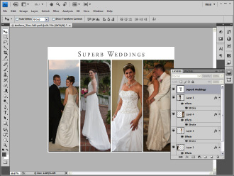
Photoshop CS4 is a powerhouse image-editing application used by professional photographers and artists. The application features an extensive feature set of filters, tools, and commands to perform functions such as color-correcting images, removing red-eye, creating images that look like paintings, and so on. Many Web designers use Photoshop to create content such as splash images and banners. The native Photoshop file format, PSD, supports multiple layers, 16-bit color depth, a unique set of blend modes, and much more. Figure 2-6 shows a splash page for a Web site being designed in Photoshop CS4. Notice the Layers panel, which shows the layers that comprise the final image.
The toolset of Photoshop deserves a book of its own. Some of the features appear in Chapters 3 and 4 of this minibook (which covers creating a banner and Web gallery) and in Book III, Chapter 4 (which covers Web and graphics software in general).
Figure 2-6:
Creating Web artwork in Photoshop CS4.
Getting Images ready for the Web with Photoshop
ImageReady was put to pasture when Photoshop CS3 was introduced, and with good reason. The Fireworks application Adobe acquired when it bought Macromedia is a much better application for creating Web-ready graphics with hotspots, interactive links, and so on. However, there are still times when you create a document in Photoshop when you need to export different parts of the document with different file formats. For example, if you create a splash page similar to the one in Figure 2-7, you get your best results and the smallest file size when you export the text by using the GIF format, and export the sections with images by using the JPEG format. To get an image ready for the Web in Photoshop, follow these steps:
1.
Create your image.
This can involve layers, filters, adjustment layers, as well as tips and tricks. Mastering Photoshop deserves a book of its own. A good bet is to check out the
For Dummies
series for the one that best fits your needs.
2.
Select the Slice tool.
This tool is introverted by nature and shares space with the Crop and Select Slice tool, which is the fifth slot on the toolbar. The last-selected tool appears at the top of the heap. Click the arrow in the lower right of the last-selected tool, and then select the Slice tool from the fly-out menu (see Figure 2-7).
3.
Slice and dice the image as needed.
When you first select the Slice tool, the entire image appears as a slice. The tool snaps to layers in the image, which makes it easy for you to segregate images and text (see Figure 2-8).
Figure 2-7:
The Slice tool cuts images like a surgeon's scalpel.

4.
Continue creating slices as needed.
If you're working on a complex image, you might end up with lots of slices. You can select individual slices with the Slice Select tool and then, if needed, resize them by clicking and dragging one of the eight handles that appear around a selected slice. After you slice and dice your image to perfection â which could be a picture of piece of pizza with pepperoni, say if you're creating a Web site for a pizza restaurant â you're ready to save the image, as described in Chapter 4 of this minibook. This command enables you to use each document slice as an image and also create an HTML file that will assemble them neatly using a table.
Creating painterly images in Corel Painter
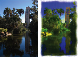
Many artists use Corel Painter to transform photographs into images that resemble paintings. If you have a client that wants something a little “different,” consider using Painter. The current version of Painter is version X. Painter features a plethora of brushes that make marks resembling strokes from different media, such as a paint brush or pastel crayons. There are way too many groups of brushes to mention here; Oil, Pastel, and Watercolor are some of its groups. You can modify each brush to create a custom brush. Painter also features layers and blend modes that determine how layers interact with each other. You can also use third-party plug-ins with Painter. Figure 2-9 shows an image prior to being cloned and modified in Painter X (left); the resulting image is on the right.
Figure 2-8:
Slicing and dicing for the Web with the Slice tool.
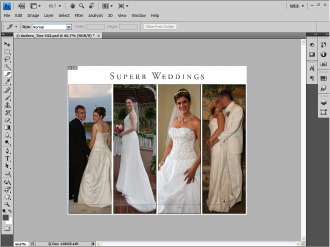
Figure 2-9:
The painterly result of an image edited in Painter X.
Chapter 3: Workhorse Graphics
In This Chapter
Creating simple buttons
Creating rollover buttons
From concept to completed page
Optimizing and exporting your Fireworks design
When you design a Web site, you create graphics that you use over and over and over and . . . you get the picture. These graphics become the workhorse graphics for your Web pages: buttons, for example. Buttons can range from the mundane to passing-for-sane. In other words, you can have a site with buttons ranging from very utilitarian (you know, functional?) to very cool that are both functional and artistically gorgeous. Buttons are an integral part of your design. This chapter shows you how to create buttons and other graphics for your Web design. So roll up your sleeves and get ready for a magical Fireworks
tour de force
.
Creating Buttons in Fireworks
You have to have navigation for a Web site. Without navigation, your visitors, looking at the home page, might yawn and say something like, “Is that all there is?” Hopefully not, if you expect to be a Web designer for any length of time. Clients also have a tendency to frown on one-page Web sites. Therefore, you need to provide visitors a way to navigate from page to page. In the old days (before cool applications like Fireworks appeared), navigation menus consisted of underlined text that, when clicked, transported the visitor to a related page. Although functional, this method was far from being artistic or compelling. Fortunately, Fireworks makes child's play of creating cool buttons. In Fireworks, you can use preset buttons.
Introducing the Button Editor
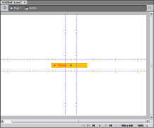
When you create a button in Fireworks, you use the Button Editor. The Button Editor can create anything from a simple two-state button to a multistate button used for a navigation menu. Figure 3-1 shows a Fireworks preset button in the Button Editor.
Figure 3-1:
Edit me a button, my lovely!
Creating a simple two-state button
The concept of a two-state button is scary, especially if the states are California and Florida. The left coast meets the right coast. Yikes! But we digress. As we mention earlier, a two-state button is the default Fireworks button. You create the graphics and text for the
State 1,
which is what the viewer sees when the page initially loads. Then you modify the same graphics for the
State 2,
which is what the user sees when hovering his cursor over the button. The different graphics are a dead giveaway that something will happen when the button is clicked. Of course, the site visitor also sees the ubiquitous hand with the pointing finger like he would with a text link, but using different graphics for each button state makes your design much cooler.
Before you can create any button, figure out what size to make it. When you decide to create a Web site, you do some sort of planning. We describe one method of going from concept to completion in the upcoming “Doodle to a Working Page: Concept to Completion” section of this chapter. Whichever method you use, you know how much area you delegated for navigation. If you have only a few links, you can use a horizontal navigation menu. If you have lots of links, though, you need a vertical menu. After you meet with and create a mockup for your client, you should know the title for each button. Your button should be slightly larger than the longest title. With all that figured out, you're ready to create a two-state button as follows:
1.
Choose Edit
â
Insert
â
New Button.
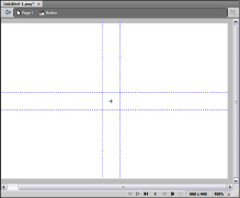
The Button Editor appears. (See Figure 3-2.)
2.
Choose your drawing tool of choice.
Figure 3-2:
So this is the Button Editor!
The logical choice is the Rectangle tool. If you're creating a pill-shaped button, you can choose the Rectangle tool and then use the Rectangle Roundness parameter to round the corners of the rectangle.
3.
Create a shape with your tool of choice in the Button Editor.
4.
In the Property inspector, specify the width and height of your button and any other parameters, such as stroke color and fill color.
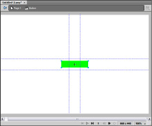
Figure 3-3 shows a button under construction.
Figure 3-3:
Building the perfect button.
5.
Choose Window
â
Align.
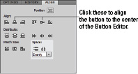
The Align panel opens. (See Figure 3-4.)
Figure 3-4:
Web site designers align objects, not wheels.
6.
Click the Position icon, and then click the middle icons in the Align section.
This aligns the shape to the center of the Button Editor.
7.
Select the Text tool. In the Property inspector, specify the parameters for the button text.
Verdana and Arial are both good choices for the font face. Choose a color that's harmonious with your design. The font size depends on the size of your button. If you make a small button and try to pack a lot of text on it, the button is hard to read.
8.
Type the desired text on the button.
9.
With the text selected, choose Window
â
Align, and then align the button to the center of the canvas.
Figure 3-5 shows a button with text on it. The neat thing about Fireworks is you don't have to create a button for each menu item. An upcoming section of this chapter shows you how to flesh out a navigation menu from one button.
10.
Choose Select
â
Select All.
If you're like us and like keyboard shortcuts, just press Ctrl+A (Windows) or
Ã
+A (Mac) instead. Selecting everything makes it easy to copy the graphics and text to another state.
11.
Choose Window
â
States.
The States panel opens in the Panel docker (see Figure 3-6).
12.
Right-click (Windows) or Control-click (Mac) State 1 to display the contextual menu and then choose Copy to States.
Figure 3-5:
A button's gotta have text. It's a law.
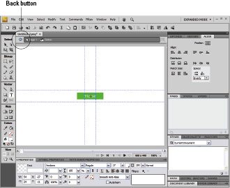
Figure 3-6:
There is not a state of confusion here.

13.
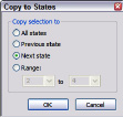
In the Copy to States dialog box that opens (see Figure 3-7), select the Next State radio button and then click OK.
You have a carbon copy of the shape and text in State 2. This is the graphic users will see when they pause their mouse over the button.
14.
Select State 2 and then modify or change the graphic you copied from State 1.
Of course, you could go with a different shape, but that's not practical for a conventional navigation menu button. You modify the button by changing its color and/or the text. For a conventional site, we vote for changing the color of the text.
Figure 3-7:
If this dialog box could copy us to another state, we could save lots of gas.
