Building Web Sites All-in-One For Dummies® (45 page)
Read Building Web Sites All-in-One For Dummies® Online
Authors: Claudia Snell

At this point, you have a wire frame layout that's starting to have a little look and feel to it. It's by no means ready to go, but it's much more developed than a bunch of boxes. These next steps take you through the process of adding a little more personality to the layout by editing fonts and colors, adjusting text, and so forth. Just follow these steps:
1.
Edit fonts, content, colors, or any other properties of text after you create it by double-clicking the text layer or by single-clicking the layer, selecting the Text tool, and then directly selecting the text in the work area.
2.
Apply the color scheme to the layout.
3.
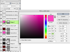
Double-click the color thumbnail to open the Color Picker and change the color.
For the rectangles you created to represent your layout, notice that the layers have two thumbnails. (See Figure 7-5.) One is the layer thumbnail; the other is the vector mask thumbnail. Photoshop actually sees shapes created with the Rectangle/Shape tool as a layer that is completely filled with color and a vector mask that shows only a portion of that color fill. This allows you to easily edit the area filled with color without losing any quality through resizing or changing it.
4.
Mouse over the custom swatches; when the cursor changes to an eyedropper, you can click one of your custom colors to apply it.
If you're not using Web-safe colors, you must clear the Web Only Colors check box in the Color Picker. See Book III, Chapter 4 for more details about how to use Photoshop Color Picker.
Figure 7-5:
Click the color thumbnail to bring up the Color Picker.

5.
Adjust the colors of the text until it has enough contrast that you can easily read it.
6.
Adjust the headings, banner text, and other supporting text until they're readable and have the amount of emphasis you want them to have.
This is a judgment you have to make, and it's different for each project's content and objectives.
7.
Apply color to the boxes you have created to represent your layout, experimenting until you produce the effect you want.
 While you're adjusting colors and making decisions, don't sacrifice readability for a cool design. The point of a site is to convey information. Low contrast (for example, light gray text over a medium gray background) might look very cool but is hard for many users to read. Any design â even a nice-looking one â is a failure if visitors can't use the content. Visitors can and will look for a site that is easier to use. See Book II, Chapter 4 for more information and pointers about choosing colors and fonts for your site.
Finishing the Artwork
In Book II, Chapter 1, we show you how to create a wire frame. The first section of this chapter shows you how to apply a little look and feel to that wire frame by adding and adjusting color, text, headings, and so on. Here, we continue to modify the wire frame by focusing on completing the banner. Note that the techniques can be applied to any of your site graphics.
Choose images or create artwork for your banner and your site pages. Like with every other step in the process, choosing or creating artwork should be driven by reinforcing your message. Of course, you'll use your own taste when selecting images, but ultimately, the direction must be driven by communication and not artistic statements.
_fmt.jpeg) Make sure you have licenses to use any images and artwork that you didn't create. A license to use an image for print is not necessarily the same thing as a license to use it online. Read the agreement carefully before using images coming from another source.
Make sure you have licenses to use any images and artwork that you didn't create. A license to use an image for print is not necessarily the same thing as a license to use it online. Read the agreement carefully before using images coming from another source.
We focus on the banner graphics for now, but keep in mind that your other images and graphics need to match the look and feel.
Placing a photo in your banner
The
site banner
is that identifying strip that lies across the top of a page. Often, the banner contains a company logo or motto or other identifier that viewers can recognize and relate to. You can jazz up this element of your site by adding photos to it. To do so, just follow these steps:
1.
Open your layout in Photoshop and then open the images you're adding to the design.
2.
Drag the image to the layout file.
Photoshop automatically creates a new layer for the image when it places it in the layout file.
3.
Select the image file and then click the Background layer.
The Background layer is the initial layer created by Photoshop by default. In a new document, this layer is empty or contains only a solid color, depending on the settings you make when creating the file. With a photo or other image, the Background layer contains the image.
4.
Drag the layer into the layout document window.
Creating a clipping mask
You create a
clipping mask
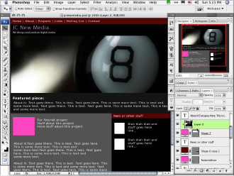
when you use a layer to constrain how much of another layer is visible. Here, we show you how to use a plain box (like the one you create in Step 4g in the “Taking a Wire Frame to a Finished Design” section) to constrain a photo to just the banner area â without having to distort or resize the photo. All you need is a rectangle that will represent the area you want to have as your banner. See Figure 7-6 for an example of a clipping mask used to constrain a graphic to the banner.
Figure 7-6:
You can use this method any time you want to constrain the effects of a layer to only the layer used as the mask (second layer).

To constrain a graphic to the banner with a clipping mask, follow these steps:
1.
Move the new image layer you created in Step 2 of “Placing a photo in your banner” so that it's directly above the banner area box.
2.
If your image layer isn't selected, click to select it.
3.
Choose Layer
â
Create Clipping Mask.
4.
Move, resize, and edit the image layer as you normally would. However, the only portion of the layer that will be visible is the area that is precisely above the box layer.
 Keep the background directly behind text or other important elements relatively clear of patterns. In other words, keep it simple behind the text because it's harder to read text that's on a busy background.
Implementing filters, adjustment layers, and blend modes
While you're working with your banner, don't be afraid to try some filters to change the look of the graphic or apply a blend mode or adjustment layer to change the look of the image until it looks how you want it to. Read Book III, Chapter 4 for information about using blend modes. Adjustment layers are covered later in this chapter.
To use a filter, follow these steps:
1.
Select the image layer.
2.
Choose one of the selection tools. (Review Book III, Chapter 4 for a tour of the Photoshop tools.)
3.
Select the area you would like to affect â if you want to affect the whole image, select the whole layer â and then choose Filter
â
Filter Gallery.
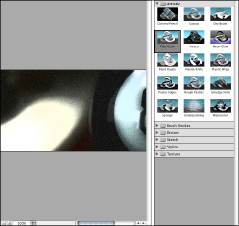
This opens the entire gallery of filters (shown in Figure 7-7) and gives you thumbnail examples of what each does.
Figure 7-7:
The filter gallery can help you choose which effect to apply to an image.

4.
Select the filter you want directly from the Filter menu by clicking it.
The filter is applied, and you see the effects. Some filters present you with a dialog box with customization options. Most allow you to preview the results before applying, so feel free to play with the options until it looks how you want.
To use an adjustment layer, follow these steps:
1.
In the Layers panel, click the Adjustment Layer button.
The Adjustment Layer button looks like a half-black, half-white circle at the bottom of the Layers panel.
