101 Excel 2013 Tips, Tricks and Timesavers (34 page)
Read 101 Excel 2013 Tips, Tricks and Timesavers Online
Authors: John Walkenbach

Figure 83-3:
Using slicers to filter a pivot table by state and by month.
Using a timeline
A
timeline
is conceptually similar to a slicer, but this control is designed to simplify time-based filtering in a pivot table. Timelines are new to Excel 2013, and (unlike slicers) this feature is for pivot tables only.
A timeline is relevant only if your pivot table has a field that’s formatted as a date. This feature does not work with times. To add a timeline, select a cell in a pivot table and choose Insert⇒Filter
➜
Timeline. A dialog box appears listing all date-based fields. If your pivot table doesn’t have a field formatted as a date, Excel displays an error.
Figure 83-4 shows a pivot table created from the data in columns A:E. This pivot table uses a timeline, set to allow date filtering by quarters. Click a button that corresponds to the quarter you want to view, and the pivot table is updated immediately. To select a range of quarters, press Shift while you click the buttons. Other filtering options (selectable from the drop-down in the upper-right corner) are Year, Month, and Day. In the figure, the pivot table displays data from the first two quarters of 2012.
You can, of course, use both slicers and a timeline for a pivot table. A timeline has the same type of formatting options as slicers, so you can create an attractive interactive dashboard that simplifies pivot table filtering.
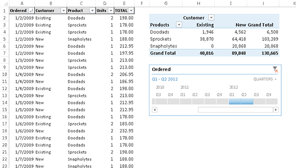
Figure 83-4:
Using a timeline to filter a pivot table by date.
Part VI: Charts and Graphics
A well-conceived chart can make a range of incomprehensible numbers make sense. The tips in this part deal with various aspects of chart making, and also covers topics related to other types of graphics.
Tips and Where to Find Them
Tip 84:
Understanding Recommended Charts
Tip 86:
Making Charts the Same Size
Tip 87:
Creating a Chart Template
Tip 88:
Creating a Combination Chart
Tip 89:
Handling Missing Data in a Chart
Tip 90:
Using High-Low Lines in a Chart
Tip 91:
Using Multi-Level Category Labels
Tip 92:
Linking Chart Text to Cells
Tip 94:
Creating a Chart Directly in a Range
Tip 95:
Creating Minimalistic Charts
Tip 96:
Applying Chart Data Labels from a Range
Tip 97:
Grouping Charts and Other Objects
Tip 98:
Taking Pictures of Ranges
Tip 84: Understanding Recommended Charts
One of the new features in Excel 2013 is Recommended Charts. Select your data, choose Insert
➜
Charts⇒Recommended Charts, and Excel responds by displaying the Recommended Charts of the Insert Chart dialog box (see Figure 84-1). This dialog box displays a preview of your data using several chart type options.
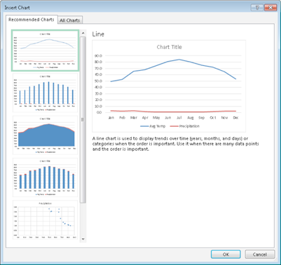
Figure 84-1:
The Recommended Charts feature displays your data using several different chart types.
How does it work? According to the Excel Help:
Want us to recommend a good chart to showcase your data? Select data in your worksheet and click this button to get a customized set of charts that we think will fit best with your data.
Don’t believe it. Excel uses some simple algorithms to make its suggestions, but don’t expect any advanced artificial intelligence. In other words, you will probably never see a recommended chart that will make you say, “Why didn’t
I
think of that!”
The recommended charts seem to be limited to the basic chart types: column charts, line charts, area charts, bar charts, pie charts, and scatter charts.
The recommendations don’t seem to take the magnitude of the data into account. For example, if you select two data series that vary drastically in scale, a combination chart would be a good recommendation. But I’ve never seen Excel recommend a combination chart. Rather, it recommends a column or line chart in which one of the data series is so close to the axis that it may not even be visible.
Even when data is perfectly suited (and labeled) for a stock market chart, that chart is never recommended. But it does offer some recommendations that are clearly inappropriate.
But the recommended charts feature is not completely useless. For example, if a data series has more than eight data points, Excel will not recommend a pie chart. That’s certainly good advice because pie charts are often used inappropriately to display too much data. Also, Excel will never recommend a 3D chart. That’s also good advice because a 3D chart is almost never the best choice.
Excel’s Recommended Charts feature is certainly a good idea, but the current implementation leaves much to be desired. The main problem is this feature is intended for novice users — and many of them will actually believe that a recommended chart is an appropriate way to present their data.
Bottom line: Don’t trust Excel’s chart recommendations, except for very simple data sets. Instead, take some time and become familiar with Excel’s chart types. Strive for simplicity and clarity, and you won’t be tempted to take bad advice from a computer program.
Tip 85: Customizing Charts
If you’ve ever been frustrated when trying to customize a chart, here’s some good news: Excel 2013 makes this task easier than ever.
When you click on a chart in Excel 2013, you see three buttons at the upper-right of the chart. These buttons are the key to quick and easy chart customization.
Adding or removing chart elements
Figure 85-1 shows the options available when you click the Chart Elements button. Note that each item can be expanded to show additional options. To expand an item in the Chart Elements list, hover your mouse over the item and click the arrow that appears.
When you display the options for a button, hover the mouse over the item to get a preview of how the chart will look if you select (or deselect) an item.
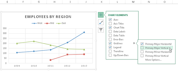
Figure 85-1:
Options available from the Chart Elements button.
Modifying a chart style or colors
Figure 85-2 shows the options available when you click the Chart Styles button.
Notice that there’s a two-item menu at the top: Style and Color. Click the Color item, and you can choose a different color palette for your chart.
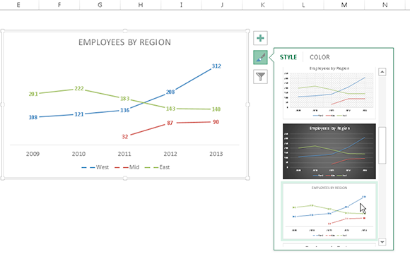
Figure 85-2:
Options available from the Chart Styles button.
Filtering chart data
Options for the third button, Chart Filters, are shown in Figure 85-3. These options enable you to quickly hide one or more charts series or even data points within a chart series.
Note that previewing works differently for these options, and you must click the Apply button to see the effect of filtering.
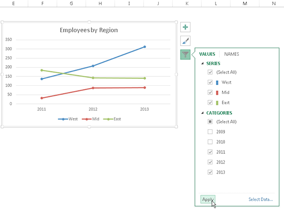
Figure 85-3:
Options available from the Chart Filters button.
Tip 86: Making Charts the Same Size
If you have several embedded charts on a worksheet, you might want to make them all exactly the same size. Figure 86-1 shows a worksheet with four charts that would look better if they were all the same size and aligned.
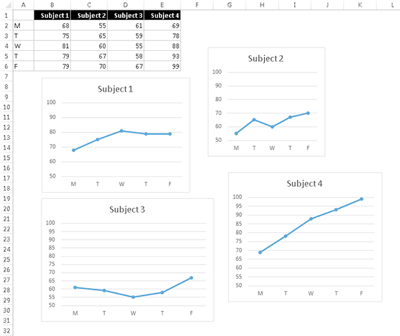
Figure 86-1:
These charts would look better if they were all the same size.
To make all the charts the same size, first identify the chart that is already the size you want. In this case, you want to make all the charts the same size as the Subject 2 chart in the upper-right area.
1.
Click the chart to select it.
2.
Choose Chart Tools⇒Format.
You see the Height and Width settings in the Size group.
3.
Make a note of the Height and Width settings.
4.
Press Ctrl while you click the other three charts (so that all four are selected).
5.
Choose Drawing Tools⇒Format, enter the Height and Width settings that you noted in Step 3 and then click OK.
The charts are now exactly the same size.
You can align the charts manually, or you can use the Chart Tools⇒Format⇒Arrange⇒Align commands. Figure 86-2 shows the result.
Note that if you Ctrl+click a chart, you select it as a graphic object so that you can use the arrow keys to move the chart. Using the arrow keys moves the chart one pixel at a time and allows more control than dragging it with your mouse.
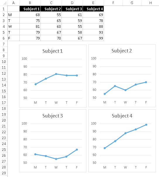
Figure 86-2:
Four charts, resized and aligned.
Tip 87: Creating a Chart Template
If you find that you’re continually making the same types of customizations to your charts, you can probably save some time by creating a template. Many users avoid this feature because they think that it’s too complicated. Creating a chart template is actually very simple.
Figure 87-1 shows a highly customized chart that will be saved as a template so it can be used for future charts. This chart includes a shape and a text box, and both of these added elements are included in the template.
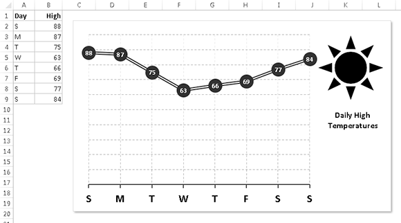
Figure 87-1:
This chart will be saved as a template.
Creating a template
To create a chart template, follow these steps:
1.
Create a chart to serve as the basis for your template.
The data you use for this chart isn’t critical, but for best results, it should be typical of the data that you will eventually plot with your custom chart type.
2.
Apply any formatting and customizations that you like.
This step determines the appearance of the charts created from the template.
3.
Activate the chart; then right-click and choose Save as Template from the shortcut menu. (The Excel 2013 Ribbon doesn’t have a command to create a chart template.)
The Save Chart Template dialog box appears.