101 Excel 2013 Tips, Tricks and Timesavers (37 page)
Read 101 Excel 2013 Tips, Tricks and Timesavers Online
Authors: John Walkenbach

The converted SERIES formula is
=SERIES(,{“Work”,”Sleep”,”Commute”,”Eat”,
“Play Banjo”,”Other”},{8,7,2,1,3,3},1)
 Excel places a limit on the length of a SERIES formula. Therefore, this method may not work if the series consists of a large number of data points.

Figure 93-2:
This chart is no longer linked to a data range.
Tip 94: Creating a Chart Directly in a Range
This tip describes two ways to display a bar chart directly in a range of cells:
→ Using conditional formatting data bars
→ Using formulas that display repeating characters
These “non-chart” charts often serve as a quick way to display lots of data graphically, without creating actual charts.
Using conditional formatting data bars
Using the data bars conditional formatting option can sometimes serve as a quick alternative to creating a chart. The data bars conditional format displays horizontal bars directly in the cell. The length of the bar is based on the value of the cell, relative to the other values in the range. When you adjust the column width, the bar lengths adjust accordingly. The differences among the bar lengths are more prominent when the column is wider.
Figure 94-1 shows results from a survey, using data bars to visualize the distribution for each survey item.
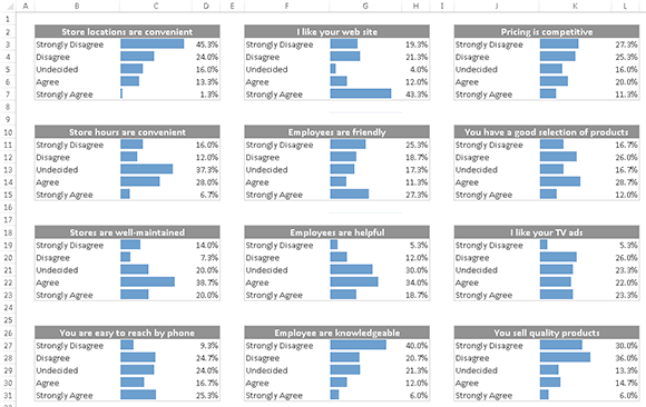
Figure 94-1:
These tables use data bars conditional formatting.
To add data bars to a range, select the range and choose Home⇒Conditional Formatting⇒Data Bars and select one of the fill options.
Excel provides quick access to 12 data bar styles via Home⇒Styles⇒Conditional Formatting⇒Data Bars. For additional choices, click the More Rules option, which displays the New Formatting Rule dialog box. Use this dialog box to do the following:
→ Show the bar only (hide the numbers).
→ Specify Minimum and Maximum values for the scaling.
→ Change the appearance of the bars.
→ Specify how negative values and the axis are handled.
→ Specify the direction of the bars.
Using formulas to display repeating characters
Figure 94-2 shows an example of a chart created by using formulas.
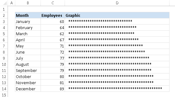
Figure 94-2:
A histogram created directly in a range of cells.
Column D contains formulas that incorporate the rarely used REPT function, which repeats a text string a specified number of times. For example, the following formula displays five asterisks:
=REPT(“*”,5)
In the example shown in Figure 94-2, cell D3 contains this formula, which was copied down the column:
=REPT(“*”,C3/2)
Notice that the formula divides the value in column B by 2. This is a way to scale the chart. Instead of displaying 60 asterisks, the cell displays 30 asterisks. For improved accuracy, you can use the ROUND function:
=REPT(“*”,ROUND(C3/2,0))
Without the ROUND function, the formula
truncates
the result of the division (disregards the decimal part of the argument). For example, the value 67 in column B displays 33 characters in column D. Using ROUND rounds up the result to 34 characters.
You can use this type of graphical display in place of a column chart. As long as you don’t require strict accuracy (because of rounding errors), this type of nonchart might fit the bill.
Figure 94-3 shows some other examples that use different characters and fonts. The chart that displays the solid bars (beginning in row 39) uses the pipe character of the Script font. On most keyboards, the pipe character is generated when you press Shift+backslash. The formula in cell D39 is
=REPT(“|”,C39/2000)
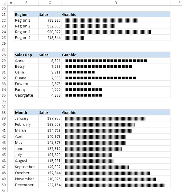
Figure 94-3:
Examples of in-cell charting using the REPT function.
The example in Figure 94-4 uses formulas in columns F and H to graphically depict monthly budget variances by displaying a series of characters. You can then easily see which budget items are under or over budget. This pseudo bar chart uses the character
n
, which appears as a small square in the Wingdings font.
The key formulas are
F3: =IF(D3<0,REPT(“n”,-ROUND(D3*100,0)),””)
G3: =A3
H3: =IF(D3>0,REPT(“n”,-ROUND(D3*-100,0)),””)
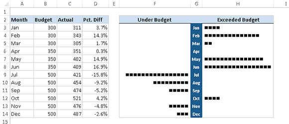
Figure 94-4:
Displaying monthly budget variances by using the REPT function.
For this example, follow these steps to set up the bar chart after entering the preceding formulas:
1.
Assign the Wingdings font to cells F3 and H3.
2.
Copy the formulas down columns F, G, and H to accommodate all the data.
3.
Right-align the text in column E and adjust any other formatting.
Depending on the numerical range of your data, you may need to change the scaling. Experiment by replacing the 100 value in the formulas. You can substitute any character you like for the
n
in the formulas to produce a different character in the chart.
Tip 95: Creating Minimalistic Charts
Effective charts don’t always have to be complicated. In fact, simpler charts that convey a clear message are almost always preferable to more complex charts.
This tip presents some simple charts that demonstrate various ways to provide a different visual experience, compared to the standard chart types. The point is to help you realize that, with a bit of creativity, you can create charts that don’t look like everyone else’s charts.
Simple column charts
Figure 95-1 shows four charts, each of which uses only one data point. This data could be displayed in a single chart, but using four charts provides a different, cleaner look.
These are very minimalistic charts. The only chart elements displayed are the single data point series, the data label for that data point, and the chart tile (displayed on the left, and rotated). The single column fills the entire width of the plot area.
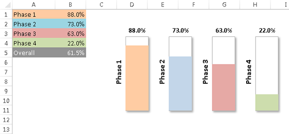
Figure 95-1:
Four minimalistic column charts.
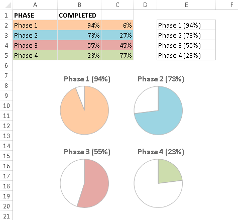
Simple pie charts
Figure 95-2 shows the same data, plotted as four pie charts. These charts were adjusted such that the angle of the first slice is 0 degrees. That step makes it easy to make comparisons across the four charts.
The chart titles are linked to the cells in column E (see Tip 92). Each title is generated with a formula that uses the original data. For example, the formula in cell E2 is
=A2&” (“&TEXT(B2,”0%”)&”)”