The Spirit Level: Why Greater Equality Makes Societies Stronger (4 page)
Read The Spirit Level: Why Greater Equality Makes Societies Stronger Online
Authors: Richard Wilkinson,Kate Pickett
Tags: #Social Science, #Economics, #General, #Economic Conditions, #Political Science, #Business & Economics


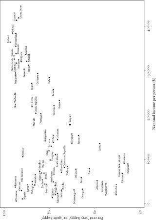
Figure 1.2
Happiness and average incomes(data for UK unavailable).
5
Sooner or later in the long history of economic growth, countries inevitably reach a level of affluence where ‘diminishing returns’ set in and additional income buys less and less additional health, happiness or wellbeing. A number of developed countries have now had almost continuous rises in average incomes for over 150 years and additional wealth is not as beneficial as it once was.
The trends in different causes of death confirm this interpretation. It is the diseases of poverty which first decline as countries start to get richer. The great infectious diseases – such as tuberculosis, cholera or measles – which are still common in the poorest countries today, gradually cease to be the most important causes of death. As they disappear, we are left with the so-called diseases of affluence – the degenerative cardiovascular diseases and cancers. While the infectious diseases of poverty are particularly common in childhood and frequently kill even in the prime of life, the diseases of affluence are very largely diseases of later life.
One other piece of evidence confirms that the reason why the curves in Figures 1.1 and 1.2 level off is because countries have reached a threshold of material living standards after which the benefits of further economic growth are less substantial. It is that the diseases which used to be called the ‘diseases of affluence’ became the diseases of the poor in affluent societies. Diseases like heart disease, stroke and obesity used to be more common among the rich. Heart disease was regarded as a businessman’s disease and it used to be the rich who were fat and the poor who were thin. But from about the 1950s onwards, in one developed country after another, these patterns reversed. Diseases which had been most common among the better-off in each society reversed their social distribution to become more common among the poor.
THE ENVIRONMENTAL LIMITS TO GROWTH
At the same time as the rich countries reach the end of the real benefits of economic growth, we have also had to recognize the problems of global warming and the environmental limits to growth. The dramatic reductions in carbon emissions needed to prevent runaway climate change and rises in sea levels may mean that even present levels of consumption are unsustainable – particularly if living standards in the poorer, developing, world are to rise as they need to. In Chapter 15 we shall discuss the ways in which the perspective outlined in this book fits in with policies designed to reduce global warming.
INCOME DIFFERENCES WITHIN AND BETWEEN SOCIETIES
We are the first generation to have to find new answers to the question of how we can make further improvements to the real quality of human life. What should we turn to if not to economic growth? One of the most powerful clues to the answer to this question comes from the fact that we are affected very differently by the income differences
within
our own society from the way we are affected by the differences in average income
between
one rich society and another.
In Chapters 4–12 we focus on a series of health and social problems like violence, mental illness, teenage births and educational failure, which within each country are all more common among the poor than the rich. As a result, it often looks as if the effect of higher incomes and living standards is to lift people out of these problems. However, when we make comparisons between different societies, we find that these social problems have little or no relation to levels of
average
incomes in a society.
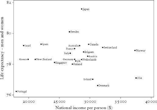
Take health as an example. Instead of looking at life expectancy across both rich and poor countries as in Figure 1.1, look just at the richest countries. Figure 1.3 shows just the rich countries and confirms that among them some countries can be almost twice as rich as others without any benefit to life expectancy. Yet
within
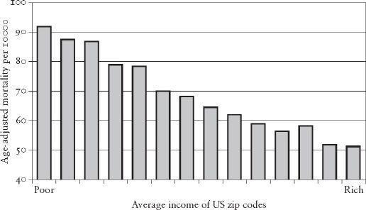
any of them death rates are closely and systematically related to income. Figure 1.4 shows the relation between death rates and income levels within the USA. The death rates are for people in zip code areas classified by the typical household income of the area in which they live. On the right are the richer zip code areas with lower death rates, and on the left are the poorer ones with higher death rates. Although we use American data to illustrate this, similar health gradients, of varying steepness, run across almost every society. Higher incomes are related to lower death rates at every level in society. Note that this is not simply a matter of the poor having worse health than everyone else. What is so striking about Figure 1.4 is how regular the health gradient is right across society – it is a gradient which affects us all.
Within each country, people’s health and happiness are related to their incomes. Richer people tend, on average, to be healthier and happier than poorer people in the same society. But comparing rich countries it makes no difference whether on average people in one society are almost twice as rich as people in another.

Figure 1.3
Life expectancy is unrelated to differences in average income
between
rich countries.
6

Figure 1.4
Death rates are closely related to differences in income
within
societies.
7
What sense can we make of this paradox – that differences in average income or living standards between whole populations or countries don’t matter at all, but income differences within those same populations matter very much indeed? There are two plausible explanations. One is that what matters in rich countries may not be your actual income level and living standard, but how you compare with other people in the same society. Perhaps average standards don’t matter and what does is simply whether you are doing better or worse than other people – where you come in the social pecking order.
The other possibility is that the social gradient in health shown in Figure 1.4 results not from the effects of relative income or social status on health, but from the effects of social mobility, sorting the healthy from the unhealthy. Perhaps the healthy tend to move up the social ladder and the unhealthy end up at the bottom.
This issue will be resolved in the next chapter. We shall see whether compressing, or stretching out, the income differences in a society matters. Do more and less equal societies suffer the same overall burden of health and social problems?
*
Superscripts refer to numbered references listed at the end of the book.
Poverty is not a certain small amount of goods, nor is it just a relation between means and ends; above all it is a relation between people. Poverty is a social status . . . It has grown . . . as an invidious distinction between classes . . .
Marshall Sahlins,
Stone Age Economics
HOW MUCH INEQUALITY?
In the last chapter we saw that economic growth and increases in average incomes have ceased to contribute much to wellbeing in the rich countries. But we also saw that within societies health and social problems remain strongly associated with incomes. In this chapter we will see whether the amount of income inequality in a society makes any difference.
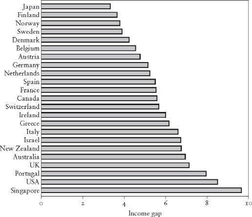
Figure 2.1 shows how the size of income differences varies from one developed country to another. At the top are the most equal countries and at the bottom are the most unequal. The length of the horizontal bars shows how much richer the richest 20 per cent of the population is in each country compared to the poorest 20 per cent. Within countries such as Japan and some of the Scandinavian countries at the top of the chart, the richest 20 per cent are less than four times as rich as the poorest 20 per cent. At the bottom of the chart are countries in which these differences are at least twice as big, including two in which the richest 20 per cent get about nine times as much as the poorest. Among the most unequal are Singapore, USA, Portugal and the United Kingdom. (The figures are for household income, after taxes and benefits, adjusted for the number of people in each household.)


Figure 2.1
How much richer are the richest 20 per cent than the poorest 20 per cent in each country?
2
There are lots of ways of measuring income inequality and they are all so closely related to each other that it doesn’t usually make much difference which you use. Instead of the top and bottom 20 per cent, we could compare the top and bottom 10 or 30 per cent. Or we could have looked at the proportion of all incomes which go to the poorer half of the population. Typically, the poorest half of the population get something like 20 or 25 per cent of all incomes and the richest half get the remaining 75 or 80 per cent. Other more sophisticated measures include one called the Gini coefficient. It measures inequality across the whole society rather than simply comparing the extremes. If all income went to one person (maximum inequality) and everyone else got nothing, the Gini coefficient would be equal to 1. If income was shared equally and everyone got exactly the same (perfect equality), the Gini would equal 0. The lower its value, the more equal a society is. The most common values tend to be between 0.3 and 0.5. Another measure of inequality is called the Robin Hood Index because it tells you what proportion of a society’s income would have to be taken from the rich and given to the poor to get complete equality.
