The Spirit Level: Why Greater Equality Makes Societies Stronger (2 page)
Read The Spirit Level: Why Greater Equality Makes Societies Stronger Online
Authors: Richard Wilkinson,Kate Pickett
Tags: #Social Science, #Economics, #General, #Economic Conditions, #Political Science, #Business & Economics

In short, our nation’s wealth is becoming even more concentrated at the top. It has become the financial equivalent of hydrodynamics: Large streams of income create even larger pools of wealth. The family of Wal-Mart founder Sam Walton has a combined fortune estimated to be about $90 billion. In 2005, Bill Gates was worth $46 billion; Warren Buffet, $44 billion. By contrast, the combined wealth of the bottom 40 percent of the United States population that year—some 120 million people—was estimated to be around $95 billion. Here again, the Great Recession of 2008–2009 took a toll; some of these billionaires’ fortunes were whittled down by 20 to 40 percent. But even then, they remained immense.
As citizens, we may feel that inequality on this scale cannot possibly be good for us, and Wilkinson and Pickett supply the evidence that confirms our gut sense of unease. Such inequality undermines the trust, solidarity, and mutuality on which responsibilities of citizenship depend. It creates a new aristocracy whose privileges perpetuate themselves over generations (one of the striking findings in these pages is that America now has less social mobility than many poorer countries). And it breeds cynicism among the rest of us.
This is not to say that the superrich are at fault. By and large, “the market” is generating these outlandish results. But the market is a creation of public policies. And public policies, as the authors make clear, can reorganize the market to reverse these trends.
The Spirit Level
shows why the effort to do so is a vital one for the health of our society.
Berkeley, California
July 2009
People usually exaggerate the importance of their own work and we worry about claiming too much. But this book is not just another set of nostrums and prejudices about how to put the world to rights. The work we describe here comes out of a very long period of research (over fifty person-years between us) devoted, initially, to trying to understand the causes of the big differences in life expectancy – the ‘health inequalities’ – between people at different levels in the social hierarchy in modern societies. The focal problem initially was to understand why health gets worse at every step down the social ladder, so that the poor are less healthy than those in the middle, who in turn are less healthy than those further up.
Like others who work on the social determinants of health, our training in epidemiology means that our methods are those used to trace the causes of diseases in populations – trying to find out why one group of people gets a particular disease while another group doesn’t, or to explain why some disease is becoming more common. The same methods can, however, also be used to understand the causes of other kinds of problems – not just health.
Just as the term ‘evidence-based medicine’ is used to describe current efforts to ensure that medical treatment is based on the best scientific evidence of what works and what does not, we thought of calling this book ‘Evidence-based Politics’. The research which underpins what we describe comes from a great many research teams in different universities and research organizations. Replicable methods have been used to study observable and objective outcomes, and peer-reviewed research reports have been published in academic, scientific journals.
This does not mean that there is no guesswork. Results always have to be interpreted, but there are usually good reasons for favouring one interpretation over another. Initial theories and expectations are often called into question by later research findings which make it necessary to think again. We would like to take you on the journey we have travelled, signposted by crucial bits of evidence and leaving out only the various culs-de-sac and wrong turnings that wasted so much time, to arrive at a better understanding of how we believe it is possible to improve the quality of life for everyone in modern societies. We shall set out the evidence and our reasons for interpreting it the way we do, so that you can judge for yourself.
At an intuitive level people have always recognized that inequality is socially corrosive. But there seemed little reason to think that levels of inequality in developed societies differed enough to expect any measurable effects. The reasons which first led one of us to look for effects seem now largely irrelevant to the striking picture which has emerged. Many discoveries owe as much to luck as judgement.
The reason why the picture we present has not been put together until now is probably that much of the data has only become available in recent years. With internationally comparable information not only on incomes and income distribution but also on different health and social problems, it could only have been a matter of time before someone came up with findings like ours. The emerging data have allowed us, and other researchers, to analyse how societies differ, to discover how one factor is related to another, and to test theories more rigorously.
It is easy to imagine that discoveries are more rapidly accepted in the natural than in the social sciences – as if physical theories are somehow less controversial than theories about the social world. But the history of the natural sciences is littered with painful personal disputes, which started off as theoretical disagreements but often lasted for the rest of people’s lives. Controversies in the natural sciences are usually confined to the experts: most people do not have strong views on rival theories in particle physics. But they do have views on how society works. Social theories are partly theories about ourselves; indeed, they might almost be regarded as part of our self-awareness or self-consciousness of societies. While natural scientists do not have to convince individual cells or atoms to accept their theories, social theorists are up against a plethora of individual views and powerful vested interests.
In 1847, Ignaz Semmelweiss discovered that if doctors washed their hands before attending women in childbirth it dramatically reduced deaths from puerperal fever. But before his work could have much benefit he had to persuade people – principally his medical colleagues – to change their behaviour. His real battle was not his initial discovery but what followed from it. His views were ridiculed and he was driven eventually to insanity and suicide. Much of the medical profession did not take his work seriously until Louis Pasteur and Joseph Lister had developed the germ theory of disease, which explained why hygiene was important.
We live in a pessimistic period. As well as being worried by the likely consequences of global warming, it is easy to feel that many societies are, despite their material success, increasingly burdened by their social failings. If correct, the theory and evidence set out in this book tells us how to make substantial improvements in the quality of life for the vast majority of the population. Yet unless it is possible to change the way most people see the societies they live in, the theory will be stillborn. Public opinion will only support the necessary political changes if something like the perspective we outline in this book permeates the public mind. We have therefore set up a not-for-profit Trust to try to make the kind of evidence set out in the following pages better known. Lacking funds and expertise it is – at the time of writing – scarcely more than a web site (
www.equalitytrust.org.uk
). But we hope at least to suggest that there is a way out of the woods for us all.
We are grateful to Danny Dorling, Stuart Proffitt and Alison Quick for their careful reading and many helpful comments on our manuscript. We also thank Molly Scott Cato for her comments on Chapter 15, Majid Ezzati for kindly sending us his corrected estimates of body mass index for US states, and Stephen Bezruchka for helpful discussions.
Richard Wilkinson would like to thank the University of Nottingham and his former colleagues in the Division of Epidemiology and Public Health for the freedom which allowed him to devote his time to the research which went into this book. Kate Pickett thanks the University of York and her colleagues for their generous support.
Figures 3.1 and 3.2 are reproduced by kind permission of Jean Twenge. We are grateful to Cambridge University Press for permission to reproduce Figures 4.3 and 10.1. Figure 6.1 is reproduced with permission from BMJ Publishing group; Figure 6.7 with permission from Bryan Christie Design, LLC; and Figure 15.3 with permission from the
Economic Journal
. All other figures are our own, and can be freely reproduced with acknowledgement.
The cartoons on pp. 16, 32, 64, 104, 118, 130, 146, 158, 172, 194, 214 and 230 are from
www.CartoonStock.com.
Grateful acknowledgement is given to them and to the following for permission to reproduce cartoons: p. 2, copyright © Andy Singer, 2007, politicalcartoons.com; p. 48, copyright ©
The New Yorker
collection, 1996, Peter Steiner, cartoonbank.com; p. 74, copyright © Joseph Farris, cartoonbank.com; p. 88, copyright ©
The New Yorker
collection, 2005, Lee Lorenz, cartoonbank.com.
FACTS FROM FIGURES: HOW TO
LOOK AT THE GRAPHS IN THIS BOOK
Most of the graphs that we use in this book are charts linking income inequality to different health and social problems. They show relationships, either: (1) internationally, comparing rich countries or (2) in the USA, comparing different states.
In all of these graphs, we put income inequality along the horizontal line at the bottom (the
x
-axis), so societies with low levels of inequality are to the left, and societies with high levels of inequality are towards the right of the graph.
The different health and social outcomes are shown on the vertical line (the
y
-axis) on the left side of the graph.
On most of the graphs, there are two features. First there is a scatter of points, either of rich countries, or of US states, so that readers can see exactly how each society compares to others. Second, there is a line, called a
regression line
, which shows the ‘best fit’ relationship between income inequality and the outcome on that graph. This line is not chosen by us, but is calculated by statistical software to give the line which best fits the trend through the data points. It is also possible to calculate how unlikely it is that the pattern we see could result from chance alone. We have only included a best fit line through the points if the relationship would be very unlikely to occur by chance. When a graph has no best fit line it means that there is no evidence of a relationship.
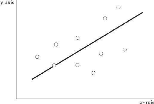
If the line slopes steeply upwards from left to right, it shows that the health or social outcome becomes more common in more unequal societies. This pattern tends to occur with problems that we think of as bad, such as violence:
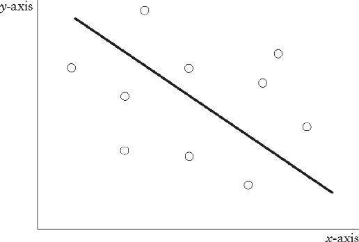
If the line slopes steeply downwards from left to right, it shows that the health or social outcome is much less common in more unequal societies. We see this pattern for things that we think of as good, such as trust:

A wider scatter of points on the graph means that there are other important influences on the outcome. It may not mean that inequality is not a powerful influence, simply that other factors matter as well:

A narrow scattering of points means that there is a very close relationship between inequality and the outcome and that inequality is an excellent predictor of the outcome:

