The Art of Pregnancy Photography (11 page)
Read The Art of Pregnancy Photography Online
Authors: Jennifer George
Tags: #Health & Fitness, #Pregnancy & Childbirth, #Photography, #Subjects & Themes, #Portraits, #Techniques, #General

LEADING LINES
Horizontal, Vertical, and Diagonal Lines
. Vertical and horizontal lines convey a feeling of motion in an image, especially when the lines form repeating patterns. Vertical lines represent stature and strength. Horizontal lines represent calmness and stability. Diagonal lines can also be used in the photographic frame to lead the viewer’s gaze to the subject. Those of us who live in the Western world read from left to right. Therefore, as we take in an image, we tend to start at the left edge of the frame and follow real or implied lines in the composition to view the main subject of the image.
As you compose your image, strive to create lines that lead the eye from the left edge of the frame, through the image, and to the subject. For instance, posing your subject so that she is lying diagonally across the frame, with her legs to camera left, can compel the viewer to follow the line of her legs toward her midsection, which should, of course, be prominent in the pregnancy portrait. Angling her arm and resting her hand softly at her chin can create another line for the viewer to follow; this one, of course, would draw the viewer’s gaze to the subject’s face—another focal point of the image.

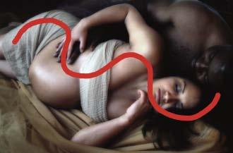
The double S curve in this image creates a winding line through the image that draws the viewer’s gaze to the couples’ faces.

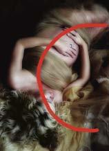
Note the sweeping C curves formed by the length of the subject’s body and in the positions of her arms.
Note, too, that the overall position of the subject’s body, and how it relates to the frame, also impacts the visual flow of the image. For example, a subject photographed lying diagonally across the frame will appear more dynamic than one photographed sitting upright.
S Curves and C Curves
. Curved lines are also visually compelling. They are a natural choice for drawing the viewer’s gaze through the image. A curved line or curved subjects represent gracefulness and tranquility. Two commonly used lines are the S curve and C curve.
The S curve is an ideal design element for composing a portrait of a pregnant woman. In the left-hand image (above), there is a repeating (or double) S curve that guides the eye from the upper-left edge of the image to the lower-right area of the frame, leading the eye to rest on the subjects’ relaxed, content expressions. Their pose also produces a sense of rhythm and repetition. The image is full of grace and femininity, and the rolling lines add a sense of movement to the portrait that keeps the viewer’s eye engaged.
A C-shaped curve is another natural choice when composing a pregnancy portrait. In the right-hand image (above), the sweeping curve of the mother’s body produces a gentle C shape. There are also C-shaped lines through the woman’s arms, and her hands are placed gently upon her tummy in a suggestion of protection, drawing our gaze to her rounded midriff.
COLOR HARMONY
Color has the power to evoke emotion and enhance the mood of an image. The color blue, for instance, is often used to portray things as cool and remote (just think of the saying, “he was feeling blue today”). Cool colors recede in the frame. Warm colors tend to have the opposite effect on viewers; they are often used to depict emotional warmth and comfort, hominess, or passion. Warm colors visually advance in the frame.

The color wheel.
When looking at the color wheel, we see that greens, blues, and purples are on one side; these are the cool colors. Yellows, oranges, and reds are on the opposite side of the wheel; these are the warm colors.
To achieve the most beautiful image possible, you will want to coordinate the colors in the background and clothing, ensuring that they complement the woman and help to create the desired mood in the image. Selecting colors that complement the skin tones will create a feeling of warmth and harmony. A majority of people, regardless of their skin tone, look healthy and radiant when surrounded by earth tones. Warm tones like gold, brown, mocha, and sienna enhance the glow of the subject’s skin. Try using gold tulle with a mocha-colored gauze and note the impact on your subject’s skin.
SUBJECT’S RELATIONSHIP TO THE LIGHT
The subject’s position in relation to the light source is a factor in creating the overall mood of the image. Light coming from the camera angle directly toward the subject will create an open mood. Light from the side can be seen as thoughtful, and light from behind is dramatic. Just as you use balance, size, rhythm, and other design elements to tell the story in the image, you can use light to compose your image. In the following three images (below and on the following page), the direction of the light is critical to the mood established in the portraits.

In this image, the main light was placed near the camera and directed toward the subjects. Along with the white clothing and background, the lighting helps to create an open, welcoming mood for the image.

Moving the lighting to the side of the subjects produced a more thoughtful mood.

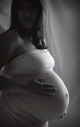
Note the dramatic feel of this portrait. To produce the effect, the light was placed behind the subject. The highlights and shadows keep our attention focused on the tummy.
ANGLE OF VIEW
Finding a fresh and different perspective can transform a simple portrait into a work of art. Once you place your subject in the composition, move around your subject looking for a unique perspective to capture the image. Keeping the basic design principles in mind, and seek out a view you would not normally capture. Moving above the subject, look down and follow the lines of the neck, arms, and hands to the main focus of the image, the mother’s midsection. Alternatively, you can drop down to a lower camera angle and use the leading lines formed by the mother’s body to pull the viewer from the bottom-left corner to the top-right area of the image. It is this creative approach that will take your images beyond typical portraits and into more of a fine-art realm.
TROUBLESHOOTING
When you are working with a client, take the time to step back, look over the scene, and see if it appears balanced. It will be readily apparent when there is a flaw in the design. Ensure that your fabric and background choices are in harmony and make the subject’s skin appear to glow.
Move the subject or move around the subject to create rhythm and repeating shapes in the composition. Place key components of the image in the one-third areas of the frame. Determine where you can create an S curve or C curve by moving the subject’s legs or arms or turning the torso the opposite direction from the face. Ensure that these lines and shapes pull the viewer’s gaze into and through the frame.
Remember, the use of design elements is imperative to the success of the image. With practice, incorporating the compositional guidelines outlined above will become second nature.

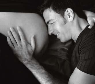
The placement and positioning in the elements in this portrait draw the eye to the connection the father has to the mom and baby.
6. LIGHTING IN THE HOME
W
e live in a three-dimensional world, where the objects we encounter have width, length, and depth. Paintings, drawings, and photographic images, however, are two-dimensional. To create a feeling of depth, the artist must create the highlights and shadows required to show the subject’s form. Photographers, of course, must learn how to make the most of their lighting to accomplish this goal.
