The Art of Pregnancy Photography (10 page)
Read The Art of Pregnancy Photography Online
Authors: Jennifer George
Tags: #Health & Fitness, #Pregnancy & Childbirth, #Photography, #Subjects & Themes, #Portraits, #Techniques, #General

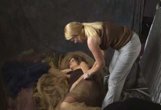
One of the best ways to learn good posing positions is to watch other photographers work with clients and models.
A second way to develop good posing technique is to study the work of other photographers. Experienced portrait photographers establish a repertoire of poses that will help them to accomplish a desired look. While observing another photographer working, take notes on the subject’s stance and posture for future reference.
Observe Dancers
. Dancers are masters of using their bodies for self-expression, and their grace in doing so is unmatched. Photographer Lois Greenfield is known for her strikingly beautiful images of dancers in motion. If you examine her work, you will find hundreds of examples of hand posing, facial expressions, and body movements that will inspire your posing work.
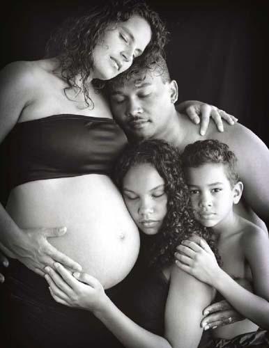
Here the family was so relaxed and comfortable during the session that they were more than willing to touch closely.
Create a File
. Many photographers make it a habit to browse through magazines and catalogs in order to create a file of their favorite poses. The file can serve as a handy reference when working with a model or subject. By using your office copier to reduce the size of the images to fit on 3x5 cards, you can easily store them in your camera bag, pocket, or purse and review them when you need inspiration.
CLIENT TESTIMONIAL
“Wow! Jake and I were awestruck at how amazing the pictures turned out! We can’t wait for everyone to see!” —Stevie S.
Posing Books
. An obvious option for cultivating a better understanding of the subject of posing is to consult one of the many books devoted to the topic. Bill Hurter’s
Portrait Photographer’s Guide to Posing
(Amherst Media, 2004) is an excellent resource that features poses that many of the industry’s pros favor, from classic to cutting edge. Hurter details everything from basic posing, to posing groups, and corrective posing techniques.
Professional Posing Techniques for Wedding and Portrait Photographers
(Norman Phillips; Amherst Media, 2006) and
Posing Techniques for Digital Photographers
(Jeff Smith; Amherst Media, 2005) are equally good resources.
Design Principles
. Developing a feel for the shapes and visual patterns that are considered aesthetically pleasing can also help you to make the most of every pose and overall image composition. These principles will be discussed in the following chapter.
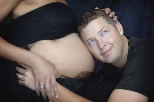
Once you have a series of successful poses, you can improvise and easily add images that feature great expressions you elicit from your subjects. In similar poses shown in this book, the male subject is shown with a serene, contemplative expression. This portrait was made to capture the whimsical expression and sense of anticipation that shows on the father’s face.
5. COMPOSING THE PORTRAIT
T
he importance of composition in creating maternity portraits should never be underestimated. Think of composition as a road map that viewers will use to reach their destination—an appreciation of the beauty of your subject. Some of the important features of this map include the subject’s relationship to another subject, to the light, and the angle of view. Also included are the relationship between the hands, face, body, and legs of the subject—as well as any props used in the image.
Design is similar to posing; it has to be practiced. Take the time to read books on the topic, take a foundational class on design, study well-known paintings, and analyze portraits created by photographers you admire. In the beginning, take practice images with willing models. When you are working with subjects, strive to perfect the composition—don’t allow the image to just happen. By working on your compositions, you will also enhance your creativity.
BALANCE
Balance is the visual aspect of an image that creates a feeling of harmony—a sense of equilibrium and an even distribution of weight—in the composition. A composition can feature objects that are evenly spaced or of the same size and weight. Alternatively, you can add to the composition a secondary subject that is similar to the main subject in color or size.
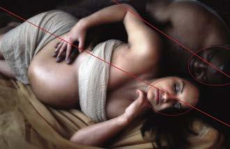
In order to create balance in this image, the couple was placed side by side. With the mother being much smaller than the father, she was placed both closer to the camera and in front of him. The effect was further enhanced by ensuring their heads were aligned and bodies were posed in a similar direction.
It may seem as if achieving visual balance in an image with two subjects with a height difference of more than a foot would prove difficult. However, by lying the couple down, the difference in height was quickly and easily diminished, and balance was achieved.
RELATIVE SIZE
In a portrait of two subjects, the person who occupies the bigger portion of the frame will draw the viewer’s gaze. The father in the image on page 51 is physically larger. Because we wanted the belly to be the focus of the image, we placed the mom in front of the father. In this position, she obscures much of his large frame and gains visual prominence. The height discrepancy also allows us to have him wrapped around the mom to suggest a sense of unity and protection. This helps to build the storytelling quality of the image.
Though you might deduce that the largest subject in the frame will
always
draw the viewer’s attention first, there is an exception to the rule: in a family portrait of a standing woman, man, and child, the smallest subject will draw the viewer’s eye first. You can capitalize on this phenomenon by composing a standing image of the family so that the height discrepancy is highlighted. This can be useful when you want to document the way the small subject is feeling about the pregnancy and impending birth. If you want a portrait in which the subjects are more or less equally prominent, you can seat the mother and father and have the child stand close so that the three subjects’ heads are more closely clustered together.
RHYTHM
Rhythm is created by using repeating elements in an image. Though the portrait above features only two subjects, the lines of their bodies create rhythm. Notice the repeating triangles formed by the mother’s arms and the repeating circular forms of the heads and belly. These rhythmic elements give the image a sense of movement.
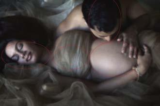
Note how the repetition of oval-shaped elements—the woman’s head, chest, and tummy, and the man’s head—create rhythm in the image.
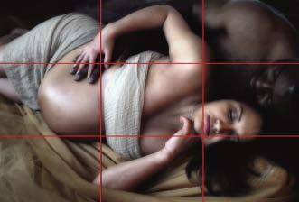
The eye is curious about and drawn to subjects that are not centered in the frame. An off-center subject also leads the viewer’s gaze across the frame. In this image, the face of the mother, the main element, is placed in a one-third area of the image, the hands are placed in another, and the midriff fills another.
RULE OF THIRDS
The rule of thirds is a compositional tool long used by photographers to determine the most effective subject placement. In essence, the rule states that subjects are more visually compelling to viewers when placed one third from any one of the outer edges (horizontally, vertically, or both) of the frame. To ensure a more effective composition, visualize a line placed one-third from the top of the frame and another line placed one-third from the bottom of the frame. Next, visualize a line positioned one-third from the left edge of the frame and another positioned one-third from the right edge. When you’re finished, you should be able to conceptualize a tic-tac-toe grid over the image frame. Note that there will be four points at which the vertical and horizontal lines intersect; these are called power points and are thought to be excellent places to position main areas of interest (e.g., the eyes and the tummy).
