Building Web Sites All-in-One For Dummies® (93 page)
Read Building Web Sites All-in-One For Dummies® Online
Authors: Claudia Snell

Clean navigation is essential. If you design a site with a cluttered navigation menu with multiple choices, visitors can be confused and have a hard time figuring out what to click to get the information they need. If your client has more products or information, you can divide the site into sections. Each section is like a minisite with pertinent information to a specific part of your client's business.
Brainstorming the site
When you and your client brainstorm to create the ultimate e-commerce site, your goal is to arrive at a common vision: a marriage of your creative talent and your client's vision. During your meeting of the minds, you should strive to take the upper hand. Unless your client is familiar with Web sites and e-commerce, some of her ideas might be over the top, or simply undoable. Designing an e-commerce site is covered in detail in Chapter 2 of this minibook. When initially planning the site, consider the following factors:
â¢
Research e-commerce sites of businesses similar to those of your clients.
In fact, ask your client for the URLs of his fiercest competitors. Most business Web sites have a common look and feel. It's generally not a good idea to design a site that's considerably different from your client's competitors' sites. Researching your client's competitors' sites gives you an idea of what are considered standard design staples for that type of business.
â¢
Display your client's company name and logo prominently on each page.
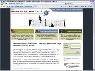
The easiest way to do this is to create a banner and display it at the top of each page. Figure 1-3 shows a Web site with the client name and logo prominently displayed at the top and left side of the page. The end of the banner gently curves into the main site menu, which comprises buttons with a color that was copied from the client's logo.
Figure 1-3:
Identifying the site with a banner.

â¢
Create a separate page for contact information.
On this page, include the client's physical address, phone number(s), fax number(s), and e-mail addresses.
â¢
Create a What's New section to showcase your client's newest products and other pertinent news.
This is also a great place to announce special promotions. This section should be updated frequently to encourage customers to visit the site often.
â¢
In addition to the main navigation menu for the site, add a text-only menu at the bottom of each page.
This information can improve the site's ranking in search engines. It also gives customers a convenient way to navigate when they scroll to the bottom of a page.
â¢
Add a privacy statement that clearly describes your client's policy for protecting customers' personal information.
â¢
Keep your navigation simple.
Customers shouldn't have to click more than six times to go from the site's home page to checkout.
â¢
Don't use any trick navigation.
The navigation menu you design should be simple and should not distract the customer's attention from the reason for the site: the product or service your client is selling.
â¢
Use meaningful link names.
If your client suggests using obtuse (yet creative) link names, it's your job to become the voice of reason and suggest readily identifiable link names. That is, of course, unless your customer is selling an avant-garde product or service whose target audience consists of eclectic people with a creative bent.
 When creating an e-commerce Web site, set up an
info@
myclientsbiz
.com
e-mail address. This can be a catchall e-mail for customer queries. Most Web hosting services provide more than enough e-mail addresses with each hosting package. Contact the service hosting your client's Web site for more information on setting up new e-mail accounts.
Adding Basic E-Commerce with PayPal
If your client is on a budget or isn't sure whether the product or service he is promoting will take off, PayPal is a viable alternative to hosting with a secure server and purchasing a credit card authorization package. In fact, many successful e-commerce sites use PayPal to complete transactions. PayPal is the brainchild of the folks who created eBay. Initially, PayPal was used to complete eBay auctions. The buyer could set up a free, personal PayPal account to pay the seller. Online shoppers with a personal PayPal account can pay for purchases using a debit card, credit card, or by transferring funds from the bank account associated with the PayPal account.
Online merchants can use PayPal to accept payments using either a Premier or Business account. Merchants can sign up for either account for free. The fees for transactions up to $3,000 per month are 2.9 percent plus $0.30 per transaction. The beauty of a PayPal account is that the merchant incurs no setup fees, no monthly maintenance fees, and no fraud-protection fees. A merchant can transfer money from his PayPal account to his bank account at any time. There is no charge for a wire transfer, which takes three to four days, depending on the bank account routing.
When you use PayPal to accept payments, you can create a custom payment page. When you create a custom payment page, it looks like the payment is being conducted with your own secure server. To create a custom page in PayPal, follow these steps:
1.
Log on to your PayPal Premier or Business account and navigate to the Profile page.
The Profile section of the PayPal Web site is where you specify your account information, financial information, and seller preferences.
2.
From the Seller Preferences menu, choose Custom Payment Pages.
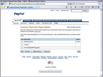
The Custom Payment Page Styles section of the site appears. The default payment style is PayPal unless you already created a custom payment page. In this case, all payment page options are displayed, as shown in Figure 1-4, and a custom style is selected.
3.
To create a new custom payment page, click Add.
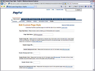
The Edit Custom Page Style page appears, as shown in Figure 1-5.
4.
Enter a name for the custom page style.
This name is added to the list of custom styles associated with your profile.
5.
Enter the URL for the custom banner that will be displayed at the top of your custom payment page in the Header Image URL field.
The ideal size for the banner is 750 pixels x 90 pixels. Ideally, the banner should contain your client's logo or the name of the e-commerce site. You can easily create an image in Fireworks that loads quickly. Unless the banner contains photorealistic images, export the image in the GIF format.
_fmt.jpeg) You should store the image for a custom payment page on a secure server. If you don't, a warning is displayed in the customer's Web browser notifying him that the payment page contains insecure items. The URL for a secure server begins with
You should store the image for a custom payment page on a secure server. If you don't, a warning is displayed in the customer's Web browser notifying him that the payment page contains insecure items. The URL for a secure server begins with
https://
instead of
http://
, which is used for Web pages in which the data is not encrypted.
6.
If you're not using a custom banner, enter the hexadecimal value for the header background color in the Header Background Color field.
Choose a background color that matches the background color of the e-commerce page from which the payments will be made. (For more information on hexadecimal values, see Book II, Chapter 4.)
7.
Enter the hexadecimal value for the header border in the Header Border Color field.
This places a 2-pixel border with the specified color around the payment page header.
8.
Enter the hexadecimal value for the background color in the Payment Flow Background Color field.
This changes the background color of the page from white to the color specified. Note that certain colors, such as red and fluorescent green, are not permitted because these colors clash with the payment page warning messages, making them hard to read. Of course, don't choose a dark color because the text will be illegible as well.
Figure 1-4:
The Custom Payment Page Styles section of the PayPal Web site.

Figure 1-5:
Create a custom payment style.

9.
Click Save to save the custom style and return to the Custom Payment Page Styles page.
Alternatively, you can click Preview to preview the custom style. If the style isn't to your liking, change the parameters until the custom style matches the look and feel of the e-commerce site from which the payments are being made.
10.
Select the radio button for the style you just created.
This makes the selected style the style that displays when payments are made from the e-commerce site.
11.
Click the Make Primary button.
The style you created is now the default style for any PayPal transactions. Figure 1-6 shows a custom PayPal payment page.
Figure 1-6:
A custom PayPal payment page makes it appear as though the payment is being made through the site's secure server, and not through PayPal.
