Building Web Sites All-in-One For Dummies® (60 page)
Read Building Web Sites All-in-One For Dummies® Online
Authors: Claudia Snell

Figure 3-14:
Adding items to the pop-up menu.
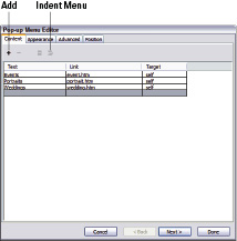
To change the order in which items appear on the menu,
click an item and then drag it to the desired position.
To indent menu items,
click the Indent Menu button. When you indent menu items, they appear as their own pop-up menu (or submenu if you prefer) when a visitor pauses her cursor over the parent menu item.
8.
Click Next.
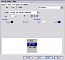
The Appearance tab of the Pop-Up Menu Editor displays. (See Figure 3-15.)
9.
Specify the parameters for the pop-up menu items' appearance:
â¢
Cells:
Select HTML or Image. If you choose HTML, Fireworks creates the code for creating the menu items. If you choose Image, Fireworks creates the images for each menu item and saves them when you export the menu.
â¢
Menu alignment drop-down menu:
Choose Horizontal Menu or Vertical Menu.
⢠Font:
Choose a font set. These are identical to the font options you have in Dreamweaver. The first font is the default. The Web browser defaults to the next font face if the default font isn't installed on the user's computer.
⢠Choose a font size from the drop-down menu.
⢠Font style and alignment options:
These are the same options you find in your friendly word-processing application: Bold; Italic; and left, center, or right align.
Figure 3-15:
The Appearance tab makes an appearance.
â¢
Up State:
Click the color swatches and choose the color for the cell and text. As a rule, you choose the same colors as the menu to which the pop-up menu is attached.
â¢
Over State:
Click the color swatches and choose the color for the cell and text that appear when a visitor pauses the cursor over a menu item.
10.
Click Next.
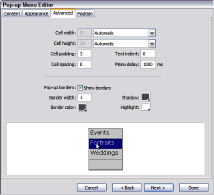
The Advanced tab of the Pop-Up Menu Editor appears. (See Figure 3-16.)
11.
Accept or modify the following parameters:
⢠Cell Width:
Fireworks determines the width based on the menu item with the longest text. To modify the width, choose Pixels from the drop-down menu. This opens the Cell Width text box into which you can enter a value.
⢠Cell Height:
Fireworks chooses a height, which can be modified by entering a different value in the Cell Height field. Alternatively, you can choose Automatic from the drop-down menu.
⢠Cell Padding:
Accept the default value, or enter a different value. This value determines the area in pixels around the cell text.
⢠Text Indent:
Accept the default value (zero) or enter an amount by which to indent the text.
⢠Cell Spacing:
Accept the default value of 0, or enter a value. If you enter a value, a space appears between each item on your pop-up menu. We like our menus tight, so we accept the default value of 0.
Figure 3-16:
And now for the Advanced properties of your pop-up menu.
⢠Menu Delay:
This is the amount of time for which the menu appears after a visitor pauses his cursor over the button. If no action is taken within that amount of time, the menu disappears. The default delay is 1000 ms, or 1 second. Enter a different value to increase or decrease menu delay.
⢠Pop-up Borders:
The
Show Borders check box is selected by default, with a default value of 1. Enter a value to display a bigger border, and then click the applicable color swatches for the border: Shadow, Border Color, and highlight. This option is not available if you choose Image on the Appearance tab.
12.
Click Next.
The Position tab of the Pop-Up Menu Editor appears. (See Figure 3-17.)
13.
Click an icon to align the pop-up in one of the following configurations: to the bottom right of the slice, to the bottom of the slice, to the top of the slice, or to the top-right of the slice.
After you choose an option, Fireworks inserts values in the X and Y fields. If you want, you can enter different values to further define the positioning of the pop-up menu. If you have indented menu items, the submenu options appear, which enable you to specify the position of submenus.
14.
Click Done.
The pop-up menu is added to the button.
15.
Press F12 to preview the menu in your default Web browser. (See Figure 3-18.)
Figure 3-17:
Position is everything.
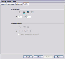
Figure 3-18:
A pop-up menu. Now everyone will want one.

Recycling: Reuse Everything
Creating graphics for your Web designs is time consuming. When you create something for your own or for a client's site, keep it. Everything you create in Fireworks and save as a PNG file (Fireworks' native file format) is fully editable. For example, if you create a vertical navigation menu in Fireworks, you can change the document size, the size of each button, and the other parameters such as the button text, URL, target window, and so on. If the colors clash with the site where you're going to put them, change the colors. It's a lot easier than creating an item from scratch.
Making a reusable graphic template
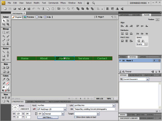
Why work harder when you can work smarter? When you create a new Web design, you don't have to reinvent the wheel: Just modify it to suit the client. Most designers develop a signature style. If you fall into that category, you can use Fireworks to create templates for the things you use often, such as banners and navigation menus. As we mention, Fireworks documents are saved with the PNG extension. The resulting document is different from the document you get when you save a file using the PNG format in an application like Photoshop. The Fireworks PNG document is fully editable. Figure 3-19 shows the document for Doug's wedding and event Web site navigation menu.
He can easily use this menu on a client's site by doing the following:
â¢
Changing the Canvas size and color in the Property inspector.
â¢
Modifying the button color and size by selecting it in the Library, and then double-clicking it to open it in the Button Editor.
If the menu is created using the techniques outlined in the earlier section, “Creating a Navigation Menu,” editing the button also changes the color and size of each instance of the button.
â¢
Modifying the text and URL of each button in the Property inspector.
 Keep a folder of assets that are editable Fireworks and Photoshop files. When you're creating a new site for a client, just pick and choose the assets that you can easily modify to suit the site you're designing.
Figure 3-19:
A fully editable navigation menu.
Organizing a site
When you create a single Web site, you might end up with hundreds of files. Some of them are items supplied by your client that you need to optimize for the Web site. Others are files you create in applications, such as Fireworks and Photoshop. When you deal with that many files, it's definitely in your best interest to be organized. Consider adopting some version of the system Doug uses to organize site assets:
