Building Web Sites All-in-One For Dummies® (13 page)
Read Building Web Sites All-in-One For Dummies® Online
Authors: Claudia Snell

Considering multimedia
Multimedia can be a good way to make very boring information more interesting. You can use animations to establish information or to clarify your point; animations can enforce your message and clarify your information. When deciding whether to use multimedia on your site, however, you must consider your time, your resources, and whether there will be a good return on the investment. Also, make sure that the content itself is better presented as multimedia. Some content is not well suited for multimedia treatment. Think about how using multimedia enhances your information; see the “Evaluating multimedia element choices” section earlier in this chapter.
Handling Printable Materials
Sometimes you want to allow your visitors to print or download materials from your site. You have different ways to handle this task.
For smaller sites, it's fine to create PDFs from your printable documents, post those PDFs to your server, and provide links to them. This method is effective if you have only a few printables that don't change very often. We don't recommend posting Word documents. They're too easy to download and change. PDFs allow you to control the content of the documents.
You can write CSS that instructs the browser how to display the page on-screen and also instructs the browser/printer how to print the document. CSS is generally thought of as a tool to control your layout on the screen, but that's just one thing that CSS can do. You can specify different media types for CSS to control. One of the options is Print, which controls how a page prints. For more about working with CSS, see Book III, Chapter 3.
Remember all your visitors while building
In addition to common browsers and printers, some other types of media that CSS can work with are
Screen readers:
This is software used by visually impaired users; it reads aloud the pages.
Braille devices:
These devices translate the pages into Braille.
TTY & Handheld:
This is for devices with limited display capabilities, such as terminals or Web-enabled handheld devices.
TVs and projectors:
This makes pages usable for television monitors or on-screen projectors where scrolling and resolution may be issues.
Information and a more complete listing of media types are at the World Wide Web Consortium (W3C) Web site (
www.w3.org/TR/CSS21/media.html
). The W3C is an organization that develops recommended standards for Web coding technologies.
To create a style sheet for print, follow these steps:
1.
Create a screen CSS file.
A
screen CSS
is the same thing as CSS without a media type specified.
2.
Create a print CSS file.
Make sure that the names of your selectors are the same in both files. There will be different values for some of the selectors depending on the intended use of the CSS, but they both need to have the same names to apply styles to. Otherwise, your code can become very messy with code that is intended for use by different style sheets.
3.
Link to the CSS files and give them the correct media types, as follows:
media=”print”>
media=”screen”>
Using the
media
type tells the browser which style sheet to use for printing and which one to use for displaying the page in a browser. There are many different values that are recognized for media type. For your purposes, you need to know only about
print
and
screen
.
4.
In the HTML, create the layers and name them.
More information about how to create HTML documents and apply styles to elements is in Book III, Chapters 2 and 3.
To use the print and screen style sheets together in a document, follow these steps:
1.
Type the following three lines of code for the CSS for screen display:
body{color: #fff; background-color:#000;}
This creates a black page with white text
h1 {color: #ccc; background-color:#999; }
This makes the
h1
headings display as gray on gray.
#banner{background-color: #009; color: #ccc;}
This code instructs the browser to display the area of the page marked as a banner with a dark blue background with gray text.
2.
In the HTML, include the following code:
3.
In the CSS document, include this code:
body{color: #000; background-color:#fff;}
This creates a white page with black text
h1 {color: #000; background-color:#ccc; }
This makes the
h1
headings display as black text over a light gray background.
#banner{display: none;}
 This last bit makes the banner area in the HTML document disappear. This also works for elements that you want to display in the printed document but not on the Web page. Just use the technique in reverse.
This method lets you make sure that the content on your site prints nicely for your visitors. It also ensures that the content in the HTML document matches what your visitor downloads. With PDFs, there is the possibility that the content on your site won't match what's in your PDF. Depending on what your content is, that might be all right â or it might not be.
Creating printable style sheets
Printable style sheets are cascading style sheets that are created for controlling the layout of Web pages when users print them from their browsers. If the owners of the site haven't included instructions for printers, the user gets everything that's on the page delivered how the printer decides to interpret it. A
printable style sheet
allows you to instruct the printer to print your page how you want it to be printed. You can even instruct the printer to ignore or replace areas of your page with more printer friendly versions, such as the banner graphics. You can create a special header that is invisible in the browser but replaces the banner when the visitor prints the page.
Printable style sheets are relatively easy to develop and implement. From a user perspective, printable style sheets make it easier to print a page. Visitors can choose FileâPrint in their browser to skip clicking a special button and awaiting a new version of the page. Here are two good reasons to create printable style sheets:
Printable style sheets make things much easier on your visitors.
And they show consideration for their ink cartridges. Those are things that add to the overall good (or bad, if you don't do them) impression that visitors have of a site. Not all sites need printable CSS because not all of them have content that people will want to print.
Creating printable style sheets means you won't have to create or maintain separate documents for your visitors to download and print.
Webmasters use various methods for producing printable versions of their pages. Some use coding or scripts to strip out the elements that aren't printer friendly (such as navigation). That process requires a visitor to click a Print This Page button that sends a request to the server to create and deliver a page that has the important content but strips things such as navigation, advertisements, or graphics the user won't want to print.
Chapter 2: Creating Effective Layouts
In This Chapter
Identifying and organizing page contents
Including essential Web page elements
Emphasizing important information
Making pages usable and accessible
Creating wire frames
This chapter helps you begin designing the pages for your Web site. Before you proceed with the page-level design process, though, you need a clear idea of what your pages should include. (If you want help defining your project, check out the information about this important step in Book I, Chapter 3.) You also need a
site map
that shows how the pages you're designing relate to one another within the site.
Creating wire frames for page-level layouts is an important and helpful step in the process of building a Web site.
Wire frames
are working sketches of the page-level layouts for your site. The process of creating these sketches gives you an opportunity to think about how the elements of your site (the pages) work together regardless of details such as specific colors and photos.
In addition to showing you how to create wire frames, this chapter gives you basic design rules, tells you what essential elements to include, and advises you how to fashion an accessible design.
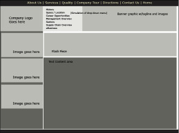
 Wire frames shouldn't include finished art. The point of creating wire frames is to make sure that the elements you want lay out on your pages in a useful and aesthetically pleasing way. Figure 2-1 shows a sample wire frame; notice that the sample represents page elements but not completed artwork.
Figure 2-1:
This wire frame shows where we plan to put the logo, text, and other elements we want to include on the page.

Content Is Key: Making Sure It's All Included
In Book I, we discuss a few important steps that make your project go more smoothly: listing goals, evaluating potential users, and so on. Here, we help you decide what content you need to include. Planning a Web page layout requires that you consider all the types of information the pages need to accommodate. You might want to include tables, lists, headers, paragraphs, images, and multimedia elements â just make a list of them all. Look at all the content you collected and determine the best way to present each piece. Also, you can make a list of content that you want to add later and include these elements in your list. Figuring out now how you'll eventually handle everything saves time later.
 Consider what would happen if you were building a house. If halfway through the project, you figure out that not all the rooms are big enough, you're stuck with a lot more work when you try to rework what has already been done to accommodate the new requirements. The same thing applies to a Web site. If you know that you would eventually like to add some graphs, for instance, figure out during this phase how you would like to display them and where they will fit into the site. That way, when the time comes, you can quickly add the new content instead of having to shoehorn it in somewhere.
Creating Order from Chaos: Consistency Is Your Friend
Always remember that consistency is your friend. Being creative doesn't mean that each page of a site becomes a freestanding document with its own design. Apply creativity on a global scale with the entire site being treated as a whole, and consider both sides of your site. You must include both the
front end
(the stuff your user sees) and the
back end
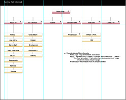
(all the files that make it work) during this phase and the site-map-building phase. (See Figure 2-2 for a sample site map.)
Figure 2-2:
A site map shows the structure of a Web site.

â¢
On the front end, consistency involves a cohesive and uniform layout for all pages.
Banner, global navigation, and main content areas need to be located in the same places on every page. (See the later section, “Including Things That Every Page Needs,” for more about the banner and other necessary elements.) Using the Web site shouldn't feel like a task in itself; rather, the site should be a transparent delivery system for your information. If a layout doesn't working for all your content, rethink your layout.
 Like with anything, here are a couple of exceptions to the rule â in this case, the “always be consistent” rule:
⢠Creating a home page that has a different layout:
If you choose to do this, all the elements should have a common look and feel to the rest of the site. Navigation elements should have the same style throughout the site so that users understand that they are used for navigation. The names on buttons, colors used, and style in general must be consistent throughout the site.
⢠Launching multimedia elements into a separate, smaller window:
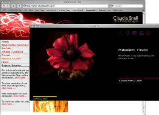
If you do this, make sure the content has a consistent look and feel with the rest of the site. Figure 2-3 shows an example of launching a multimedia element in a new window. Note how the elements in both windows share a common look and feel. This signals to users that, while different, these pieces are part of a whole.
Figure 2-3:
Sample of a Flash piece launched into a secondary browser window showing a different layout but a consistent style with the rest of the site.

â¢
On the back end, consistency involves employing file organization.
The back end of your Web site comprises the collection of documents, images, media, and other elements that make it all work. Any project, no matter what the size, should have a planned file structure. Keep images together in a folder; group content documents in a logical way. Develop a standard way of naming files, explain the naming convention to other team members, and stick to it. Such tasks might take you more time in the beginning, but as the site grows, you'll benefit from huge time savings in maintenance. Sharing the work with others, if you need to, is also easier if file organization is implemented and adhered to.
Staying Web legal
The term
Web legal
has nothing to do with the law. It simply refers to filenames that work on the Web. Page names with spaces and characters in them might cause problems or not work at all. Names that are too long also can cause trouble. In other words, avoid calling a file
“company “picnic” with lots of great food & drinks.jpg”
.
Whatever naming conventions you create, make sure that you and your team members stick to them, and especially make sure that your system is logical, easy to follow, expandable, and
Web legal
(that is, use filenames that work on the Web). Avoid vague names, such as
IMG001.jpg
and
pagetwo.html
. Such names end up causing confusion because they're not descriptive. Maintenance can become difficult when filenames give no clue about what they are.
 One common way of labeling folders for Web documents is to match them to the major navigation areas. For example, if your global navigation includes About Us, Our Products, and Services links, your file structure can include folders named About, Products, and Services. All Web documents pertaining to those areas are then organized by how they logically appear. In a similar fashion, include information on the type of graphic (such as a button, icon, thumbnail, and so on) and, sometimes, the size dimensions (for instance, 50 x 20) in a graphic filename. For example, you can name the file for your About Us button
about_but_50x20.gif
.
