Building Web Sites All-in-One For Dummies® (16 page)
Read Building Web Sites All-in-One For Dummies® Online
Authors: Claudia Snell

â¢
Make sure that the colors you choose have enough contrast so that people can read the text.
We're surprised by how many sites sport gray backgrounds with gray text. They might look cool, but for anyone over 35, it might be hard to read.
â¢
Make sure your site includes site maps, breadcrumbs, and other orientation tools.
Breadcrumbs
refer to a list of links, generally displayed at the top of a page, that shows the path to where the user is â think Hansel and Gretel. Figure 2-9 shows an example of breadcrumbs.
We cover these important topics in more depth in Chapters 1 and 3 of this minibook and also in Book III, Chapter 9.
Figure 2-9:
This breadcrumb trail shows that the user went from the Home page to the About page.

Creating a Layout Wire Frame
A
wire frame
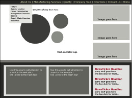
is a page-level layout sketch â like a blueprint of the main areas where you intend to put images, text, headings, links, and so on, on a page; see Figure 2-10. You can create wire frames with traditional drawing tools (pen, pencil, paper, or crayons, if that's what you like) or with a graphics program such as Photoshop, Illustrator, or Fireworks. Claudia generally starts to work out her ideas on paper and then re-creates the wire frames in Illustrator.
Figure 2-10:
This wire frame is a sketch of a site Claudia is planning.

The number of wire frames you need to create depends on the individual needs of the site you're creating. Some sites work well with one layout for all the pages, and other sites need multiple layouts. Remember, these are just layouts at this point, not finished designs.
To create a layout wire frame using Photoshop CS4, just follow these steps:
1.
Open Photoshop and choose File
â
New to create a new document.
The New dialog box opens. Select Web from the Preset drop-down menu and then 1024 x 768 (which is the default) as the size. (See Figure 2-11.)
Figure 2-11:
Start your wire frame here.

2.
Fill in the following information and then click OK.
â¢
Name:
Set the name of the file to
myDocument
(or something else you like better). Because this becomes the name of the file, create a name you'll remember.
â¢
Width:
Set at 1024 pixels.
â¢
Height:
Set at 768 pixels.
The current standard Web screen resolution is 1024 x 768. You can set this number to any size you like, but by starting with 1024 x 768 pixels, you can see how your layout works at the standard Web size.
â¢
Background contents:
Set to white or any other background color. (You can change this later if you change your mind.) This just starts your work area off with a background color.
After you click OK, the dialog box disappears, and the new document appears in its place.
3.
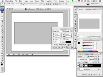
In the new document (see Figure 2-12), create the main element areas (banner, content, navigation, and so on):
a. Click the Rectangle tool on the Tools panel.
It's the fifth tool from the bottom. Your cursor now looks like a plus sign.
b. Click and drag to create rectangles to represent all the areas of your page â banner, navigation, content, and so on.
Each time you click and drag, a new layer is created.
c. On the Layers panel, double-click the name of the new layer and give it a descriptive name.
If you don't, you'll end up with a bunch of layers with the names Layer 1, Layer 2 (or Shape 1, if you used the Shape tool), and so on. Unless you can remember what each layer number represents, it's hard to change your layout later.
d. Position the elements by selecting the layer you wish to move, clicking the Move tool, and dragging each element.
e. Resize an element by selecting the layer, choosing Edit
â
Transform
â
Scale, and then clicking and dragging in the main window.
f. Change the color of elements by double-clicking the layer thumbnail on the Layers panel.
g. In the Color Picker that launches, choose a color and click OK.
Figure 2-12:
Create the main element areas in your new document.

4.
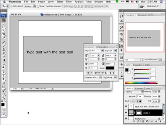
In the main window, create placeholder text. (See Figure 2-13.)
a. Select the Text tool.
b. Click a location in the main window and type some text.
c. Format the text by double-clicking the large T on the Layers panel and making changes via the Options panel or on the Character panel.
You can move text the same way you moved the layout elements: by dragging with the Move tool.
When you're finished, your wire frame should be a layout grid that will drive the graphic design and page development process.
Figure 2-13:
Accessing the Text tool and text editing via the Options panel.

Chapter 3: Organizing Your Content
In This Chapter
Establishing and sharing file management conventions
Developing Web site content
Keeping best practices in mind
Book II, Chapter 2 helps you figure out what content to include on your site. Although, by now, you might have collected much of it, your content will evolve while you develop it. Web site content actually continues to develop throughout the life of the site. For this reason, planning and building a good organizational structure is very important, and that's why we devote this chapter to that topic. While you collect information, it's tempting to just dive right in to the artwork part of designing your site. Resist the temptation. This chapter shows you how.
Starting with the Skeleton: The Structure
The following pointers can help you organize the content (and save yourself some headaches in the process):
â¢
Keep all site files in one set of folders.
Typically, you have pictures, text documents, and other elements (such as PowerPoint files and Excel spreadsheets). Some of these files end up directly on your site, and others just provide information. In either case, keep the original files together in a set of folders. Keep this set of folders in the local copy of your site. (A
local copy
refers to the version of the site that's on your computer's hard drive.) You work on these files and then publish them to a Web server.
â¢
Do first things first.
Start with designing the structure and maintenance of your site. If you start creating artwork first, you're likely to design something that looks great but doesn't work for the purpose of the site.
â¢
Keep site maintenance manageable.
A good way to make sure that maintenance doesn't get done is to make it difficult for people to work on the site. For instance, if you create content that needs to be updated often, you'll need to assign the editing to people who probably already have other jobs. Or the task might fall to someone who doesn't know how to do it, which means that you need to train that person. So if you don't think through all aspects of the site upfront, you risk ending up with a hard-to-manage site and overworked people.
One small update shouldn't be a big deal, but several can accumulate into a large project. Consider looking for ways to automate part of the maintenance or create content that doesn't need to be updated as often. The decision of what is best depends on your needs and your resources.
â¢
Remember that design includes the whole project, not just the pretty graphics and layout.
The
whole project
includes functionality, maintenance, usability, accessibility, graphics, layout, and expandability. You need to consider all users of the site, from content owners to the people who maintain the site to potential visitors. A beautiful-looking site that doesn't work for the intended purpose is a failed design. The life of such a design is not as long as the life of a design that you've thought through and designed well.
The rest of this chapter elaborates on these ideas and also explores the issues of file management, content placement, and best practices in terms of what's best for the site user.
Considering File Management
Even if you think file management is boring and tedious, it's necessary. Whether you're building a site that multiple people maintain or you're working alone, make sure you have a plan for managing files. When working on a Web project, you'll accumulate a lot of files â Word documents, Excel spreadsheets, images, audio, HTML, sketches or notes on paper, and so on â so developing a logical method of organizing these documents is essential to the project. Part of the file management process includes keeping copies of original files, for these (and other) reasons:
â¢
Reference:
Suppose you need to reconstruct a page or section of a Web site. If you back up your entire site periodically (a good practice in case of a major problem with your Web servers), you can easily backtrack and redo that part.
â¢
Repurposing content:
In many cases, you can repurpose existing print content, such as logos, fliers, product catalogs, and so on, to the Web site. Naturally, you want to keep copies of all those resources. With these resources at hand, you can
⢠Pull up the original content quickly and make changes.
⢠Keep track of the original content.
⢠Build a source of information for other parts of your project.
While, for the most part, the information stays the same from print to Web, the layout changes. Maybe you need only parts of the material on a particular page. For instance, if you have a presentation comprising five slides with bullet1 points, you might want to condense the information to three bullet1 points for the Web. Two months after you launch your site, if you decide to freshen the content and give your visitors even more information, you can refer back to the original document and add those other bullet1 points.
â¢
Revision of graphics:
With most images, whether they're photos or art, you edit them, apply effects, or add them to other elements and use the finished version of the images on the Web. If you crop and prepare your photos and other graphics for use on your Web site without saving the originals, you can't revise the images as easily. Keeping a copy of the originals ensures that you can reuse the graphics with the most flexibility. To keep a copy, just choose FileâSave As and name the file something descriptive.
 When revising a file, choose FileâSave As and change the name
immediately
after opening the file so you don't accidentally ruin your original. This technique works no matter what software package you're using â such as Fireworks, Photoshop, or Illustrator. Saving the original with a name that's different from the names of the files in-progress and the finished file ensures that you can go back to your starting point if you need to. Make sure you include something in the filenames that will help you keep track of versions. For example, append a date or version number to the filename. Create a standard for yourself and stick to it.
 With graphics files, you typically have a working file and a final version. The
working file
is the version that has all the editable pieces still intact. The important thing to know here is that as you work in graphics software, you generate a series of layers with pieces of your graphic on each layer. One image, actually, is made up of multiple layers that you can edit. When you generate the final copy of the graphic for your site, the resulting file is
flattened
â in other words, the layers no longer exist in that file. Because the layers don't exist anymore, you can't easily make changes to the file, and some changes become impossible. In most cases, you have to open the working copy and edit the layers.
Keeping copies of these working files â along with the other support and content files â in a Production Files folder means that you don't have to reconstruct the project every time you want to make a change to the graphics. (Book IV has more information about how to use graphics software.) And keeping a Production Files folder within your local site means that you can easily find the files you want to edit.
The
final version
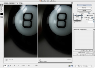
of a graphics or multimedia file is the JPEG, GIF, or SWF file (to name a few) that you use on your actual Web page. Put these files in your Images folder with the other site graphics. Here's an example of how you take a working file to its final version: When you work with Flash, it generates an editable FLA file â your working file. When you're ready to publish the Flash project to your live site, you save it as a SWF file â the file that a browser with the Flash player plug-in can run. You store the FLA file in your Production Files folder so that you can edit it in the future if you need to, and you save the SWF file in your Images folder to publish on the Web site. Figure 3-1 shows the Save for Web & Devices dialog box in Photoshop; in this example, a photograph is being optimized for use on a page. By choosing FileâSave for Web & Devices, you can prepare a graphic to use on your site by choosing a format, optimizing the graphic for the Web, and even resizing it if you need to.
Figure 3-1:
Use the Save for Web & Devices dialog box to turn a layered Photoshop document into an optimized Web graphic.

Keeping It Tidy
You need to keep your production files somewhere, and if you're working alone, it's all right to keep them within your local copy of the site. If you're working on a team, you might want to find a place that all team members can use, such as a shared network drive. That way, they can do what they need to do and keep the site consistent. It also ensures that the live server doesn't become cluttered in the process. Regardless, whether you're using your local copy of the site or a shared drive, the following points can help you continue good file management after initially implementing it:
â¢
Create a system for naming your files before you start building the site.
This applies whether you're working alone or with a team. If you're working as a team, make sure everyone on the team understands the naming conventions and uses them correctly. Create a document explaining the site structure and naming conventions and make sure that everyone has access to it. This document of standards helps everyone understand how to work on the site without creating a mess.
â¢
Write down maintenance procedures as you create them.
Attempting to figure out how you need to update something is frustrating, even for seasoned Web professionals. The task of producing consistent results becomes much more difficult when you make your teammates guess how they should do things. The techniques of keeping documents and notes aren't only for large, complex sites with lots of people working on them. Documented maintenance procedures can save you, the one-man band, when you need to get some work done on a site that you haven't worked on in a while.
â¢
Don't waste precious hosting space on production files.
Production files tend to be very large, so they take up a lot of space. Also, Web staff can access anything on your Web server. Files can become inadvertently available to people you don't want having your files, and that can result in unwanted changes (or worse). The best rule is to not post files unless they need to be there.
â¢
Archive obsolete files.
If you're no longer using a graphic on the
live site
(the published version of the site), remove it from the Web server. It's all right to create an archive on your local or shared network drive, but remove it from the live server. This is especially important for large, complex sites and sites that have multiple people working on them. Make sure that each member of the team knows that she is responsible for archiving the files that she makes obsolete. This is also true for whole sections of the site. If you intend to remove a file (or more) from the site, remove it fully from the server. Make a backup of it so you can recover it if you need to.
