Building Web Sites All-in-One For Dummies® (26 page)
Read Building Web Sites All-in-One For Dummies® Online
Authors: Claudia Snell

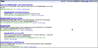
This code communicates important information, such as the name of the site, the author and publisher of the content, a description of the site content, and what version of HTML/XHTML the page is using. This information is used by the browser, search engines, and the site's visitors. The code also makes sure that all the correct CSS and JavaScript needed to make the page work is loaded. Figures 2-2 and 2-3 show how the search engine and browser use the head tag information to help your visitors find and use your Web site.
Figure 2-2:
Head tag information is used in search engine results.

Figure 2-3:
Head tag information is also used in the browser.

Now, for some body!
The main part of a page is the
body.
This is where all the visible content of a page goes. All the graphics, images, banners, headings, and paragraphs of text must be contained between the
and
tags.
Before you start coding, organize the content as an outline with a main topic heading and then supporting subheadings under each. Although several layers of headings are available, we recommend that you stick with three levels or less. If a subheading has enough supporting information to require
and above, it might be a good candidate for being its own page. Remember that people like short, easy-to-access information on a Web page. The cleaner your outline, the cleaner your page â and the better the experience for site visitors.
Adding headings
Headings on your page belong between heading tags. These are container tags that should be used in order of your content structure â
,
,
, and so on. The
tag is for the main heading of your page,
is for subheadings, and
is for subheadings under the
subheadings. You can see the progression in the following:
Main Heading Of the Page
An opening paragraph is sometimes nice
A subheading
A subheading of the above h2
This is a good place for a paragraph
 To see what this code looks like as an actual Web page, copy it directly into a plain-text document. Save the document with an
.html
file extension instead of
.txt
. Open the document in a browser. It won't be very nice looking, but you will be able to see what parts of this code are visible on the page, which parts are in the title bar, and which parts are invisible. You will also be able to see what the different heading types look like by default (before styling). You'll most likely want to apply CSS to make them look better.
Also, notice the closing tags on these container tags. If you don't close the heading or paragraph tags, the browser doesn't know that section has ended. It will treat the rest of the document as if it were part of that section. Imagine an entire page displayed as a main heading!
Coding paragraphs
As you might have noticed in the preceding code example, the container tags for paragraphs are
, and you use them to separate text into paragraphs. Each paragraph must have its own set of paragraph tags. As you look at the HTML of other sites, you might notice that they don't use
tags instead â sometimes several of them â to create the visual effect of having paragraphs.
_fmt.jpeg) This is an incorrect use of the break tag and should never be done. The break tag should be used only when you need a hard break, like in a very long bullet. The reason using multiple
This is an incorrect use of the break tag and should never be done. The break tag should be used only when you need a hard break, like in a very long bullet. The reason using multiple
tags is incorrect is that when you apply style sheets, you can get inconsistencies in your design because the style sheet will apply attributes to things like paragraphs. The
tags will not get the same attributes unless you clutter up your CSS with code to make them the same. Also, coding your site properly will make your content more compatible with other technologies, such as screen readers and handheld devices.
The anatomy of a whole page
Headings and paragraphs aren't always enough. Sometimes you need lists and tabular data on your pages, too. When deciding how to present your data, consider your other options. If the text fits into short bullets, present it that way. Bulleted lists work very well on the Web where your audience will be looking for quick, easy-to-access information. Tables should be used whenever your information needs that type of structure, like contact lists or price lists. These are scenarios when columns and rows really are best.
Using bulleted and numbered lists
Bulleted lists and numbered lists help your visitors get the point quickly. The code for lists â bulleted or numbered â is fairly simple. You can put the heading for a list in either a paragraph tag or in a heading tag, whichever suits the situation best. Take a look at the following HTML, which creates a simple bullet list:
My list of fruit
- apples
- bananas
- oranges
Note that the paragraph tag is closed before the list tags begin. The
tag in the set means
unordered list,
and the
list item.
To turn this list into a numbered list, use
(for
ordered list
) in place of the
tag â and don't forget to close it with the
tag.
Sometimes a list has nested sub-items in it. The code to make that happen looks like this:
My list of fruit
- apples
- red
- green
- yellow
- bananas
- oranges
In this example, the sub-items in the
apples
item are part of a second unordered list. Notice how the sub-items list begins and is closed between the
of the
apples
item. The browser displays them as indented items under
apples
in the main list.
Building tables for your site
Another situation you will likely encounter is a need for tabular data. Tables usually turn up in the form of contact lists on sites but are very common with many types of data, such as price lists or comparison charts. In the old days of Web design, tables were used to control layout of the page, and many sites are still built this way. Sometimes, it's necessary to use some form of layout tables.
 If you're using layout tables, avoid nesting tables excessively.
Nesting
refers to the practice of creating a table within a table, within a table, and so on. Building a page with nested tables creates these problems:
â¢
The pages load slowly.
If the tables have significant nesting, the browser has a lot more information to interpret and display, and the page loads can be slowed considerably.
â¢
The information is less accessible.
Nested tables can make a Web page difficult to view by people who are using devices without traditional browsers â such as PDAs or Web-enabled phones â to visit your site. And they can make your Web page nearly impossible to use by people using screen readers.
â¢
Pages are difficult to maintain and update.
Excessively nested tables create a confusing pile of code that is easy to break, hard to repair, and even more difficult to edit, expand, and modify. Edits that should take seconds can end up taking hours.
