B0041VYHGW EBOK (108 page)
Authors: David Bordwell,Kristin Thompson

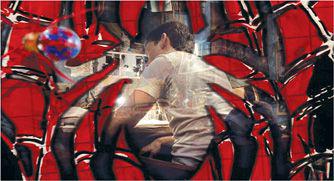
6.126 The
Spider-Man
sequence also uses a more traditional linking device, a dissolve that briefly superimposes two shots.
In sum, the continuity style uses the temporal dimension of editing primarily for narrative purposes. Through prior knowledge, the spectator expects the editing to present story events in chronological order, with only occasional rearrangement through flashbacks. The viewer expects that editing will respect the frequency of story events. And the viewer assumes that actions irrelevant to story causality will be omitted or at least abridged by judicious ellipses. All these expectations allow the viewer to follow the story with minimal effort.
Like graphics, rhythm, and space, time is organized to permit the unfolding of cause and effect, and the arousal of curiosity, suspense, and surprise. But there are many alternatives to the continuity style of editing, and these are worth a look.
Graphic and Rhythmic Possibilities
Powerful and pervasive as it is, the continuity style remains only
one
style, and many filmmakers have explored other editing possibilities.
Films using abstract or associational form have frequently granted the graphic and rhythmic dimensions of editing great weight. Instead of joining shot 1 to shot 2 primarily on the basis of the spatial and temporal functions that the shot fulfills in presenting a story, you could join them on the basis of purely graphic or rhythmic qualities—independent of the time and space they represent. In films such as
Anticipation of the Night, Scenes from Under Childhood,
and
Western History,
experimentalist Stan Brakhage uses purely graphic means of joining shot to shot. Continuities and discontinuities of light, texture, and shape motivate the editing. Similarly, parts of Bruce Conner’s
Cosmic Ray, A Movie,
and
Report
cut together newsreel footage, old film clips, film leader, and black frames on the basis of graphic patterns of movement, direction, and speed.
Many non-narrative films have completely subordinated the space and time presented in each shot to the rhythmic relations among shots.
Single-frame films
(in which each shot is only one frame long) are the most extreme examples of this overriding rhythmic concern. Two famous examples are Robert Breer’s
Fist Fight
(
6.127
)
and Peter Kubelka’s
Schwechater.
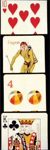
6.127 The stretches of single-frame shots in
Fist Fight
create a flickering effect on the screen.
As early as 1913, some painters were contemplating the pure-design possibilities offered by film, and many works of the European avant-grade movements of the 1920s combined an interest in abstract graphics with a desire to explore rhythmic editing. Perhaps the most famous of these is the Fernand Léger–Dudley Murphy film
Ballet mécanique.
In
Chapter 10
, we’ll see how
Ballet mécanique
juxtaposes its shots on the basis of graphic and rhythmic qualities.
The graphic and rhythmic possibilities of editing haven’t been neglected in the story film, either. Some narrative filmmakers occasionally subordinate narrative concerns to graphic pattern. The most famous examples are probably the films for which Busby Berkeley choreographed elaborate dance numbers. In
42nd Street, Gold Diggers of 1933, Footlight Parade, Gold Diggers of 1935,
and
Dames,
the narrative periodically grinds to a halt, and the film presents intricate dances that are arranged, shot, and edited with a concern for the pure configuration of dancers and background (
4.146
, from
42nd Street
).
More complex is the graphic editing of Yasujiro Ozu. Ozu’s cutting is often dictated by a much more precise graphic continuity than we find in the classical continuity style. In a scene from
An Autumn Afternoon,
Ozu creates close graphic matches on two men seated at a table drinking sake
(
6.128
,
6.129
).
In
Ohayu,
Ozu uses color for the same purpose, cutting from laundry on a line to a domestic interior and matching on a red shape in the upper left of each shot (a shirt, a lamp;
6.130
,
6.131
).
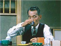
6.128 In
An Autumn Afternoon,
Ozu cuts from one man drinking sake directly …
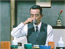
6.129 … to another caught in almost exactly the same position, costume, and gesture.
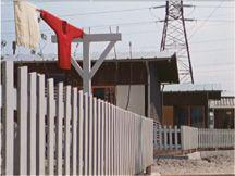
6.130 In
Ohayu,
Ozu creates a playful graphic match by cutting from an outdoor scene with a bright red sweater in the upper left …
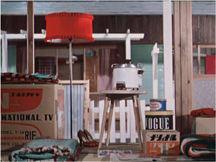
6.131 … to an interior with a vivid red lampshade in the same position.
Some narrative films have momentarily subordinated spatial and temporal editing to rhythmic cutting. In the 1920s, both the French Impressionist school and the Soviet avant-garde frequently made story progression secondary to purely rhythmic editing. In such films as Abel Gance’s
La Roue,
Jean Epstein’s
Coeur fidèle
and
La Glace à trois faces,
and Alexandre Volkoff’s
Kean,
accelerated editing renders the tempo of an onrushing train, a whirling carousel, a racing automobile, and a drunken dance. Kuleshov’s
The Death Ray
and, as we shall see, Eisenstein’s
October
occasionally make rhythm dominate narrative space and time. We can find strong passages of rhythmic editing in Rouben Mamoulian’s
Love Me Tonight,
René Clair’s
Le Million,
and several films of Ozu and Hitchcock, as well as in
Assault on Precinct 13
and
The Terminator.
Pulsating rhythmic editing is prominent in films influenced by music videos, such as
The Crow
and
Romeo + Juliet.
As we saw with graphics, rhythmic editing may override the spatial and temporal dimensions; when this happens, narrative usually becomes less important.
How can you tell a story without adhering to the continuity rules? Let’s sample some ways filmmakers have created distinct editing styles by use of what might be considered spatial and temporal discontinuities.
One option is to use spatial continuity in ambiguous ways. In
Mon Oncle d’Amérique,
Resnais intercuts the stories of his three main characters with shots of each character’s favorite star, taken from French films of the 1940s. At one point, as René’s pesky office mate calls to him, we get the coworker in one shot
(
6.132
).
But Resnais cuts to a shot of Jean Gabin in an older film, turning in reverse shot
(
6.133
).
Only then does Resnais supply a shot of René turning to meet his questioner
(
6.134
).
The film does not definitely present the Gabin shot as a fantasy image; we can’t tell whether René imagines himself as his favorite star confronting his coworker, or whether the film’s narration draws the comparison independent of René’s state of mind. The cut relies on the cues of shot/reverse shot but uses them to create a momentarily jarring discontinuity that triggers ambiguity.
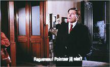
6.132
Mon Oncle d’Amérique.
