The Norm Chronicles (37 page)
Read The Norm Chronicles Online
Authors: Michael Blastland

Some states in the US mandate mortality reporting. For example, all hospitals in New York State that perform cardiac surgery must file details of their cases with the State Department of Health.
13
In 2008 there were 10,707 CABG operations in 40 hospitals, and 194 patients died either in hospital or within 30 days – a mortality rate of 1.8 per cent. Or, as they would say in the UK, a survival rate of 98.2 per cent.
Surgery on heart valves was a higher risk: of 21,445 operations between 2006 and 2008, 1,120 patients died – a mortality rate of 5.2 per cent, or just over 1 in 20. That’s an average of 52,000 MicroMorts per operation, equivalent to around 5,000 parachute jumps, or two RAF bombing missions in the Second World War. Needless to say, this is serious, but presumably the judgement is that the risk without an operation is higher.
This is an example of where we have data, we can define the risks, and that allows us to make comparisons between hospitals. But how useful are they? That sounds like a daft question. If they are real data, what could possibly be wrong with them?
What follows is a trip along the slippery path of working out what
the dangers for a group of hospitals really are – even based on relatively good data. Stick with it if you can. It is an object lesson in the difficulty of coming to clear conclusions about risk, and another reminder of medicine’s uncertainty about how good it is really.
Taking the numbers at face value, you might prefer the hospital with the lowest rate of deaths, which happens to be Vassar Brothers Medical Center, which had only 8 deaths in 470 operations (1.7 per cent). At the other extreme, we find University Hospital in Stony Brook, which reported 43 deaths in 512 operations (8.4 per cent). But would you be right in this choice?
Maybe Stony Brook was treating more severe patients. It was for this reason that Florence Nightingale decided 150 years ago that crude mortality rates were unreliable for comparisons, since hospitals differ in their ‘case-mix’. Ever since there have been attempts to ‘risk-adjust’ the data to check whether the difference in the number of deaths could be accounted for by the type of patient.
In New York they collect data on the age and severity of the patient’s illness and build a statistical equation that tries to say what the chances are that each patient will die in an ‘average hospital’. For the type of patients treated in Stony Brook we would have expected 35 deaths, compared with 27 if they were treating only average patients, which shows that Stony Brook really did have a tendency to treat older or more severely ill patients.
But, as we mentioned above, Stony Brook actually had 43 deaths, eight more than expected, so even the case-mix does not seem entirely to explain the high number of patient deaths. With 43 deaths rather than the expected 35, we can say they had 43/35 = 123 per cent of the expected mortality. New York State Department of Health takes this excess risk of 123 per cent and applies it to the overall death rate in New York, 5.2 per cent, to give an overall ‘Risk Adjusted Mortality Rate’ of 123 per cent of 5.2 per cent which is 6.4 per cent, a figure intended to reflect the risk for an average patient treated in that hospital.
But even a good surgeon might have a run of unexpected bad cases. Kieran’s patient dies, but was he just unlucky? Did he have one uncharacteristically off-day, distracted by the lovely Lara? Was Stony Brook
just unlucky to have a mortality rate (risk-adjusted) of 6.9 per cent, compared with the state-wide average of 5.2 per cent? The question is becoming increasingly sophisticated: how do we measure bad luck?
Figure 29:
Heart valve surgery 2006–08: New York state hospitals
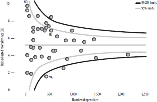
‘Funnel plot’ comparing the ‘risk-adjusted mortality rates’ for New York hospitals carrying out adult heart surgery. Hospitals carrying out more operations are towards the right. If a hospital lies outside the funnels, there is reason to think their mortality risk is truly different from average. Vassar, Stony Brook and New York Hospital Queens are highlighted.
Fortunately statistical methods are good enough to have a stab at it. They depend on making a distinction, mentioned back in
Chapter 1
(‘The beginning’), between the observed mortality
rate
– the historical proportion who died – and the underlying mortality
risk
, which is the chance a similar future patient has of dying. Rates will not exactly match risks, just as 100 coin flips will rarely end in exactly 50 heads and 50 tails. There is always the element of chance, or luck, or whatever you want to call it.
We can check the role of the ordinary ups and downs of good and bad luck by using a
funnel plot
, which shows the mortality rates for all 40 hospitals plotted against the number of patients treated. Smaller hospitals are to the left and bigger ones to the right. The areas inside the ‘funnels’ show where we would expect the hospitals to be if the actual risk for each patient was equal to the overall average and the only
differences between hospitals were due to chance. The funnels are wider for the smaller hospitals because they treat fewer cases, and so a bit of bad luck can make a bigger difference to their apparent performance. If it were really the case that they were all average and the only difference between them was luck, 95 per cent of hospitals (38 out of 40) should lie in the inner funnel and 99.8 per cent (40 out of 40) should lie in the outer funnel.
In fact, five hospitals lie above and five below the 95 per cent funnel, eight more than we would expect by chance alone; and two even lie below the 99.8 per cent funnel, suggesting they are doing surprisingly well. Stony Brook (SB) lies well inside the funnel, suggesting that its apparent excess mortality could be entirely due to bad luck and there is no reliable evidence that it is an unusually dangerous place to go for treatment. Vassar (VA), on the other hand, has an extraordinarily low number of deaths, even allowing for its case-mix. It looks genuinely good.
The ‘worst’ hospital is apparently New York Hospital Queens (NQ), with a risk-adjusted mortality rates of 9.5 per cent, almost double the state-wide average. But this is based on only 6 deaths in 93 operations, and so we cannot be confident that this was not just a run of bad luck – it is also inside the funnel.
The UK now produces funnel plots of a Summary Hospital-level Mortality Indicator (SHMI), which compares hospitals according to how many patients die within thirty days of admission, adjusting for the type and severity of their condition.
14
This measure is controversial. For example, what about very sick patients admitted for palliative care only because they are expected to die? Unless allowance is made for these, perhaps hospitals would start using the Nightingale trick of either refusing them admission or rapidly getting rid of patients that were too sick.
One approach has been to allow hospitals to tick a box saying the patients were admitted for palliative care, but the temptation has been to do this for as many as possible as it raises the ‘expected’ numbers of deaths and so makes performance look better. At the extreme, there is evidence that some hospitals coded as many as 30 per cent of their admissions for palliative care.
15
This box has been removed from the current system.
Measuring hospital risk is a fascinating example of the genius and limitations of statistics. The risks at each institution ought to be calculable – and to some extent they are. But although we can measure differences, and although we can even estimate the extent of luck and bad luck, and though we can use techniques such as the funnel plot to picture all these data and put them in context and show them so that they are easier to understand, we cannot be sure, just as Florence Nightingale could not be sure, that we have eliminated human ingenuity for playing the system. The people factor is still there to mess up the odds. If you want to know the safest place for your operation, check the statistics, but don’t expect a simple answer.
24
SCREENING
S
HOULD SHE, SHOULDN’T SHE
? Prudence was seventy. The invitation – to be screened for breast cancer – lay on the table. It came with a leaflet that told her, more or less, to go; it might save her life. And in the past she had. But now there were these rumours. God, did they know how to make an old woman suffer.
‘It’s about three to one,’ said Norm, offering advice.
‘It’s well after two,’ said Prudence.
‘The ratio,’ said Norm.
‘Oh yes,’ said Prudence, ‘the ratio.’
‘Of the number of people who are treated unnecessarily when the lump is harmless, compared to the number of lives saved.’
‘And if it’s a positive test, does that mean I’m the one or the three?’
‘Can’t tell. If we knew that, it would be easy.’
‘And when would we know?’
‘Never.’
‘Never? Even after they’d chopped them off?’
‘Even after … [staring somewhere else] … so it’s for you to decide, really, how to weigh the balance between a life saved and three times as much chance of an over-diagnosis with … erm … collateral damage.’
‘Yes, Norm. But I’m frightened. Even if I’m old.’
‘Oh,’ said Norm, looking down. ‘Maybe you need to learn to live with uncertainty?’ he said, looking up, ‘and relax.’
‘Relax?’
‘Relax.’ He smiled.
‘I don’t want to play the odds, Norm. It’s too late. I want not to be afraid. Please, how can I not be afraid?’
‘Ah, erm … erm …’
FEELING ILL
? ‘Fine, thanks,’ you say. Not worried that the twinge in your chest might be … something. ‘Never felt better,’ you say. Ah, then perhaps this well-being hides a risk yet to strike, an unseen killer, lurking in your genes or blood. Are you sure you wouldn’t like some professional reassurance?
‘Well, now you mention it …’
Reassurance – peace of mind – is often the health industry message. It’s what Prudence wants. And screening sounds like a good way to get it. The impulse to ‘find out’, to ‘check’, which Prudence feels powerfully, imagines a day when doubt is put to rest. And it’s easy nowadays to find clinics to examine and scan us for a worrying range of diseases that we might have without realising. There are effusive testimonials from smiling people who have been ‘saved’ by these tests. What could be the harm in having a check up? Possibly, quite a lot.
The story of screening taps into the story of a medical cure that we looked at in the last chapter, and goes like this: Woman (Prudence) is worried. Woman goes for check up/screening. Check up discovers cancer. Cancer is treated. Woman is saved. Screening saves women’s lives.
There’s a simple linearity here of cause and effect. But is it the only one? Is it, that is, the right story? Prudence is suddenly not so sure, and having her reassurance taken away is hard. She feels this because of recent reports that there is another story about screening – that it also, sometimes, causes harm. The big problem is that we don’t know who will be harmed and who will be saved. So in some ways screening creates new kinds of uncertainty and new threats of harm.
How? And how much harm compared with the life-saving benefits?
Consider another screening system: security. Here’s something to think about as you inch forward in the queue to be allowed into someone else’s country. Suppose you’ve rounded up a thousand of the usual
terrorist suspects, they all declare their innocence, and someone claims to have a lie detector that is 90 per cent accurate. You wire them up, and eventually the machine declares that 108 are probably lying. These are taken away, given orange suits and not seen again for years. No doubt one or two could be innocent, but it serves them right for being in the wrong place at the wrong time.
But then as the years pass and the court cases for false imprisonment mount, you begin to wonder about this 90 per cent accuracy. You go back and check the small print, which says that whether someone is telling the truth or a lie, the machine will correctly classify them in 90 per cent of cases.
But this means, believe it or not, that there were most likely to have been just 10 terrorists in the 1,000, even with ‘90 per cent accuracy’. The sums are fairly basic: the test would pick up 9 out of 10 of the real terrorists, letting one go free. But there were 990 innocent people, and the test would incorrectly classify 10 per cent of them – that’s 99 – as ‘terrorists’. That makes 9 + 99 = 108 people sent off to a remote prison, 99 of them wholly innocent – that’s 91 per cent of the accused wrongly incarcerated by a ‘90 per cent accurate’ test.
You may think this story is exaggerated, but this is exactly what happens in screening for breast cancer using mammography: only 9 per cent of positive mammograms are truly cancer, and 91 per cent of the apparently ‘positive’ results – many of which will cause a good deal of anxiety to women, some of whom will go on to have biopsies and other investigations – are false positives.
1
The 10 per cent inaccuracy bedevils an awful lot of healthy people.