Presentation Zen: Simple Ideas on Presentation Design and Delivery, 2nd Edition (Ira Katz's Library) (37 page)
Authors: Garr Reynolds

Jobs always made good use of images to compare and contrast features. In this photo he is introducing a new iPod Nano during an Apple special event in 2007 in San Francisco. (Photo by Justin Sullivan/iStockphoto.com.)
My experience teaching and presenting in different parts of the world over the past 20 years has taught me that the physical distance between a speaker and the audience—and the distance between the audience members—has a great influence on the ability to engage and be effective. The spatial context has a great impact on nonverbal communication and the quality of engagement. Ideas concerning personal space vary among cultures, but as much as possible, engaging an audience means being close to the audience. In addition, it helps if your audience members are close to each other. Within physical limitations, as a general principle we must (1) shorten the distance between ourselves and the audience, (2) bring individual audience members closer to each other while remaining sensitive to local perceptions of personal space, and (3) remove any barriers between us and the audience that create distance, whether it’s actual distance or merely a perception. Perceived distance, for example, is created by using language that is too formal, inappropriate, or industry specific for a particular audience. Technology, too, if not used well can create a feeling of distance that diminishes engagement regardless of how close you may physically be to the audience.
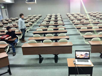
The typical lecture hall like this—with chairs and tables that cannot be moved—does not lend itself to engagement. I took this picture, then worked to modify the room. I set up my computer away from the lectern on the elevated podium, and instead came down closer to the students. While not ideal, it at least removed some of the barriers. We were even able to do some group work in spite of the rigid setup. I further attempted to remove barriers by often walking into the audience, especially during the short activities.
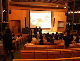
Even modern, beautiful halls like the one at Akita University shown above typically place a large lectern at the front. You can see that we cleared the lectern to the side, making room on stage for me to walk. At right, I placed the computer down low and completely out of sight of the audience.
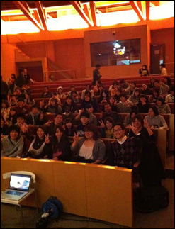
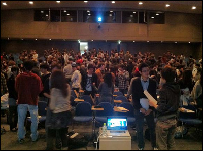
In the large auditorium shown at left, I moved the lectern off the stage and moved down to the front row. In this position I can see the computer without the audience being aware that I am glancing at a monitor from time to time. Note in this photo that the audience members are speaking to each other. As much as possible, I try to get the audience to connect with each other, not just with me.
I see a lot of presentations given by very smart people. Despite their intelligence, all too often presenters use a remote poorly (as if it’s the first time they’ve seen such a device) or not at all. Even today, too many presenters stay next to the computer on a table or lectern or walk back to the computer to change slides every few minutes.
Remote control devices for computers are relatively cheap and an absolute must. No excuses, you’ve got to have one. If you are not currently using a remote to advance slides, adding one to your delivery style will make a huge difference. The remote allows you to get out front closer to the people, move to different parts of the stage or room, and make those connections.
When we stay glued to the laptop and look down to advance every slide, our presentations become more like slide shows with narration—the kind your uncle used to bore you with when he whipped out his 35mm slide projector with highlights of his latest fishing trip. Yawn.
Remember, you want the technology behind your presentation to be as invisible as possible to the audience. If you use technology well, your audience will not even know (or care) what actual digital tools you are using. But when you have your hand on the computer and your eyes are moving back and forth from the computer screen to the keyboard to the audience or projection screen, it becomes more like the typical slide presentations that people complain about.
If you are giving the kind of presentation that requires a computer for more than simply advancing slides, then it’s fine to occasionally go to the computer to start a program, demonstrate a website, and so on. However, you should also move away from the computer when you do not have to be there.
A small and basic remote is all you need. I prefer small remotes with only the most basic features. You can buy remotes that you can mouse around with on screen and are equipped with myriad other features, but they are large and call attention to themselves. All you really need is the ability to advance, go back, and turn the screen black. Very simple.
If you use slideware in presentations, one of the most useful keys to remember is the B key. If you hit the B key in PowerPoint or Keynote, your screen becomes black. (Pressing the W key creates a white screen.) You can even build black screens into your presentation by inserting black slides at various points in your talk when you want to shift all attention away from the screen. Hitting the B key is very useful, for example, if a spontaneous but relevant discussion diverges a bit from the visual information on the screen. Changing the screen to black removes information that may have become a distraction and puts all eyes on you and the people engaged in the discussion. When you are ready to proceed further with your prepared points, just hit the B key again (this feature is on most remote controls as well) and the slides display again.

Filmmaker Kaori Brand keeps her eyes on the TEDxTokyo audience and advances her visuals smoothly with the remote (in her right hand) as if there were nothing in her hand at all. The best presenters get comfortable with the remote and use their hands naturally, never calling attention to the piece of plastic in their hand. (Photo: TEDxTokyo/Andy McGovern.)
If you are going to engage an audience, they have to be able to see you. When the audience can actually see your eye movements and read your facial expressions, they will better understand your message. The audience members are interpreting meaning based on verbal (your actual words), vocal (your voice), and visual (your nonverbal language) cues. Your nonverbal signals are a very important part of your message, but if people cannot see you—even if they can see the screen fine—much of the richness of your message will be lost.
So while it is tempting to turn the lights off to make the visuals look better, the most important thing is to keep the light on the presenter. Often, a compromise can be worked out by dimming only some of the lights.
Given the advances in projection technology, it is often possible to keep all or most of the lights on in conference rooms and lecture halls today. Auditoriums usually have better lighting setups that can keep lights on the presenter but off the screen. No matter what kind of presentation situation you are in, make sure there is plenty of light on you. You cannot engage the audience members if they cannot see you.
In corporate meeting rooms across Japan, common practice is to turn off all or most of the lights for presentations. It is also very common for the presenter to sit next to or behind a table and operate a computer while the audience stares at the screen and the “presenter” narrates the slides. This practice is so common that it is considered normal. It may be normal, but it is not effective. Audiences better understand the presenter’s message when they can both hear
and see
the presenter.
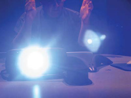
If you turn off the lights and present from the back of the room like this...

