Presentation Zen: Simple Ideas on Presentation Design and Delivery, 2nd Edition (Ira Katz's Library) (33 page)
Authors: Garr Reynolds

Guy Kawasaki, a venture capitalist and former chief evangelist at Apple, urges people to use large type on slides that people can actually see. “This forces you, he says, “to actually know your presentation and just put the core of the text on your slide.” This is what the outspoken Kawasaki had to say about reading text off slides in a speech he gave to a room full of entrepreneurs in Silicon Valley in 2006:
“If you need to put eight-point or ten-point fonts up there, it’s because you do not know your material. If you start reading your material because you do not know your material, the audience is very quickly going to think that you are a bozo. They are going to say to themselves ‘This bozo is reading his slides. I can read faster than this bozo can speak. I will just read ahead.’ ”
Guy’s comments got a lot of laughs, but he’s right. If you plan on reading slides, you might as well call off the presentation now, because your ability to connect with, persuade, or teach the audience anything will approach zero. Reading slides is no way to show presence, make a connection, or even transfer information in a memorable way. In many cases, reading a deck of slides is indeed a good way to put the room to sleep.
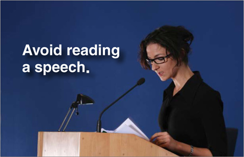
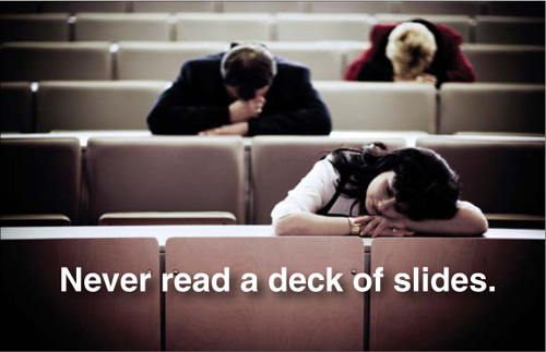
Images in the slides above from iStockphoto.com
If Your Idea is Worth Spreading...
The annual TED (Technology, Entertainment, Design) conference brings together the world’s most fascinating thinkers and doers, who are invited to give insanely great talks on stage in 18 minutes or less. The time limit usually results in very concise, tight, and focused talks. If you have ideas worth talking about, then you’ve got to be able to stand, deliver, and make your case. As the presenters at TED demonstrate every year, presentation skill is critically important.

What’s great about TED is that their amazing presentations are not limited to an elite few. Instead, they “give it away” by uploading tons of their best presentations to the Web and making the videos available in many different formats for online viewing and downloading. Hundreds of quality short-form presentations from the TED archives are available online, and more are added each week. The production quality is excellent and so is the content. TED truly exemplifies the spirit of the conceptual age—share, give it away, make it easy—because the more people who know your idea, the more powerful it becomes. Because of the high-quality free videos, the reach and impact of TED is huge. The TED website is a great resource for content and for those interested in watching good presentations, often with good use of multimedia.
Al Gore
TOP
(TED/leslieimage.com)
William McDonough
CENTER
(TED/Asa Mathat)
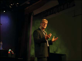
Sir Ken Robinson
BOTTOM
(TED/leslieimage.com)
Stand, Deliver, Connect
Hans Rosling (right), a professor of global health at Sweden’s Karolinska Institute, is the Zen master of presenting statistics that have meaning and tell a story. Rosling co-developed the software behind his visualizations through his nonprofit Gapminder. Using U.N. statistics, Rosling shows that it is indeed a different world. Several presentations on the TED website showcase Rosling’s talents. Conventional wisdom says to never stand between the screen and the projector, which is generally good advice. But as you can see from the photo here, Rosling at times defies conventional wisdom and gets involved with the data in an energetic way that engages his audience with the data and the story.

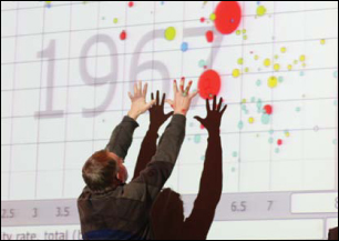
Hans Rosling (
TED/leslieimage.com)
Other TED presenters on this page demonstrate the importance of standing front and center and connecting with the audience.
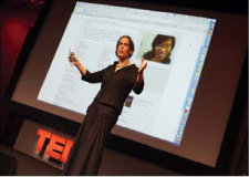
June Cohen (
TED/leslieimage.com)
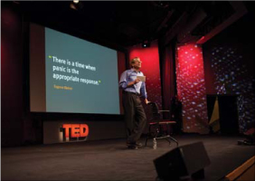
Lawrence Lessig (
TED/leslieimage.com)
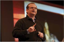
John Doerr
(TED/leslieimage.com)
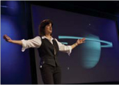
Carolyn Porco
(TED/leslieimage.com)
