Happy City: Transforming Our Lives Through Urban Design (17 page)
Read Happy City: Transforming Our Lives Through Urban Design Online
Authors: Charles Montgomery

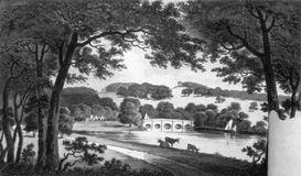
Modern students of landscape architecture have all been inculcated with prospect-refuge theory. Indeed, since the dawn of the profession, its practitioners have been trying to replicate that ideal, sometimes without even knowing it. Humphry Repton, a landscape architect who designed the gardens of dozens of England’s famous estates in the eighteenth century, perfected the technique. Repton’s manipulations appear in the drawings he made for his landed clientele, in which he would move trees from forest edges into open space, add herds of grazing animals, and create watering hole–like lakes to mimic savanna-like vistas. His contemporaries even built ditches, or
haw-haws
, to keep animals in without interrupting the naturalistic scenes with fencing.
These views have been reproduced complete with shade trees, broad meadows, and lakes in the heart of some megacities, from London’s Hyde Park to Mexico City’s Bosque de Chapultepec to Frederick Law Olmsted’s New York masterpieces, Central and Prospect parks.
In many ways, our landscape preferences support the lingering nineteenth-century idea that the city itself is a toxic and unnatural environment, and that dispersal is the natural response to biological truths. Indeed, the Repo Home Tour through the neighborhoods at the urban edge in San Joaquin County felt like a safari through a vast biophilic compromise. From the raised deck of Interstate 5, you could catch glimpses of the broad parks, golf courses, or artificial lakes that define the suburban savanna. Even the highway berms were treated with naturalistic lawns and shrubbery. The view from every front door of every foreclosed home featured an edited version of the Paleolithic landscape: a broad front lawn, low shrubs gathered along building edges, and at least one low-trunked shade tree.
Evolution of the Ideal Landscape

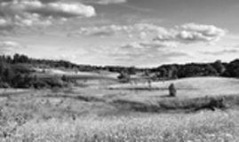
Psychologists believe that savanna-like views have an inherently calming effect on us, perhaps because they depict landscapes similar to those in which the human brain developed. When architects installed this mural in the booking area of a California jail, the guards experienced lower heart rates and had an easier time remembering things.
(
istockphoto.com
)

The eighteenth-century landscape architect Humphry Repton rendered the ideal landscapes he would then create on British estates.
(Repton, Humphry,
Observations on the Theory and Practice of Landscape Gardening,
London: printed by T. Bensley for J. Taylor, 1803)

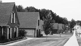
Modern suburban real estate developers create an atomized savanna for everyone.
(Todd Bennett / © 2013 Journal Communications Inc.)
If the lawn view was universally good for us, the aesthetic dividends of dispersal from central cities would be beyond dispute. But it’s not certain that the pseudo-savanna is actually the best view for the human brain.
It turns out that the happiness paradox—that gulf between what we choose and what is good for us—even extends to landscapes.
“I see a big distinction between landscapes that are preferred and those that are beneficial,” biologist Richard Fuller explained to me. Fuller and his colleagues surveyed users of parks around Sheffield, England. Visitors said they felt much more healthy, connected, and “grounded” after spending time in parks with many different kinds of trees and birds than in parks that distilled nature down to lawns and a few trees. The “messier” and more diverse the landscape, the better.
This inquiry into the aesthetic value of biological complexity has just begun, but such work suggests that sterile lawns and token trees might be hollow calories for the nature-craving brain. They are better than nothing, but they are not good enough. It would certainly make sense for diverse, complex ecosystems and views to pack a bigger psychological punch than, say, a manicured patch of grass, because they are more likely to draw us into the levels of involuntary attention that are so soothing.
How do we achieve biological complexity in cities? Well, we can either let our green spaces go truly wild or plant and nurture complexity in them. This is hard work. In my travels I have found that the farther I drive into exurbia, the fewer truly complex and rich front yard gardens I see. People burdened with long commutes and huge yards simply have less time for gardening. On the other hand, the high modernists failed the biophilic complexity test at high densities, too. The huge lawns that serve as “green space” between the social housing tower blocks of the last century are deserts compared with what they could be.
So where is the balance between the isolation of the suburban savanna and the unnerving barrens of hyperdensity?
“People read my work and conclude that sprawl is the way to go. They think, lawns, low density, houses far apart,” said Kuo. “But that is not at all the case! When you look at the body of research on effects of nature, it can actually work at every scale.” What is crucial for healthy living, she insists, is not quantity, but regular exposure, daily doses of nature. So the trick is in finding ways to infuse nature, and nature complexity, into denser places. One experiment worth looking at is my own hometown.
View-Based Urbanism
Vancouver, Canada, has spent the past thirty years drawing people into density in a way that radically reversed a half century of suburban retreat. The experiment began in the early 1970s when citizens rejected a plan to wrap downtown in ribbons of freeway. That made Vancouver the only major city in North America without a single highway running through its core. Since then, the city has steadfastly refused to create any more road space for cars.
*
On top of that, Vancouver is hemmed in by ocean, steep mountains, and an agricultural land reserve that restricts suburban growth. These conditions, together with a steady flow of immigration, fueled a downtown building boom that gained momentum even during the decades when other North American cities were hollowing out.
Vancouver’s urban core, a 20-block-long peninsula bound on two sides by the sea and capped by the magnificent rain forest of Stanley Park, has been rapidly transformed. More than one hundred and fifty residential towers have shot up here since the late 1980s, joining a hundred-odd that sprouted in the 1960s and 1970s. The population nearly doubled between 1991 and 2005. As Americans raced toward suburban horizons, Vancouverites were rushing back downtown, waiting overnight in presale lineups, paying millions of dollars for tower condominiums even before their foundations were poured.
Here is the remarkable paradox: the more crowded Vancouver gets, the more people want to live there and the higher the city has risen on international surveys ranking the world’s best places to live. It now usually sits at or near the top of quality-of-life lists published by Mercer,
Forbes
magazine, and the Economist Intelligence Unit. Prices have doubled on many condominium units in the past fifteen years, and they remained buoyant right through the global economic crisis. To top it off, Vancouver has the lowest per capita carbon footprint of any major city on the continent—a dividend achieved in part by people living closer together, reducing the energy used in transportation and home heating.
*
Part of what made Vancouver’s vertical experiment both unique and desirable was the way it accommodated residents’ biophilic needs. The city’s new downtown was shaped to a large extent by the local obsession with views. Despite its dark winters, almost nobody in the city wants to face south, where the sun occasionally appears through the rain clouds. Vancouverites instinctively turn their gaze north and west: to mountains, rain forest, and ocean—in other words, to nature’s rugged complexity. Any construction that threatens to block views to the North Shore mountains is met with outrage. City planners have responded with bylaws that shape the skyline, creating a series of “view corridors” through the downtown that allow for unimpeded mountain views from various vantage points to the south. Planners have actually forced some builders to alter the orientation of their towers to protect those sight lines.
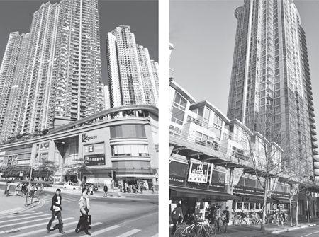
This tension between the condo dweller’s wish for a panoramic nature view from her window and the public’s right to a glimpse of the mountains has helped establish a standard local architecture, just as concerns about building massing and shade determined the form of generations of Manhattan’s skyscrapers. New York’s 1916 Zoning Resolution forced developers to reduce the mass of their buildings as they got higher, resulting in the stepped form of the iconic Manhattan tower and preserving at least some natural light down on the street. Vancouver’s vertical design adaptation borrowed not from New York, but from Hong Kong, the source of so many of its new residents in the 1980s. In land-scarce Hong Kong, builders in that era were accommodating an exploding population by a method you might call extreme stacking. Several levels of shops and services would typically be combined in bulky podium blocks, and then five, six, or more residential towers would stand on top. In some of these complexes, you may be thirty floors up but still have your view of the surrounding hills completely blocked. The model needed adjustment in view-conscious Vancouver. City planners pushed the podiums down to three or four stories. They squeezed the footprint for the towers above and spaced them a minimum of 80 feet apart, so what eventually grew into the skyline were tall, thin shards of glass with plenty of air between them. The result is a place where almost every tower dweller enjoys a visual connection with nature while everyone down on the street gets at least a glimpse. The podiums are lined with town houses or commercial spaces, so that the streets remain lively, safe, and packed with the shops and services that make life as convenient as it is in New York.

Hong Kongism/Vancouverism
The super-dense, mixed-use podium-and-tower model common in land-scarce Hong Kong (
left
) was adapted for Vancouver tastes by scaling down street-side podiums and spacing out residential towers (
right
). Where it succeeds, the Vancouverism model offers both vibrant street life and views for everyone.
(
Left
: Charles Bowman;
right
: Charles Montgomery)
