CSS: The Definitive Guide, 3rd Edition (24 page)
Read CSS: The Definitive Guide, 3rd Edition Online
Authors: Eric A. Meyer
Tags: #COMPUTERS / Web / Page Design

Even without altering the font in use, there are many ways to change the appearance
of text. There are classic effects such as underlining, of course, but CSS also enables
you to draw lines over text or through it, change the amount of space between words and
letters, indent the first line of a paragraph (or other block-level element), align text
to the left or right, and much more. You can even alter the amount of space between
lines of text, although this operation is unexpectedly complicated and covered in more
detail in
Chapter 7
.
These behaviors are all relatively well supported, or else not supported at all. Full
justification of text is a major one that is not well supported, and most user agents
released during the 20th century exhibited bugs in the text decoration and vertical
alignment, as well as line-height calculations. On the other hand, word and letter
spacing almost always work correctly when they're supported, and text indentation has
manifested only a few very small bugs. The same is true of the ability to alter
capitalization, which is usually supported correctly.
At a few points in this chapter, I mentioned that the layout of lines was a more
complicated process than presented. The next chapter covers details of that process and
a great deal more.
In the previous chapters, we covered a great deal of practical information on how CSS
handles text and fonts in a document. In this chapter, we'll look at the theoretical side
of visual rendering, answering many of the questions we skipped earlier in the interest of
addressing how CSS is implemented.
Why is it necessary to spend an entire chapter on the theoretical underpinnings of
visual rendering in CSS? The answer is that with a model as open and powerful as that
contained within CSS, no book could hope to cover every possible way of combining
properties and effects. You will obviously go on to discover new ways of using CSS for your
own document effects.
In the course of exploring CSS, you may encounter seemingly strange behaviors in user
agents. With a thorough grasp of how the visual rendering model works in CSS, you'll be
able to determine whether a behavior is a correct (though unexpected) consequence of the
rendering engine CSS defines, or whether you've stumbled across a bug that needs to be
reported.
CSS assumes that every element generates one or more
rectangular boxes, called
element boxes
.
(Future versions of the specification may allow for
nonrectangular boxes, but for now everything is rectangular.) Each element box has a
content area
at its core. The content area is surrounded by optional
amounts of padding,
borders,
and
margins.
These items are considered optional
because they could all be set to a width of zero, effectively removing them from the
element box. An example content area is shown in
Figure 7-1
, along with the surrounding regions of padding, border, and
margins.
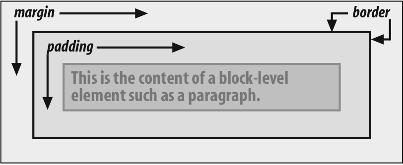
Figure 7-1. The content area and its surroundings
Each of the margins, borders, and padding can be set using various properties, such
asmargin-leftorborder-bottom. The content's background—a color or tiled image, for
example—is also applied to the padding. The margins are always transparent, revealing
the background of
any parent
elements. Padding cannot be a negative value, but margins can. We'll explore the effects
of negative margins later in this chapter.
Borders are generated using defined styles, such assolidorinset, and their colors are set
using theborder-colorproperty. If
no color is set, then the border takes on the foreground color of
the
element's content. For example, if the text of a paragraph is white, then any
borders
around that paragraph will be white unless
the author explicitly declares a different border color. If a border style has gaps of
some type, then the element's background is visible through those gaps. In other words,
the border has the same background as the content and padding. Finally, the width of a
border can never be negative.
The various components of an element box can be affected by a number of
properties, such aswidthorborder-right. Many of these properties will be used in
this chapter, even though we haven't discussed them yet. The actual property
definitions are given in
Chapter 8
, which builds
on the concepts set forth in this chapter.
You will, however, find differences in how various types of elements are formatted.
Block-level elements are treated differently than inline-level elements, while floated
and positioned elements have their own ways of behaving.
Every element is laid out with respect to its
containing block; in a very real way, the containing block is the "layout context"
for an element. CSS2.1 defines a series of rules for determining an element's
containing block. I'll cover only those rules that pertain to the concepts covered in
this chapter and leave the rest for future chapters.
For an element in the normal, Western-style flow of text, the containing block is
formed by the
content edge
of the nearest block-level, table
cell, or inline-block ancestor box. Consider the following markup:
This is a paragraph.
In this very simple example, the containing block for thepelement is thedivelement, as
that is the closest ancestor element that is block-level, a table cell, or
inline-block (in this case, it's a block box). Similarly, thediv's containing block is thebody. Thus, the layout of thepis
dependent on the layout of thediv, which is in
turn dependent on the layout of thebody.
You don't need to worry about inline elements since the way they are laid out
doesn't depend directly on containing blocks. We'll talk about them later in the
chapter.
Let's quickly review the kinds of elements we'll be
discussing, as well as some important terms that are needed to follow the
explanations in this chapter:
- Normal flow
The left-to-right, top-to-bottom rendering of text in Western languages
and the familiar text layout of traditional HTML documents. Note that the
flow direction may be changed in non-Western languages. Most elements are in
the normal flow,
and the
only way for an element to leave it is to be floated or positioned (covered
in
Chapter 10
). Remember, the
discussions in this chapter cover only elements in the normal flow.- Nonreplaced element
An element whose content is contained within the document. For example, a
paragraph is a nonreplaced element because its textual content is found
within the element itself.- Replaced element
An element that serves as a placeholder for something else. The classic
example of a replaced element is theimgelement, which simply points to an image file that is then inserted into the
document's flow at the point where theimgelement itself is found. Most form elements
are also replaced (e.g.,- Block-level element
An element such as a paragraph, heading, or a
div. These elements generate "new lines" both before and after
their boxes when in the normal flow, so that block-level elements
in the normal
flow stack vertically. An element can be made to generate a block-level box
by declaringdisplay:block.- Inline element
An element such as
strongorspan. These elements do not generate "line
breaks" before or after themselves, and they are descendants of a
block-level element. You can cause an element to generate an inline-level
box by declaringdisplay:inline.- Root element
The element at the top of the document tree. In HTML documents, this is
the elementhtml. In XML documents, it
can be whatever the language permits.
Block-level elements can behave in both predictable and
surprising ways. The handling of element placement along the horizontal and vertical
axes can differ, for example. To fully understand how block-level elements are handled,
you must clearly understand a number of boundaries and areas. They are shown in detail
in
Figure 7-2
.
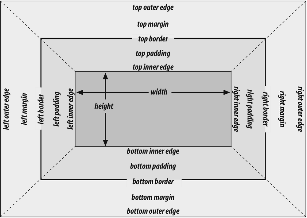
Figure 7-2. The complete box model
In general, thewidthof an element is defined as
the distance from the left inner edge to the right inner edge, and theheightis the distance from the inner top to the inner
bottom. Both of these properties can be applied to an element.
The various widths, heights, padding, and margins combine to determine how a document
is laid out. In most cases, the height and width of
the document are
automatically determined by the browser and are based on the available display region
and other factors. Under CSS, of course, you can assert more direct control over the way
elements are sized and displayed. You can select different effects for horizontal and
vertical layouts, so we'll tackle them separately.
Horizontal formatting is often more complex than you'd think. Part of the
complexity has to do with howwidthaffects the
width of the content area,
not
the entire visible element box.
Consider the following example:
wideness?
This line of code will make the paragraph's content 200 pixels wide. If you gave
the element a background, this would be quite obvious. However, any padding, borders,
or margins you specify are
added
to the width value. Suppose you
do this:
wideness?
The visible element box is now 220 pixels wide since you've added 10 pixels of
padding to the right and left of the content. The margins will now extend another 20
pixels to both sides for an overall element box width of 260 pixels.
Understanding the hidden additions towidthis
critical. Most users think thatwidthrefers to
the width of the visible element box, and that if they declare an element to have
padding, borders, and a width, the value they supply for the width will be the
distance from the outer left border edge to the outer right border edge.
This is not the case in CSS
. Keep this fact firmly in mind to
avoid confusion later.
As of this writing, the Box Model module of CSS includes proposals for ways to
let authors choose whetherwidthrefers to the
content width or the visible box width.
Almost as simple is the rule that says that the sum of the horizontal components
of a block-level element box in the normal flow always equals thewidthof the parent. Take two paragraphs within adivwhose margins have been set to1em. The content width (the value ofwidth) of the paragraph, plus its left and right
padding, borders, and margins, always add up to thewidthof thediv's content area.
Let's say thewidthof thedivis30em, making
the sum total of the content width, padding, borders, and margins of each paragraph30em. In
Figure 7-3
, the "blank" space around the paragraphs is actually their
margins. If thedivhad any padding, there would
be even more blank space, but that isn't the case here. I'll discuss padding soon.
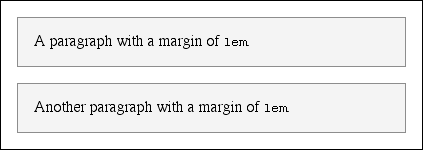
Figure 7-3. Element boxes are as wide as their parent element's width
properties
The "seven properties"
of horizontal formatting are:margin-left,border-left,padding-left,width,padding-right,border-right, andmargin-right.
These properties, which are diagrammed in
Figure 7-4
, relate to the horizontal layout of block-level
boxes.
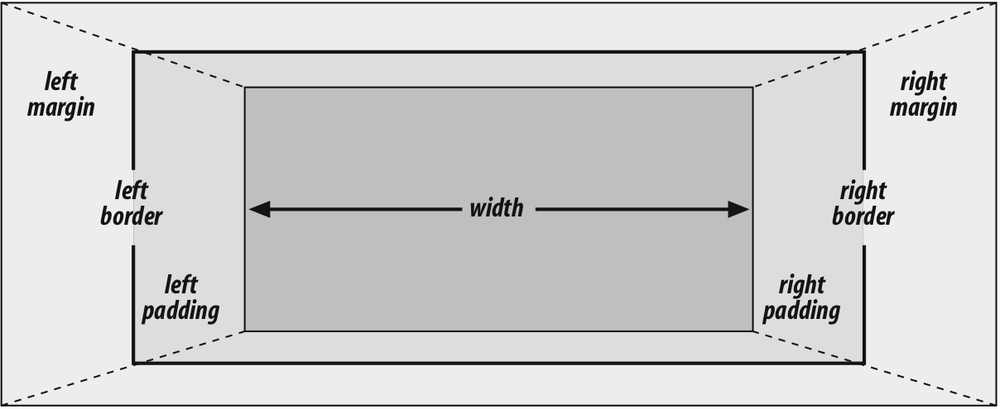
Figure 7-4. The "seven properties" of horizontal formatting
The values of these seven properties must add up to the width of the
element's containing block, which is usually the value ofwidthfor a block element's parent (since block-level elements
nearly always have block-level elements for parents).
Of these seven
properties, only three may be set toauto: thewidthof the element's content and the left
and right margins. The remaining properties must be set either to specific values
or default to a width of zero.
Figure
7-5
shows which parts of the box can take a value ofautoand which cannot.
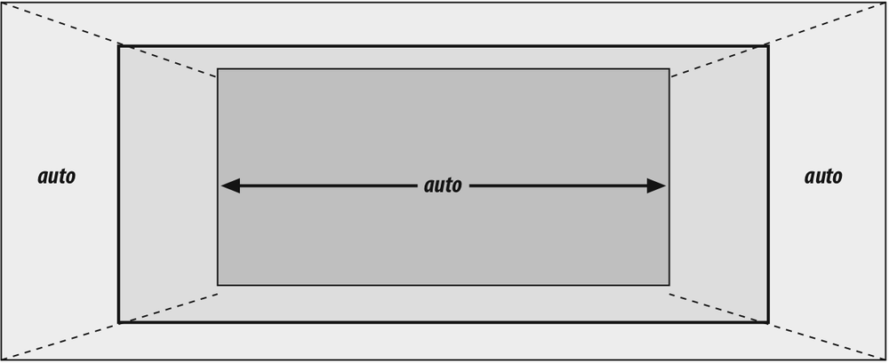
Figure 7-5. Horizontal properties that can be set to auto
widthmust either be set toautoor a nonnegative value of some type. When you do
useautoin horizontal formatting, different
effects can result.
CSS allows browsers to set a minimum value forwidth; this is the value below which a block-level element'swidthcannot drop. The value of this
minimum can vary between browsers, as it is not defined in the
specification.
If you setwidth,margin-left, ormargin-rightto a
value ofauto, and give the remaining two
properties specific values, then the property that is set toautodetermines the length required to make the
element box's width equal to the parent element'swidth. In other words, let's say the sum of the seven properties must
equal 400 pixels, no padding or borders are set, the right margin and width are
set to100px, and the left margin is set toauto. The left margin will be 200 pixels
wide:
p {margin-left: auto; margin-right: 100px;
width: 100px;}   /* 'auto' left margin evaluates to 200px */
In a sense,autocan be used to make up the
difference between everything else and the required total. However, what if all
three of these properties are set to100pxand
none of them are set toauto?
In the case where all three properties are set to something other thanauto—or, in CSS terminology, when these formatting
properties have beenoverconstrained—thenmargin-rightis
always
forced to beauto. This means that if both
margins and the width are set to100px, then
the user agent will reset the right margin toauto. The right margin's width will then be set according to the rule
that oneautovalue "fills in" the distance
needed to make the element's overall width equal that of its containing block.
Figure 7-6
shows the result of the
following markup:
p {margin-left: 100px; margin-right: 100px;
width: 100px;}   /* right margin forced to be 200px */

Figure 7-6. Overriding the margin-right setting
margin-rightis forced to beautoonly for left-to-right languages such as
English. In right-to-left languages, everything is reversed, somargin-leftis forced to beauto, notmargin-right.
If both margins are set explicitly, andwidthis set toauto, then the value
ofwidthwill be set to whatever value is
needed to reach the required total (which is the content width of the parent
element). The results of the following markup are shown in
Figure 7-7
:
p {margin-left: 100px; margin-right: 100px; width: auto;}

Figure 7-7. Automatic width
The case shown in
Figure 7-7
is the
most common since it is equivalent to setting the margins and not declaring
anything for thewidth. The result of the
following markup is exactly the same as that shown in
Figure 7-7
:
p {margin-left: 100px; margin-right: 100px;} /* same as before */
auto
Now let's see what happens
when two of the three properties (width,margin-left, ormargin-right) are set toauto. If
both margins are set toauto, as shown in the
code below, then they are set to equal lengths, thus centering the element within
its parent, as you can see in
Figure
7-8
:
p {width: 100px; margin-left: auto; margin-right: auto;}

Figure 7-8. Setting an explicit width
Setting both margins to equal lengths is the correct way to center
elements, as opposed to usingtext-align.
(text-alignapplies only to the inline
content of a block-level element, so setting an element to have atext-alignofcentershouldn't center it.)
In practice, only browsers released after February 1999 correctly handleautomargin centering, and not all of
them get it completely right. Those that do not handleautomargins correctly behave in inconsistent ways, but the
safest bet is to assume that outdated browsers will reset both margins to
zero.
Another way of sizing elements is to set one of the margins and the
width toauto. The margin set toautois reduced to
zero:
p {margin-left: auto; margin-right: 100px;
width: auto;}  /* left margin evaluates to 0 */
Thewidthis then set to the value necessary to
make the element fill its containing block.
Finally, what happens when
all three properties are set toauto? The
answer is simple: both margins are set to zero, and thewidthis made as wide as possible. This result is the same as the
default situation, when no values are explicitly declared for margins or the
width. In such a case, the margins default to zero and the width defaults toauto.
Note that since horizontal
margins do not collapse, the padding, borders, and margins of a parent element can
affect its children. The effect is indirect in that the margins (and so on) of an
element can induce an offset for child elements. The results of the following
markup are shown in
Figure
7-9
:
div {padding: 30px; background: silver;}
p {margin: 20px; padding: 20; background: white;}
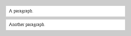
Figure 7-9. Offset is implicit in the parent's margins and padding