CSS: The Definitive Guide, 3rd Edition (19 page)
Read CSS: The Definitive Guide, 3rd Edition Online
Authors: Eric A. Meyer
Tags: #COMPUTERS / Web / Page Design

As we've seen,
CSS allows for the matching of font families, weights, and variants. This is all
accomplished through font matching, which is a vaguely complicated procedure.
Understanding it is important for authors who want to help user agents make good font
selections when displaying their documents. I left it for the end of the chapter because
it's not really necessary to understand how the font properties work, and some readers
will probably want to skip this part and go on to the next chapter. If you're still
interested, here's how font matching works.
The user agent creates, or otherwise accesses, a database of font properties.
This database lists the various CSS properties of all of the fonts to which the
user agent has access. Typically, this will be all fonts installed on the machine,
although there could be others (for example, the user agent could have its own
built-in fonts). If the user agent encounters two identical fonts, it will simply
ignore one of them.The user agent takes apart an element to which font properties have been
applied and constructs a list of font properties necessary for the display of that
element. Based on that list, the user agent makes an initial choice of a font
family to use in displaying the element. If there is a complete match, then the
user agent can use that font. Otherwise, it needs to do a little more work.A font is first matched against the
font-style. The keyworditalicis matched by any font that is labeled as either "italic" or "oblique." If
neither is available, then the match fails.The next match attempt is on
font-variant. Any font that is not labeled "small-caps" is
assumed to benormal. A font can be
matched tosmall-capsby any font that is
labeled as "small-caps," by any font that allows the synthesis of a
small-caps style, or by any font where lowercase letters are replaced by
uppercase letters.The next match is to
font-weight,
which can never fail thanks to the wayfont-weightis handled in CSS (explained earlier in the
chapter).Then,
font-sizeis tackled. This must
be matched within a certain tolerance, but that tolerance is defined by the
user agent. Thus, one user agent might allow matching within a 20 percent
margin of error, whereas another might allow only 10 percent differences
between the size specified and the size that is actually used.
If there was no font match in Step 2, the user agent looks for alternate fonts
within the same font family. If it finds any, then it repeats Step 2 for that
font.Assuming a generic match has been found, but it doesn't contain everything
needed to display a given element—the font is missing the copyright symbol, for
instance—then the user agent goes back to Step 3, which entails a search for
another alternate font and another trip through Step 2.Finally, if no match has been made and all alternate fonts have been tried,
then the user agent selects the default font for the given generic font family and
does the best it can to display the element correctly.
The whole process is long and tedious, but it helps to understand how user agents
pick the fonts they do. For example, you might specify the use of Times or any other
serif font in a document:
body {font-family: Times, serif;}
For each element, the user agent should examine the characters in that element and
determine whether Times can provide characters to match. In most cases, it can do so
with no problem. Assume, however, that a Chinese character has been placed in the middle
of a paragraph. Times has nothing that can match this character, so the user agent has
to work around the character or look for another font that can fulfill the needs of
displaying that element. Of course, any Western font is highly unlikely to contain
Chinese characters, but should one exist (let's call it AsiaTimes), the user agent could
use it in the display of that one element—or simply for the single character. Thus, the
whole paragraph might be displayed using AsiaTimes, or everything in the paragraph might
be in Times except for the single Chinese character, which is displayed in AsiaTimes.
CSS2 introduced a way to exert much greater control over
font matching through an@font-facerule. Since no
web browsers had fully implemented this rule as of spring 2003,@font-facewas removed from CSS2.1. I will not spend
much time on it, as the aspects of this rule are very complicated and could probably
fill a chapter (or a book!) of their own.
There are four ways to arrive at a font to be used in the document. We'll look
briefly at each, since future versions of CSS may use this mechanism, and most SVG
renderers at least partially support the font-face matching described in CSS2. If you
are in a situation where you need to implement@font-face, please refer to the CSS2 specification, or whatever the latest
version of CSS might be (such as the CSS3 Web Fonts module); the following
descriptions are incomplete at best.
To match the font name, the user agent uses an available font that has the same
family name as the requested font. The font's appearance and metrics might not be
the same. This is the method described earlier in this section.
In this case, the user agent uses an available font that is the closest match
in appearance to the requested font. The two may not match exactly, but they
should be as close as possible.
The information used to match the two fonts includes the kind of font (text or
symbol), nature of serifs, weight, cap height, x-height, ascent, descent, slant,
and so on. For example, an author could request that a certain font be as close as
possible to a certain slant by writing:
@font-face {font-style: normal; font-family: "Times"; slope: -5;}
It would then be up to the user agent to find a serif normal (upright) font
with a slope as close to five degrees to the right as possible, if Times does not
fit the bill. There are a great many font aspects described in CSS2, all of which
can be used to drive the matching process in a user agent that supports
them.
It's also possible that a user agent would choose to actually generate, on the
fly, a font whose appearance and metrics match the description given in the@font-facerule. CSS2 has this to say about
the process:
In this case, the user agent creates a font that is not only a close match
in appearance, but also matches the metrics of the requested font. The
synthesizing information includes the matching information and typically
requires more accurate values for the parameters than are used for some
matching schemes. In particular, synthesis requires accurate width metrics and
character to glyph substitution and position information if all the layout
characteristics of the specified font are to be preserved.
If this makes sense to you, then you probably don't need my help to explain it.
If not, you probably won't ever need to worry about it.
In this
approach, the user agent may download a remote font for use in the document. To
declare a font for downloading,
you
might write something like this:
@font-face {font-family: "Scarborough Fair";
src: url(http://www.example.com/fonts/ps/scarborough.ps);}
You could then use that font throughout the document.
Even in a user agent that permits font downloading, it may take some time to
retrieve the font file (such files can be quite large), which would delay the
rendering of the document or at least delay the final rendering.
Although authors cannot count on a specific font being used in a document, they can
very easily specify generic font families to be used. This particular behavior is very
well supported, since any user agent that didn't let authors (or even readers) assign
fonts would quickly find itself out of favor.
As for the other areas of font manipulation, support varies. Changing the size of
fonts usually works well, but 20th-century implementations ranged from frustratingly
simplistic to very nearly correct in this area. The frustration for authors is usually
not the way in which font sizing is supported, but rather, in how a unit they want to
use (points) can yield very different results in different media, or even in different
operating systems and user agents. The dangers of using points are many, and using
length units for web design is generally not a good idea. Percentages, em units, and ex
units are usually best for changing font sizes, since these scale very well in all
common display environments.
The other frustration is likely the continued lack of a mechanism to specify fonts
for downloading and use in a document. This means that authors are still dependent on
the fonts available to the user, and therefore, they cannot predict what appearance that
text will take.
Speaking of styling text, there are ways to do it that don't involve fonts, which the
next chapter will address.
Sure, a lot of web design involves picking the right colors and getting the coolest look
for your pages, but when it comes right down to it, you probably spend more of your time
worrying about where text
will go and how it will look.
Such concerns gave rise to HTML tags such as
you some measure of control over the appearance and placement of text.
Because text is so important, there are many CSS properties that affect it in one way or
another. What is the difference between text and fonts?
Simply, text
is the content, and fonts are used to display that content. Using text properties, you can
affect the position of text in relation to the rest of the line, superscript it, underline
it, and change the capitalization. You can even simulate, to a limited degree, the use of a
typewriter's Tab key.
Let's start
with a discussion of how you can affect the horizontal positioning of text within a
line. Think of these basic actions as the same types of steps you might take to create a
newsletter or write a report.
Indenting the first line of a
paragraph on a web page is one of the most sought-after text-formatting effects.
(Eliminating the blank line between paragraphs, which is discussed in
Chapter 7
, is a close second.) Some sites create
the illusion of indented text by placing a small transparent image before the first
letter in a paragraph, which shoves over the text. Other sites use the utterly
nonstandardSPACERtag. Thanks to CSS, there's a
better way to indent text, calledtext-indent.
Usingtext-indent, the first line of any
element can be indented by a given length—even if that length is negative. The most
common use for this property is, of course, to indent the first line of paragraphs:
p {text-indent: 3em;}
text-indent
- Values:
| | inherit- Initial value:
0- Applies to:
Block-level elements
- Inherited:
Yes
- Percentages:
Refer to the width of the containing block
- Computed value:
For percentage values, as specified; for length values, the absolute
length
This rule will cause the first line of any paragraph to be indented three ems, as
shown in
Figure 6-1
.
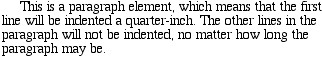
Figure 6-1. Text indenting
In general, you can applytext-indentto any
block-level element. You can't apply it to inline elements or on replaced elements
such as images. However, if you have an image within the first line of a block-level
element, like a paragraph, it will be shifted over with the rest of the text in the
line.
If you want to "indent" the first line of an inline element, you can create the
effect with left padding or margin.
You can also set negative values fortext-indent, a technique that leads to a number of interesting effects.
The most common use is a "hanging indent," where the first line hangs out to the left
of the rest of the element:
p {text-indent: -4em;}
Be careful when setting a negative value fortext-indent: the first three words ("This is a") may be chopped off by the
left edge of the browser window. To avoid display problems, I recommend you use a
margin or some padding to accommodate the negative indentation:
p {text-indent: -4em; padding-left: 4em;}
Negative indents can, however, be used to your advantage. Consider the following
example, demonstrated in
Figure 6-2
, which
adds a floated image to the mix:
p.hang {text-indent: -25px;}

 This paragraph has a negatively indented first
line, which overlaps the floated image that precedes the text.  Subsequent
lines do not overlap the image, since they are not indented in any way.
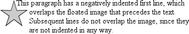
Figure 6-2. A floated image and negative text indenting
A variety of interesting designs can be achieved using this simple technique.
Any unit of length, including percentage values, may be used withtext-indent. In the following case, the percentage
refers to the width of the parent element of the element being indented. In other
words, if you set the indent value to10%, the
first line of an affected element will be indented by 10 percent of its parent
element's width, as shown in
Figure 6-3
:
div {width: 400px;}
p {text-indent: 10%;}

This paragraph is contained inside a DIV, which is 400px wide, so the
first line of the paragraph is indented 40px (400 * 10% = 40).  This is
because percentages are computed with respect to the width of the element.
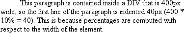
Figure 6-3. Text indenting with percentages
Note that this indentation only applies to the first line of an element, even if
you insert line breaks. The interesting part abouttext-indentis that because it's inherited, it can have unexpected
effects. For example, consider the following markup, which is illustrated in
Figure 6-4
:
div#outer {width: 500px;}
div#inner {text-indent: 10%;}
p {width: 200px;}


This first line of the DIV is indented by 50 pixels.

This paragraph is 200px wide, and the first line of the paragraph
is indented 50px.  This is because computed values for 'text-indent'
are inherited, instead of the declared values.
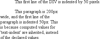
Figure 6-4. Inherited text indenting
In versions of CSS prior to 2.1,text-indentalways inherited the computed value, not the declared value.
Even more basic thantext-indentis the propertytext-align, which affects how the lines of text
in an element are
aligned with respect to one another. The first three values are pretty
straightforward, but the fourth and fifth have a few complexities.
text-align
- CSS2.1 values:
left|center|right|justify|inherit- CSS2 values:
left|center|right|justify|| inherit- Initial value:
User agent-specific; may also depend on writing direction
- Applies to:
Block-level elements
- Inherited:
Yes
- Computed value:
As specified
- Note:
CSS2 included a
value that was dropped from CSS2.1 due
to a lack of implementation
The quickest way to understand how these values work is to examine
Figure 6-5
.
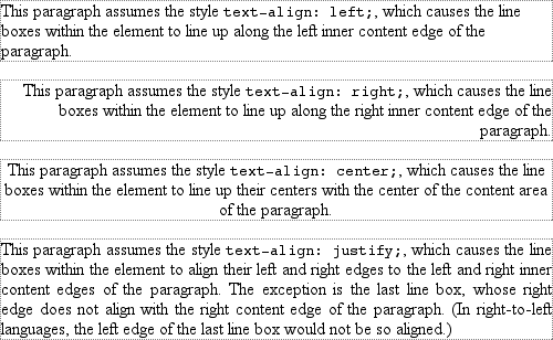
Figure 6-5. Behaviors of the
text-align property
Obviously, the valuesleft,right, andcentercause the text within elements to be aligned exactly as described. Becausetext-alignapplies only to block-level elements, such as
paragraphs, there's no way to center an anchor within its line without aligning the
rest of the line (nor would you want to, since that would likely cause text overlap).
For Western languages, which are read from left to right, the default value oftext-alignisleft. The text aligns on the left margin and has a ragged right margin
(otherwise known as "left-to-right" text). Languages such as Hebrew and Arabic
default torightsince they are read right to
left. As expected,centercauses each line of text
to be centered within the element.
Centering block-level or table elements is accomplished by properly setting the
left and right margins on those elements. See
Chapter 7
for details.
Although you may be tempted to believe thattext-align:centeris the same as the
different.
but also centered whole elements, such as tables.text-aligndoes not control the alignment of elements, only their inline
content.
Figure 6-5
illustrates this
clearly. The actual elements are not shifted from one side to the other. Only the
text within them is affected.
One of the more pernicious bugs in IE/Win up through IE6 is that it actually
does treattext-align: centeras if it were the
as well as text. This does not happen in standards mode in IE6 and later, but it
persists in IE5.x and earlier.
The last horizontal alignment property isjustify, which raises some issues of its own. In justified
text,
both ends of a line of text are placed at the inner edge of the parent element, as
Figure 6-6
shows. Then, the spacing
between words and letters is adjusted so that each line is precisely the same length.
Justified text is common in the print world (for example, in this book), but under
CSS, a few extra considerations come into play.
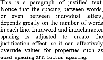
Figure 6-6. Justified text
The user agent—not CSS—determines how justified text should be stretched to fill
the space between the left and right edges of the parent. Some browsers, for example,
might add extra space only between words, while others might distribute the extra
space between letters (although the CSS specification specifically states that "user
agents may not further increase or decrease the inter-character space" if the
propertyletter-spacinghas been assigned a length
value). Other user agents may reduce space on some lines, thus mashing the text
together a bit more than usual. All of these possibilities will affect the appearance
of an element, and may even change its height, depending on how many lines of text
result from the user agent's justification choices.
CSS also doesn't specify how hyphenation should be handled.
[
ast
]
Most justified text uses hyphenation to break long words across two
lines, thus reducing the space between words and improving the appearance of lines.
However, since CSS defines no hyphenation behavior, user agents are unlikely to
perform any automatic hyphenation. As a result, justified text looks much less
attractive under CSS than it does in print, especially when elements become so narrow
that only a few words can fit on each line. You can still use narrow design elements,
of course, but be aware of the drawbacks.