CSS: The Definitive Guide, 3rd Edition (16 page)
Read CSS: The Definitive Guide, 3rd Edition Online
Authors: Eric A. Meyer
Tags: #COMPUTERS / Web / Page Design

As you might expect,lighterworks in just the same way, except it causes the user agent to
move down the weight scale instead of up. With a quick modification of the previous
example, you can see this very clearly:
/*   assume only two faces for this example: 'Regular' and 'Bold'   */
p {font-weight: 900;}   /* as bold as possible, which will look 'bold' */
p span {font-weight: 700;}   /* this will also be bold */
strong {font-weight: lighter;}   /* lighter than its parent */
b {font-weight: lighter;}   /* lighter still */

900  700  400  300  200
.


bold  bold  regular  regular
 regular .
Ignoring the fact that this would be entirely counterintuitive, what you see in
Figure 5-8
is that the main paragraph
text has a weight of900. When thestrongtext is set to belighter, it evaluates to the next-lighter face, which is the regular
face, or400(the same asnormal) on the numeric scale. The next step down is to300, which is the same asnormalsince no lighter faces exist. From there, the user agent can
reduce the weight only one numeric step at a time until it reaches100(which it doesn't do in the example). The second
paragraph shows which text will be bold and which will be regular.
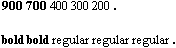
Figure 5-8. Making text lighter
The methods for determining font size are both very
familiar and very different.
font-size
- Values:
xx-small|x-small|small|medium|large|x-large|xx-large|smaller|larger|| | inherit- Initial value:
medium- Applies to:
All elements
- Inherited:
Yes
- Percentages:
Calculated with respect to the parent element's font size
- Computed value:
An absolute length
In a fashion very similar to thefont-weightkeywordsbolderandlighter, the propertyfont-sizehas
relative-size keywords calledlargerandsmaller. Much like what we saw with relative font weights,
these keywords cause the computed value offont-sizeto move up and down a scale of size values, which you'll need to understand before you
can explorelargerandsmaller. First, though, we need to examine how fonts are sized in the
first place.
In fact, the actual relation of thefont-sizeproperty to what you see rendered is determined by the font's designer. This
relationship is set as an
em square
(some call it an
em box
)
within the font itself. This em square (and thus the font
size) doesn't have to refer to any boundaries established by the characters in a font.
Instead, it refers to the distance between baselines when the font is set without any
extra leading (line-heightin CSS). It is quite
possible for fonts to have characters that are taller than the default distance between
baselines. For that matter, a font might be defined such that all of its characters are
smaller than its em square, as many fonts do. Some hypothetical examples are shown in
Figure 5-9
.
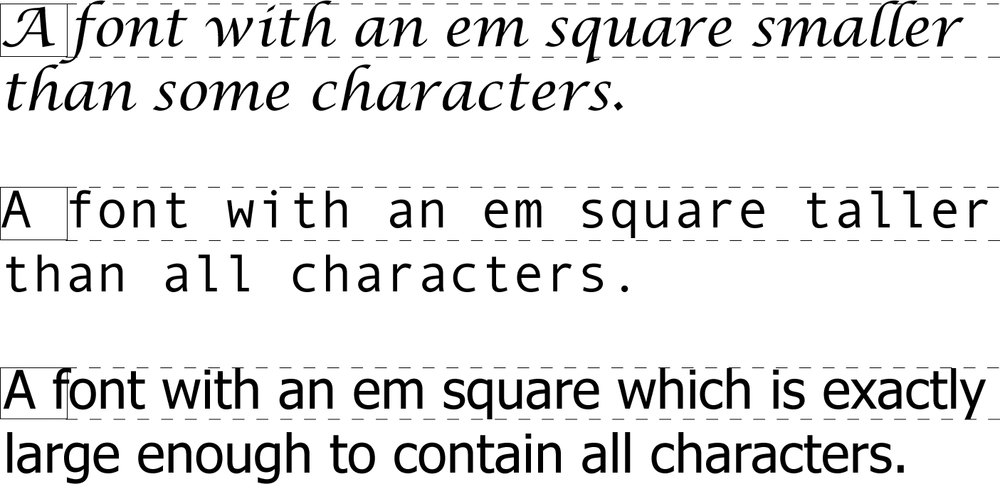
Figure 5-9. Font characters and em squares
Thus, the effect offont-sizeis to provide a size
for the em box of a given font. This does not guarantee that any of the actual displayed
characters will be this size.
Having established all of that, we turn now to the
absolute-size keywords. There are seven absolute-size values forfont-size:xx-small,x-small,small,medium,large,x-large, andxx-large. These are not defined precisely, but are
relative to each other, as
Figure 5-10
demonstrates:
p.one {font-size: xx-small;}
p.two {font-size: x-small;}
p.three {font-size: small;}
p.four {font-size: medium;}
p.five {font-size: large;}
p.six {font-size: x-large;}
p.seven {font-size: xx-large;}
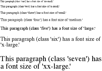
Figure 5-10. Absolute font sizes
According to the CSS1 specification, the difference (or
scaling
factor
)
between one absolute size and the next should be about
1.5 going up the ladder, or 0.66 going down. Thus, ifmediumis the same as10px, thenlargeshould be the same as15px. On the other hand, the scaling factor does not
have to be 1.5; not only might it be different for different user agents, but it was
changed to a factor somewhere between 1.0 and 1.2 in CSS2.
Working from the assumption thatmediumequals16px, for different scaling factors, we get the
absolute sizes shown in
Table 5-3
. (The
following values are approximations, of course.)
Table 5-3. Scaling factors translated to pixels
Keyword | Scaling: 1.5 | Scaling: 1.2 |
|---|---|---|
|
|
|
|
|
|
|
|
|
|
|
|
|
|
|
|
|
|
|
|
|
Further complicating the situation is the fact that different user agents have
assigned the "default" font size to different absolute keywords. Take the Version 4
browsers as an example: Navigator 4 makesmediumthe same size as unstyled text, whereas Internet Explorer 4 assumes thatsmalltext is equivalent in size to unstyled text.
Despite the fact that the default value forfont-styleis supposed to bemedium,
IE4's behavior may be wrong, but not quite so wrong as it might first
appear.
[
*
]
Fortunately, IE6 fixed the problem, at least when the browser is in
standards mode, and treatsmediumas the
default.
Comparatively speaking, the keywordslargerandsmallerare simple: they cause the size of an element to be shifted up or down the
absolute-size scale, relative to their parent element, using the same scaling factor
employed to calculate absolute sizes. In other words, if the browser used a scaling
factor of 1.2 for absolute sizes, then it should use the same factor when applying
relative-size keywords:
p {font-size: medium;}
strong, em {font-size: larger;}
This paragraph element contains a strong-emphasis element
which itself contains an emphasis element that also contains
a strong element.
 medium large  x-large
xx-large
Unlike the relative values for weight, the relative-size values are not
necessarily constrained to the limits of the absolute-size range. Thus, a font's size
can be pushed beyond the sizes forxx-smallandxx-large. For example:
h1 {font-size: xx-large;}
em {font-size: larger;}
A Heading with Emphasis added
This paragraph has some emphasis as well.
As you can see in
Figure 5-11
, the
emphasized text in theh1element is slightly
larger thanxx-large. The amount of scaling is
left up to the user agent, with the scaling factor of 1.2 being preferred. Theemtext in the paragraph, of course, is shifted
one slot up the absolute-size scale (large).
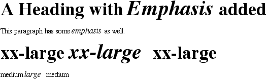
Figure 5-11. Relative font sizing at the edges of the absolute sizes
User agents are not required to increase or decrease font size beyond the
limits of the absolute-size keywords.
In a way, percentage values are very similar to the
relative-size keywords. A percentage value is always computed in terms of whatever
size is inherited from an element's parent. Percentages, unlike the relative-size
keywords, permit much finer control over the computed font size. Consider the
following example, illustrated in
Figure
5-12
:
body {font-size: 15px;}
p {font-size: 12px;}
em {font-size: 120%;}
strong {font-size: 135%;}
small, .fnote {font-size: 70%;}

This paragraph contains both emphasis and strong
emphasis, both of which are larger than their parent element.
The small text, on the other hand, is smaller by a quarter.
This is a 'footnote' and is smaller than regular text.
 12px  14.4px  12px  16.2px   12px
 9px  12px
 10.5px
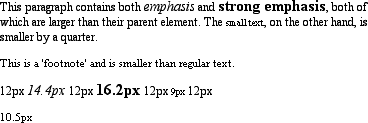
Figure 5-12. Throwing percentages into the mix
In this example, the exact pixel size values are shown. In practice, a web browser
would very likely round the values off to the nearest whole-number pixel, such as14px, although advanced user agents may
approximate fractional pixels through anti-aliasing or when printing the document.
For otherfont-sizevalues, the browser may (or
may not) preserve fractions.
Incidentally, CSS defines the length valueemto be equivalent to percentage values, in the sense that1emis the same as100%when sizing
fonts. Thus, the following would yield identical results (assuming both paragraphs
have the same parent element):
p.one {font-size: 166%;}
p.two {font-size: 1.6em;}
When usingemmeasurements, the same principles
apply as with percentages, such as the inheritance of computed sizes, and so
forth.