Presentation Zen: Simple Ideas on Presentation Design and Delivery, 2nd Edition (Ira Katz's Library) (21 page)
Authors: Garr Reynolds

BELOW
The final slide design used in the presentation is shown on the left. The remaining slides in the deck were then redesigned using Japanese stock images to give the entire presentation a consistent visual theme that supported the presenter’s words.

All the slides on this page use images that bleed off the edge, filling the entire screen, and the text and images work in harmony. The masking tape and paper note shown below is a JPEG image from iStockphoto that provides an interesting effect and prevents the text from getting lost in the background. This element provides good contrast with the text and adds depth to the overall visual. The slight angle of the note and text add interest without being distracting.
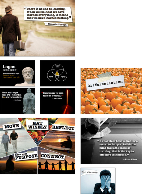
Slide images on this page from iStockphoto.com.
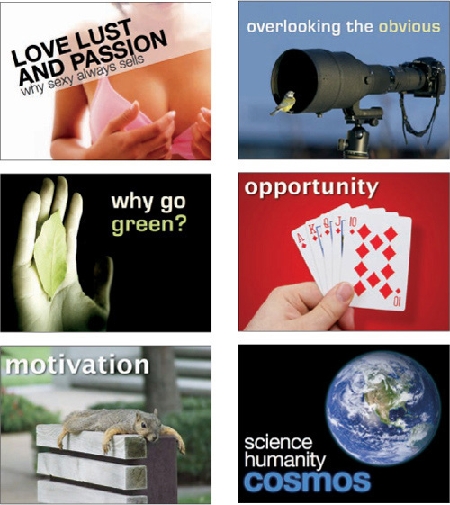
The slides on this page are from the portfolio of Jeff Brenman, the creator of Apollo Ideas and the winner of SlideShare’s “World’s Best Presentation Contest” in 2007. (You can see the slide deck that won him first place in the next chapter.) Jeff has a talent for combining images and text in a way that is fresh and effective for augmenting the presenter’s messages.
Where Can You Get Good Images?
Getty Images may have the best quality and the greatest selection of images for presentations. But what if you cannot afford to make a slide presentation that costs hundreds or thousands of dollars in stock image fees? In that case, low-cost, royalty-free “micro-stock” images are a good alternative. The site I recommend most often is iStockphoto.com (the source of most of the images used in this book). The iStockphoto library is incredibly easy to use; after performing a search, you can just roll over thumbnails for a larger view without having to open another page.

I do not suggest that you limit your image searches to iStockphoto.com. I subscribe to other photo sites and use photos I shoot myself more and more. But when it comes to great micro-stock, iStockphoto is the best. They have millions of images from which to choose and add thousands of images every week. The site just keeps getting better and better. Plus, iStockphoto has a “free image of the week” so you may want to check back from time to time to see what’s new—and free. At the back of this book, you will find a special code, just for you, that entitles you to 10 free photos on the iStockphoto website. So take your free credits and download a few images from iStockphoto.com.
My personal favorite photo site
• iStockphoto (
www.istockphoto.com
)
Other places to get low-cost images
• Dreams Time (
www.dreamstime.com
)
• Fotolia (
www.fotolia.com
)
• Japanese Streets (
www.japanesestreets.com
)
• Shutter Stock (
www.shutterstock.com
)
A few sites that offer free images
• Morgue File (
www.morguefile.com
)
• Flickr Creative Commons Pool (
www.flickr.com/creativecommons
)
• Everystockphoto search engine (
www.everystockphoto.com
)
• NASA Image Exchange (
http://nix.nasa.gov
); these images are generally not copyrighted, but read the copyright for each image to be sure
While long bullet points are not very effective visually, displaying quotations in slides can be a very powerful technique. Depending on the presentation, I often use quite a few quotes from various fields to support my points. The trick is not to use them too much and to make sure they are short and legible.
When I first saw Tom Peters give a live presentation a few years ago while I was working in Silicon Valley, I was happy to see that he used a good deal of quotes from various experts, authors, and industry leaders. Using quotes in his presentation visuals is a big deal for Tom. In fact, it is No. 18 on his “Presentation Excellence 56” article on his website.
To explain why he uses so many quotes, Tom says:
“My conclusions are much more credible when I back them up with Great Sources. I say pretty radical stuff. I say ‘Get radical!’ That’s one thing. But then I show a quote from Jack Welch, who, after all, ran a $150 billion company (I didn’t): ‘You can’t behave in a calm, rational manner; you’ve got to be out there on the lunatic fringe.’ Suddenly my radicalism is ‘certified’ by a ‘real operator.’ Also, I find that people like to get beyond the spoken word, and see a SIMPLE reminder of what I’m saying.”
Quotes can indeed add credibility to your story. Weave a simple quote into your narrative to support your point, or as a springboard from which you can launch your next topic. Remember, quotes should be short, in most cases, since it can become quite tedious to have a presenter read a paragraph from a screen.
I almost always use quotes that are straight out of material I have read or from personal interviews. My books, for example, are filled with sticky notes and pages full of my comments and highlighter marks. I sketch a star and write a note to myself next to great passages for future reference. It’s kind of messy, but it works for me when I put presentations together.
When I use a quote, I sometimes add a graphic element that targets people’s emotions, creates more visual interest, and enhances the effect of the slide. But rather than using a small photo or other element, consider placing the text within a larger photo. To do this, you will want to use an image at least as large as your slide dimensions (800x600, for example) for your background. Look for an image that supports the point you are making with the quotation. The image should have plenty of empty space so the text fits comfortably with good contrast.
This page shows two slides that display a quotation in a typical manner. On the opposite page, you’ll see the same quote displayed
within
the image rather than simply next to a smaller version of the image. Notice the difference in the visual impact of both the quote and image.
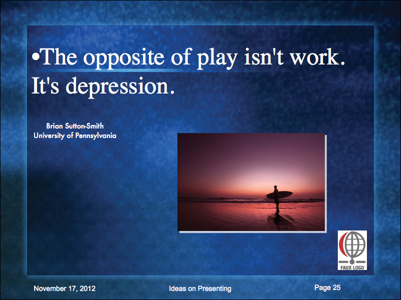
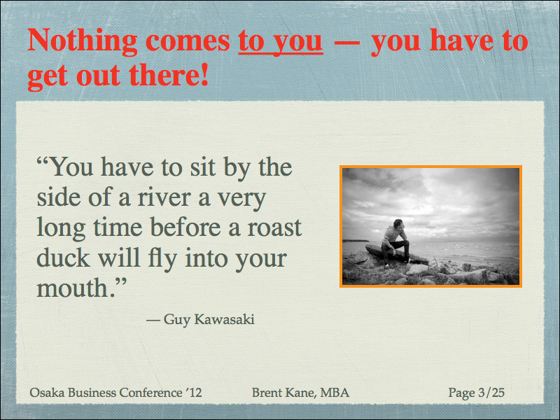
(Photos in these slides from iStockphoto.com.)


