Read Maphead: Charting the Wide, Weird World of Geography Wonks Online
Authors: Ken Jennings
Tags: #General, #Social Science, #Technology & Engineering, #Reference, #Atlases, #Cartography, #Human Geography, #Atlases & Gazetteers, #Trivia
Maphead: Charting the Wide, Weird World of Geography Wonks (34 page)

Should we be worried about the fact that a single company, however awesome its rotating holiday logos and employee snacks, has this much authoritative influence on the world’s maps? At the dawn of the Internet mapping era, some geographers fretted about a coming “
McDonaldization
” of cartography, in which maps would become fast food: cheap and omnipresent but driven by distant, unaccountable corporations concerned more with ad revenue than quality. In reality, far from skimping on quality, Google has continued to add blow-your-mind features (3-D underwater terrain! Street View–level mapping of ski trails!
*
Interactive global warming models!) to its maps
on a seemingly weekly basis. But Google Earth’s unprecedented detail and popularity have led to more serious concerns about privacy and security. After all, any map of Mumbai that can help tourists find their hotel can also help terrorists attack that hotel.
There’s not much that Google can do about how its maps are used, but at least their very popularity provides a safeguard against the map-maker itself, whether it’s Google or Microsoft or Yahoo!, trying to promote any sinister agenda with its maps. After all, every change they make to their data happens in front of millions of eyeballs. When mistakes are introduced (or even, if you prefer, when shady cartographic kowtowing takes place), locals notice and bloggers squawk and problems get fixed. In 2009, towns in the Indian border state of Arunachal Pradesh were
briefly given Chinese names
on Google Maps; when horrified Indians reacted, Google admitted its mistake the same day and reverted to the Hindi names.
Brian McClendon calls Google’s Borgesian dream of a centimeter-per-pixel real-time world map “the end of resolution,” and the phrase shocks me a little with its finality, because to me it implies the end of all mapmaking, the end of all discovery. It’s one of the central paradoxes of maps: they make the world larger by showing us new vistas, but then they order and bean-count those new vistas into submission, and the world gets a little smaller as well. If Google Earth becomes the perfect map, the map of everything, why ever draw another one?
McClendon disagrees; he argues that virtual globes have actually led to a renaissance of discovery. After all, much of the aerial imagery that Google posts, old and new, has never been seen by human eyeballs before, and he’s putting it in front of millions of curious armchair travelers. “There was so much of it that it was never visually inspected down to the bottom pixels. And sometimes there are things there at the bottom that were never known before.”
In 1868, the element helium was discovered, revolutionizing children’s birthday parties forever. Though Earth has large reserves of helium underground—some U.S. natural gas deposits are as much as 7 percent helium—the scientists who first discovered evidence of
helium found it not under their feet but through spectroscopic analysis from one hundred million miles away. Helium was discovered on the Sun fifteen years before we found it here on Earth.
*
In much the same way, scientists and amateurs alike are nowadays discovering Earth’s hidden secrets on Google Earth before they turn up on our real home planet.
Meteor-impact craters
in Western Australia,
a Roman villa in Parma
, the ruins of
a lost Amazonian city
that may have inspired the legends of El Dorado,
a remote forest in Mozambique
where hundreds of new species of plants and animals live—all these things were never on any map until they were spotted from space by Google Earth surfers.
†
In 2008, a team of German scientists studied Google images of more than
eight thousand grazing cattle
and three thousand wild deer in pastures all over the world. The vast majority, they were surprised to see, graze standing north to south, aligned to the Earth’s poles. It was the first evidence that large mammals can sense and use the Earth’s magnetic fields the way that migrating birds and turtles do, and it had been right under our noses all the time. People have watched livestock graze for millennia, but before Google Earth, nobody had ever noticed that they were all facing the same way. “I think you’ll end up with both scientific and amateur studies solving problems that were intractable ten years ago,” says McClendon. “I wouldn’t be surprised if we discover
more
in the next twenty years than we ever did.”
But the Google Earth team believes its software has changed maps in a more fundamental way than just adding detail. Because its globe looks like a real place, it blurs the distinction between map and territory in a way that would make Borges or Eco dizzy. When you see something on Google Earth, says McClendon, “You don’t debate it.
You don’t say, ‘Is this somebody’s representation? Did they draw this picture?’ It’s not somebody’s version of reality. It
is
reality.”
Map deconstructionists would have a field day with that claim! The trend in geography over the last thirty years has been to consider maps
not
as reality but as fallible narratives, each with its own quirks and agendas. This is a healthy kind of skepticism; maps work so well, generally, in getting us where we’re going that we don’t think to question the thousands of assumptions and biases that undergird them. Even a seemingly unimpeachable world map on a classroom wall isn’t immune. Why should the top of the map be north, rather than south? Why is America arbitrarily at the center? Why is it easier to see political features than physical ones? Why include this city but not that one? Why label Taiwan as a country but not Palestine, or vice versa?
Mapmakers may make all these choices with the best of intentions, but the result is still, even if unconsciously, to reinforce some particular view of the world. I distinctly remember
not
believing, when my parents first told me, that Brazil was actually five times the size of Alaska. On the map of my bedroom wall, I could see
with my own eyes
that they were virtually twins! That’s because my map was drawn according to the venerable Mercator Projection. In 1569, the Flemish cartographer Gerardus Mercator drew a world map using a cylindrical projection that would neatly render a rhumb line—a ship’s course in a constant direction, like west or north-northeast—as a straight line.
*
The problem is that this kind of projection inflates the polar regions way out of proportion—in fact, on such a map, the poles can never even be drawn, because they’re an
infinite
distance from the Equator.
†
Mercator maps were still used everywhere when I was growing up—classrooms, nightly newscasts, stamps, government briefing rooms—and so my generation grew up thinking that Greenland was bigger than Africa, since
Greenland is oversized fourteenfold
on Mercator maps.
Of course, all map projections have to fudge somewhere, whether on area or on direction. Imagine trying to flatten an orange peel onto a flat surface, and as it tears and scrunches, you’ll see the problem: something’s got to give.
*
But the Mercator map stayed so popular in the West for so long, at least in part, because of how helpful its particular distortions were. Most obviously, it makes North America and Europe seem disproportionately important, while marginalizing much of the developing world. As a result, a 1996 study found that when students all over the world were asked to draw the contours of the continents,
nearly all made Europe too big
and Africa too small. Even when the test was given in Africa, the results were the same. And during the Cold War, we liked the sprawling, menacing Soviet Union that Mercator provided us, with the rest of Asia dangling halfheartedly beneath it.
As a high school junior, I walked into my Spanish class on the first day of school to see, replacing the familiar Mercator map on the teacher’s wall, an equal-area Peters Projection map. This controversial map was unveiled with much fanfare in 1973 by the German historian Arno Peters, who told the media it was a revolutionary attack on the stodgy Mercator.
†
In fact, it was a simple retread of the 1855 Gall Orthographic Projection, and many cartographers disliked its north-south distortion of the equatorial regions, which stretched shape in order to properly represent area. The geographer Arthur Robinson compared Peters’s continents to “
wet, ragged long winter underwear
hung out to dry on the Arctic Circle.” But if Peters’s goal was to shock, it worked on me. I stared at the map endlessly, marveling at the big,
muscular Africa dominating its center and the anemic Russia and Alaska hugging the North Pole. I’d been
told
that the maps I knew were lying to me about the globe, but it was quite another thing to see the evidence with my own eyes.
You can trace the decline of the Mercator Projection by looking at the set changes on
Saturday Night Live
’s “Weekend Update” faux newscast. The world outline map behind the newscasters was an acromegalic Mercator back in the Dan Aykroyd/Jane Curtin era, but under Dennis Miller it was replaced with a less absurd, modified Mercator called the Miller (no relation) cylindrical projection. Today the map behind Seth Meyers is an equirectangular projection called the
plate carrée,
useless for oceangoing but popular among computer mappers. But the Mercator map of our childhoods, though less visible today, is far from extinct. For example, use Google to bring up a map of your street or your city. Now zoom all the way out—yup,
all
the way, so the entire planet is on the map. See how Antarctica now looks bigger than every other continent put together? That’s right: Google Maps still uses a Mercator Projection.
*
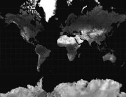
The Mercator and Gall-Peters: Greenland’s favorite and least favorite map projections, respectively
So it’s easy to quibble with McClendon’s assertion that everything on Google’s maps is unimpeachably
true
in some epistemological sense.
†
In some ways, it’s as full of judgment calls and compromises as any other map. What he really means is that Google Earth is more convincing, more compelling, than a paper map and that this immersiveness gives it a unique ability to change the way we see the world.
“You trust that this picture is truly of this place. And when people see that, they get an emotional reaction. They feel like they’re really visiting another place, and that’s something no map has ever given before. You look at a traffic jam in Baghdad, and you realize, those guys are not much different than we are. How would it feel if
we
were getting bombed and we were losing buildings? That’s what’s happening to them right now. Same thing in Tehran. Here are these people that have a very Western city in many regards, but we see them as old-school Islamists that must be living in tents. But they’re not. Tehran looks very European from the air, very densely populated.”
“It sounds like you’re almost saying that Google Earth is an ideological tool to bring peace to
real
Earth,” I tell McClendon.
He doesn’t hesitate for a minute. “Yes. I say that, and I believe that. If it brings people that we’re purportedly in conflict with close enough to us, then it’s very hard to stay in conflict. If everybody had that—if North Koreans had that and could see what it’s like in L.A. or small-town Middle America—they might not feel so isolated. But they have no access to any information.”
*
It’s a particularly Google approach to utopia: the notion that information
isn’t
neutral, that on balance it’s inherently good because of its power to help people understand one another.
At the dawn of the World Wide Web, much was made of the fact that this new “Internet” was a place without place—a geography-less void that was, like God, everywhere and nowhere. Cyberspace was
analogous
in some ways to space, but it would be navigated virtually, with no relation to our real three-dimensional world at all. There were two problems with this idea. First, it led to crappy “virtual reality” movies like
Virtuosity
and
The Lawnmower Man
. And second, in the long run, it turned out to be totally wrong. Fifteen years later, the hottest trend in information is “geotagging”: ensuring that every bit of data on the Internet—every tweet, every YouTube video, every photo on Flickr—is coded with locational metadata tying it to a point on Earth.