HTML The Definitive Guide (94 page)
Read HTML The Definitive Guide Online
Authors: Chuck Musciano Bill Kennedy

Internet Explorer 4 does not support the blink value; Netscape does not support the overline value.
9.3.5.5 The text-indent property
Although less common today, it still is standard practice to indent the first line of a paragraph of text.[
4] And
some text blocks, such as definitions, typically "out-dent" the first line, creating what is called a
hanging
indent
.
[4] But not, obviously, in this book.
The CSS text-indent property lets you apply these features to any block tag and thereby control the amount of indentation of the first line of the block. Use length and percentage values; negative values create the hanging indent. Percentage values compute the indentation as a percentage of the parent element's width.
The default value is zero.
To indent all the paragraphs in your document, for example: P {text-indent: 3em}
The length unit em scales the indent as the font of the paragraph changes in size on different browsers.
Hanging indents are a bit trickier because you have to watch out for the element borders. Negative indentation does not shift the left margin of the text; it simply shifts the first line of the element left, possibly into the margin, border, or padding of the parent element. For this reason, hanging indents only work as expected if you also shift the left margin of the element to the right by an amount equal to or greater than the size of the hanging indent. For example: P.wrong {text-indent: -3em}
P.hang {text-indent: -3em; margin-left: 3em}
P.large {text-indent: -3em; margin-left: 6em}
creates three paragraph styles. The first creates a hanging indent that extends into the left margin. The second creates a conventional hanging indent. The third creates a paragraph whose body is indented more than the hanging indent. All three styles are shown in use in
Figure 9.3.
Figure 9.3: The effects of text-indent and margin-left on a paragraph
9.3.5.6 The text-transform property
The text-transform property changes the case for all the text within a tag. Valid values for this property are capitalize, uppercase, lowercase, and none, which is the default. The value capitalize ensures that the first letter of every word gets capitalized, while uppercase and lowercase affect every letter in the text.
The actual capitalization rules used by the browser depend upon the character encoding and language used by the browser.
In Netscape, this property is not inherited by child elements, as prescribed by the CSS standard.
9.3.5.7 The vertical-align property
The vertical-align property controls the relative position of an element with respect to the line containing the element. Valid values for this property include: baseline
Align the baseline of the element with the baseline of the containing element.
middle
Align the middle of the element with the middle (usually the x-height) of the containing element.
sub
Subscript the element.
super
Superscript the element.
texttop
Align the top of the element with the top of the font of the parent element.
textbottom
Align the bottom of the element with the bottom of the font of the parent element.
top
Align the top of the element with the top of the tallest element in the current line.
bottom
Align the bottom of the element with the bottom of the lowest element in the current line.
In addition, a percentage value indicates a position relative to the current baseline, so that a position of 50%
puts the element halfway up the line height above the baseline. A position value of -100% puts the element an entire line-height below the baseline of the current line.
Netscape 4 supports all but the sub, super, and baseline values only when this property is applied to the tag. Internet Explorer 4 supports only sub and super when applied to text elements.
9.3.5.8 The word-spacing property
Use the word-spacing property to add additional space between words within a tag. You can specify a length value or the keyword normal to revert to normal word spacing. For example: H3 {word-spacing: 25px}

places an additional 25 pixels of space between words in the
tag.
This property is currently not supported by any browser.
9.3.6 Box Properties
The CSS model assumes that HTML elements always fit within a rectangular box. Using the properties defined in this section, you can control the size, appearance, and position of the boxes containing the elements in your documents.
9.3.6.1 The CSS formatting model
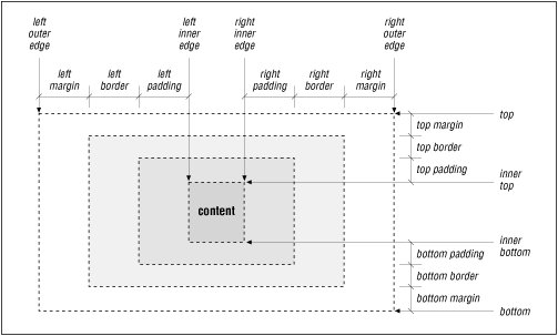
Each element in an HTML document can fit in a rectangular box. The CSS authors call this box the "core content area" and surround it with three more boxes: the padding, the border, and the margin.
Figure 9.4
shows these boxes and defines some useful terminology.
Figure 9.4: The CSS formatting model and terminology
The top, bottom, left-outer, and right-outer edges bound the content area of an element and all of its padding, border, and margin spaces. The inner-top, inner-bottom, left-inner, and right-inner edges define the sides of the core content area. The extra space around the element is the area between the inner and outer edges, including the padding, border, and margin. A browser may omit any and all of these extra spaces for any HTML element, and for many, the inner and outer edges are the same.
When elements are vertically adjacent, the bottom margin of the upper elements and the top margin of the lower elements overlap, so that the total space between the elements is the greater of the adjacent margins.
For example, if one paragraph has a bottom margin of one inch, and the next paragraph has a top margin of one-half inch, the greater of the two margins, one inch, will be placed between the two paragraphs. This practice is known as
margin collapsing
and generally results in better document appearance.
Horizontally adjacent elements do not have overlapping margins. Instead, the CSS model adds together adjacent horizontal margins. For example, if a paragraph has a left margin of 1 inch, and is adjacent to an image with a right margin of 0.5 inch, the total space between the two will be 1.5 inches. This rule also applies for nested elements, so that a paragraph within a division will have a left margin equal to the sum of
the division's left margin and the paragraph's left margin.
As shown in
Figure 9.4, the total width of an element is equal to the sum of seven items: the left and right
margins, the left and right borders, the left and right padding, and the element's content itself. The sum of these seven items must equal the width of the containing element. Of these seven items, only three (the element's width, and its left and right margins) can be given the value auto, indicating that the browser can compute a value for that property. When this becomes necessary, the browser follows these rules: If none of these properties is set to
●
auto, and the total width is less than the width of the parent element, the margin-right property will be set to auto and made large enough to make the total width equal to the width of the parent element.
If exactly one property is set to
●
auto, that property will be made large enough to make the total width equal to the width of the parent element.
If width,
●
margin-left and margin-right are all set to auto, the CSS-compliant browser will set both margin-left and margin-right to zero, and set width large enough to make the total equal to the width of the parent element.
If both the left and right margins are set to ●
auto, they will always be set to equal values, centering the element within its parent.
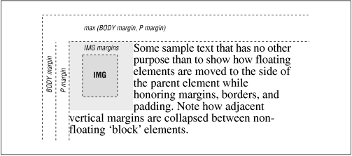
There are special rules for floating elements. A floating element (such as an image with align=left specified) will not have its margins collapsed with the margins of containing or preceding elements, unless
the floating element has negative margins. This is easy to see in Figure 9.5
, which shows how this bit of HTML might be rendered:
 Some sample text...
Figure 9.5: Handling the margins of floating elements
The browser moves the image, including its margins, as far as possible to the left and towards the top of the paragraph without overlapping the left and top margins of the paragraph or the document body. The left margins of the paragraph and the containing body are added, while their top margins are collapsed.
9.3.6.2 The border properties
The border surrounding an element has a color, a thickness, and a style. You can use various properties to control these three aspects of the border on each of the four sides of an element. Shorthand properties make it easy to define the same color, thickness, and style for the entire border, if desired. Border properties are not inherited; you must explicitly set them for each element that has a border.
9.3.6.3 The bordercolor property
Use the bordercolor property to set the border color. If not specified, the browser draws the border using the value of the element's color property.
The bordercolor property accepts from one to four color values. The number of values determines how they are applied to the borders (summarized in
Table 9.1
). If you include just one property value, all four sides of the border are set to the specified color. Two values set the top and bottom borders to the first value and the left and right borders to the second value. With three values, the first is the top border, the second sets the right and left borders, and the third color value is for the bottom border. Four values specify colors for each side, clockwise from the top, then right, bottom, and left borders, in that order.
Table 9.1: Order of Effects for Multiple Border, Margin, and Padding Property Values
Number of Values Affected Border(s), Margin(s), or Padding
1
All same.
2
First value sets
top
and
bottom
; second value sets
left
and
right
.
3
