CSS: The Definitive Guide, 3rd Edition (33 page)
Read CSS: The Definitive Guide, 3rd Edition Online
Authors: Eric A. Meyer
Tags: #COMPUTERS / Web / Page Design

Sometimes, the values you're entering formarginget a little repetitive:
p {margin: 0.25em 1em 0.25em 1em;}
You don't have to keep typing in pairs of numbers like this, though. Instead of
the preceding rule, try this:
p {margin: 0.25em 1em;}
These two values are enough to take the place of four. But how? CSS defines a few
rules to accommodate fewer than four values formargin. These are:
If the value for
leftis missing, use the value
provided forright.If the value for
bottomis missing, use the value
provided fortop.If the value for
rightis missing, use the value
provided fortop.
If you prefer a more visual approach, take a look at the diagram shown in
Figure 8-10
.

Figure 8-10. Value replication pattern
In other words, if three values are given formargin, the fourth (left) is copied from the
second (right). If two values are given, the fourth is
copied from the second, and the third (bottom) from the
first (top). Finally, if only one value is given, the
other sides copy that value.
This simple mechanism allows authors to supply only as many values as necessary,
as illustrated here:
h1 {margin: 0.25em 0 0.5em;} /* same as '0.25em 0 0.5em 0' */
h2 {margin: 0.15em 0.2em;}  /* same as '0.15em 0.2em 0.15em 0.2em' */
p {margin: 0.5em 10px;}    /* same as '0.5em 10px 0.5em 10px' */
p.close {margin: 0.1em;}  /* same as '0.1em 0.1em 0.1em 0.1em' */
The method presents a small drawback, which you're bound to encounter eventually.
Suppose you want to set the top and left margins forh1elements to 10 pixels, and the bottom and right margins to 20 pixels.
In that case, you have to write the following:
h1 {margin: 10px 20px 20px 10px;} /* can't be any shorter */
You get what you want, but it takes a while to get it all in. Unfortunately, there
is no way to cut down on the number of values needed in such a circumstance. Let's
take another example, one where you want all of the margins to beauto—except for the left margin, which should be3em:
h2 {margin: auto auto auto 3em;}
Again, you get the effect you want. The problem is that typingautobecomes a little tedious. All you want to do is
affect the margin on one side of the element, which leads us to the next
topic.
Fortunately, there's a way
to assign a value to the margin on a single side of an element. Let's say you only
want to set the left margin ofh2elements to3em. Instead of using the typing-intensivemargin, you could take this approach:
h2 {margin-left: 3em;}
margin-leftis one of four properties devoted to
setting the margins on each of the four sides of an element box. Their names should
come as little surprise.
margin-top, margin-right, margin-bottom, margin-left
- Values:
| | auto|inherit- Initial value:
0- Applies to:
All elements
- Inherited:
No
- Percentages:
Refer to the width of the containing block
- Computed value:
For percentages, as specified; otherwise, the absolute length
Using any one of these properties lets you set a margin on that side only, without
directly affecting any of the other margins.
It's possible to use more than one of these single-side properties in a single
rule, for example:
h2 {margin-left: 3em; margin-bottom: 2em;
margin-right: 0; margin-top: 0;
background: silver;}
As you can see in
Figure 8-11
, the
margins are set as you want them. Of course, in this case, it might have been easier
to usemarginafter all:
h2 {margin: 0 0 2em 3em;}
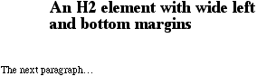
Figure 8-11. More than one single-side margin
Whether you use single-side properties or shorthand, you'll get the same result.
In general, if you're trying to set margins for more than one side, it's easier to
simply usemargin. From the standpoint of your
document's display, however, it doesn't really matter which approach you use, so
choose whichever is easiest for you.
As was
discussed in detail in
Chapter 7
, it's possible
to set negative margins for an element. This can cause the element's box to stick out
of its parent or to overlap other elements without violating the box model. Consider
these rules, which are illustrated in
Figure
8-12
:
div {border: 1px dotted gray; margin: 1em;}
p {margin: 1em; border: 1px dashed silver;}
p.one {margin:  0 -1em;}
p.two {margin: -1em 0;}
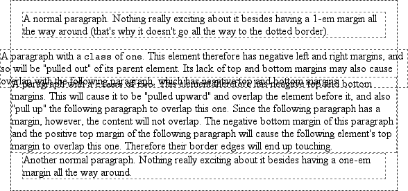
Figure 8-12. Negative margins in action
In the first case, the math works out such that the paragraph's computedwidthplus its right and left margins are exactly equal
to the width of the parentdiv. So, the paragraph
ends up two ems wider than the parent element without actually being "wider" (from a
mathematical point of view). In the second case, the negative top and bottom margins
effectively reduce the computed height of the element and move its top and bottom
outer edges inward, which is how it ends up overlapping
the
paragraphs before and after it.
Combining negative and positive margins is actually very useful. For example, you
can make a paragraph "punch out" of a parent element by being creative with positive
and negative margins, or you can create a Mondrian effect
with several overlapping or randomly placed boxes,
as shown in
Figure 8-13
:
div {background: silver; border: 1px solid;}
p {margin: 1em;}
p.punch {background: white; margin: 1em -1px 1em 25%;
border: 1px solid; border-right: none; text-align: center;}
p.mond {background: #333; color: white; margin: 1em 3em -3em -3em;}
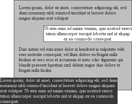
Figure 8-13. Punching out of a parent
Thanks to the negative bottom margin for the "mond" paragraph, the bottom of its
parent element is pulled upward, allowing the paragraph to stick out of the bottom of
its parent.
Speaking of top and bottom margins, it's also important to remember that
vertically adjacent margins in the normal flow will collapse, a topic we covered in
the previous chapter. Margin collapsing
is at
work in practically every document you style. For example, here's a simple rule:
p {margin: 15px 0;}
This will cause one paragraph to follow another with 15 pixels of "margin space"
between them. If margins didn't collapse, there would be 30 pixels of space between
two adjacent paragraphs, but that behavior wouldn't be what authors expect.
This does, however, mean that you must be careful about how you style margins.
Most likely, you'll want to close up the space between a heading and the following
paragraph. Because paragraphs in HTML documents have a top margin, it isn't enough to
set the bottom margin for the heading to zero; you must also eliminate the top margin
of the paragraph. This is simple to do with CSS2's adjacent-sibling selector:
h2 {margin-bottom: 0;}
h2 + p {margin-top: 0;}
Unfortunately, browser support for adjacent-sibling selectors is (as of this
writing) limited enough that most users will see a 1-em space between the heading and
its following paragraph. You can still get the desired effect without using CSS2
selectors, but you'll have to be a little tricky:
h2 {margin-bottom: 0;}
p {margin: 0 0 1em;}
This will actually remove a top margin from all paragraphs, but since they also
all have1embottom margins, the desired
interparagraph separation will hold, as shown in
Figure 8-14
.
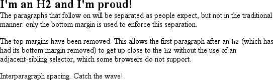
Figure 8-14. Intelligently setting margins
This works because the usual 1-em separation between paragraphs is a result of
margin collapsing. Thus, if you take away one of those margins—the top margin, in
this case—the visual result will be the same as if you'd left the margin in
place.