CSS: The Definitive Guide, 3rd Edition (3 page)
Read CSS: The Definitive Guide, 3rd Edition Online
Authors: Eric A. Meyer
Tags: #COMPUTERS / Web / Page Design

Elements
are the basis of document structure. In HTML, the most
common elements
are easily recognizable, such asp,table,span,a, anddiv. Every single element in a document plays a part in its
presentation. In CSS terms, at least as of CSS2.1, that means each element generates a
box that contains the element's content.
Although CSS depends on elements, not all elements are created equally. For
example, images and paragraphs are not the same type of element, nor arespananddiv. In CSS,
elements generally take two forms: replaced and nonreplaced. The two types are
explored in detail in
Chapter 7
, which covers
the particulars of the box model, but I'll address them briefly here.
Replaced elements
are those where the element's content is
replaced by something that is not directly represented by document content. The
most familiar XHTML example is theimgelement,
which is replaced by an image file external to the document itself. In fact,imghas no actual content, as you can see by
considering a simple example:
This markup fragment contains no actual content—only an element name and an
attribute. The element presents nothing unless you point it to some external
content (in this case, an image specified by thesrcattribute). Theinputelement is
also replaced by a radio button, checkbox, or text input box, depending on its
type. Replaced elements also generate boxes in their display.
The majority of HTML and XHTML elements are
nonreplaced
elements
.
This means that their content is presented by the
user agent (generally a browser) inside a box generated by the element itself. For
example,hi thereis a
nonreplaced element, and the text "hi there" will be displayed by the user agent.
This is true of paragraphs, headings, table cells, lists, and almost everything
else in XHTML.
In addition to replaced and nonreplaced elements, CSS2.1 uses two other basic
types of elements:
block-level
and
inline-level
. These types will be more familiar to authors who
have spent time with HTML or XHTML markup and its display in web browsers;
the elements are illustrated in
Figure 1-1
.

Figure 1-1. Block- and inline-level
elements in an XHTML document
elements
Block-level elements
generate an element box that (by
default) fills its parent element's content area and cannot have other elements at
its sides. In other words, it generates "breaks" before and after the element box.
The most familiar block elements from HTML arepanddiv. Replaced elements can be
block-level elements,
but they usually are
not.
List items are a special case of block-level elements. In
addition to behaving in a manner consistent with other block elements, they
generate a marker—typically a bullet for unordered lists and a number for ordered
lists—that is "attached" to the element box. Except for the presence of this
marker, list items are in all other ways identical to other block elements.
Inline-level elements
generate an element box within a line
of text
and do not break up the flow of that line. The
best inline element example is theaelement in
XHTML. Other candidates arestrongandem. These elements do not generate a "break" before
or after themselves, so they can appear within the content of another element
without disrupting its display.
Note that while the names "block" and "inline" share a great deal in common
with block- and inline-level elements in XHTML, there is an important difference.
In HTML and XHTML, block-level elements cannot descend from inline-level elements.
In CSS, there is no restriction on how display roles can be nested within each
other.
To see how this works, let's consider a CSS property,display.
You may have noticed that there are a lot of values, only three of which I've
even come close to mentioning:block,inline, andlist-item. We're not going to explore the others now, mostly because
they are covered in some detail in
Chapter 2
and
Chapter 7
.
For the moment, let's just concentrate onblockandinline. Consider the
following markup:
This is a paragraph with an inline element within it.
display
- Values:
none|inline|block|inline-block|list-item|run-in|table|inline-table|table-row-group|table-header-group|table-footer-group|table-row|table-column-group|table-column|table-cell|table-caption|inherit- Initial value:
inline- Applies to:
All elements
- Inherited:
No
- Computed value:
Varies for floated, positioned, and root elements (see CSS2.1,
section 9.7); otherwise, as specified
Here we have two block elements (bodyandp) and an inline element (em). According to the XHTML specification,emcan descend fromp, but the reverse is not true. Typically, the XHTML hierarchy works
out such that inlines can descend from blocks, but not the other way around.
CSS, on the other hand, has no such restrictions. You can leave the markup as
it is but change the display roles of the two elements like this:
p {display: inline;}
em {display: block;}
This causes the elements to generate a block box inside an inline box. This is
perfectly legal and violates no specification. The only problem would be if you
tried to reverse the nesting of the elements:
This is a paragraph improperly enclosed by an inline element.
No matter what you do to the display roles via CSS, this is not legal in XHTML.
While changing the display roles of elements can be useful in XHTML documents,
it becomes downright critical for XML documents. An XML document is unlikely to
have any inherent display roles, so it's up to the author to define them. For
example, you might wonder how to lay out the following snippet of XML:
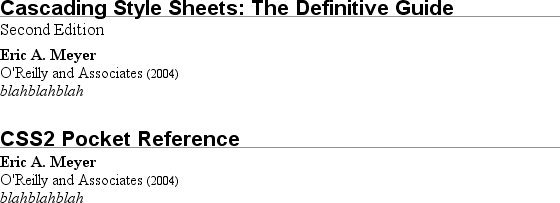
Cascading Style Sheets: The Definitive Guide
Second Edition
Eric A. Meyer
O'Reilly and Associates
2004
blahblahblah


CSS2 Pocket Reference
Eric A. Meyer
O'Reilly and Associates
2004
blahblahblah
Since the default value ofdisplayisinline, the content would be rendered as
inline text by default, as illustrated in
Figure 1-2
. This isn't a terribly useful display.

Figure 1-2. Default display of an XML document
You can define the basics of the layout withdisplay:
book, maintitle, subtitle, author, isbn {display: block;}
publisher, pubdate {display: inline;}
You've now set five of the seven elements to be block and two to be inline.
This means each of the block elements will be treated much asdivis treated in XHTML, and the two inlines will be
treated in a manner similar tospan.
This fundamental ability to affect display roles makes CSS highly useful in a
variety of situations. You could take the preceding rules as a starting point, add
a number of other styles, and get the result shown in
Figure 1-3
.

Figure 1-3. Styled display of an XML document
Throughout the rest of this book, we'll explore the various properties and
values that allow presentation like this. First, though, we need to look at how
one can associate CSS with a document. After all, without tying the two together,
there's no way for the CSS to affect the document. We'll explore this in an XHTML
setting since it's the most familiar.
I've mentioned
that HTML and XHTML documents have an inherent structure, and that's a point worth
repeating. In fact, that's part of the problem with web pages of old: too many of us
forgot that documents are supposed to have an internal structure, which is altogether
different than a visual structure. In our rush to create the coolest-looking pages on
the Web, we bent, warped, and generally ignored the idea that pages should contain
information with some structural meaning.
That structure is an inherent part of the relationship between XHTML and CSS; without
the structure, there couldn't be a relationship at all. To understand it better, let's
look at an example XHTML document and break it down by pieces:
Eric's World of Waffles
Waffles!The most wonderful of all breakfast foods is
the waffle—a ridged and cratered slab of home-cooked, fluffy goodness
that makes every child's heart soar with joy. And they're so easy to make!
Just a simple waffle-maker and some batter, and you're ready for a morning
of aromatic ecstasy!
This markup is shown in
Figure 1-4
.

Figure 1-4. A simple document
Now, let's examine the various ways this document connects to CSS.
First,
consider the use of thelinktag:
Thelinktag is a little-regarded but
nonetheless perfectly valid tag that has been hanging around the HTML specification
for years, just waiting to be put to good use. Its basic purpose is to allow HTML
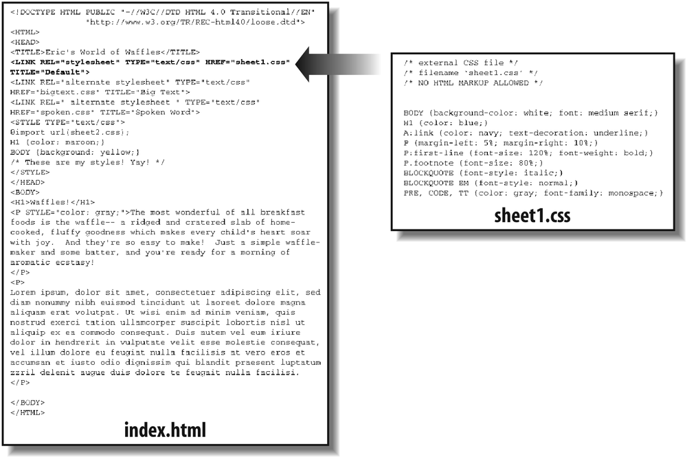
authors to associate other documents with the document containing thelinktag. CSS uses it to link style sheets to the
document; in
Figure 1-5
, a style sheet
called
sheet1.css
is linked to the document.

Figure 1-5. A representation of how
external style sheets are applied to documents
These style sheets, which are not part of the HTML document but are still used by
it, are referred to as
external style sheets
. This is because
they're style sheets that are external to the HTML document. (Go figure.)
To successfully load an external style sheet,linkmust be placed inside theheadelement but may not be placed inside any other element, rather liketitle. This will cause the web browser to locate and
load the style sheet and use whatever styles it contains to render the HTML document
in the manner shown in
Figure 1-5
.
And what is the format of an external style sheet? It's simply a list of rules,
just like those we saw in the previous section and in the example XHTML document, but
in this case, the rules are saved into their own file. Just remember that no XHTML or
any other markup language can be included in the style sheet—only style rules. Here
are the contents of an external style sheet:
h1 {color: red;}
h2 {color: maroon; background: white;}
h3 {color: white; background: black;
font: medium Helvetica;}
That's all
there
is to it—no HTML markup or comments at all, just plain-and-simple style declarations.
These are saved into a plain-text file and are usually given an extension of
.css
, as in
sheet1.css
.
An external style sheet cannot contain any document markup at all, only CSS
rules and CSS comments, both of which are explained later in the chapter. The
presence of markup in an external style sheet can cause some or all of it to be
ignored.
The filename extension is not required, but some older browsers won't recognize
the file as containing a style sheet unless it actually ends with
.css
, even if you
do
include the correcttypeoftext/cssin thelinkelement. In fact,
some web servers won't hand over a file astext/cssunless its filename ends with
.css
, though
that can usually be fixed by changing the server's configuration files.
For the rest of thelinktag, the attributes and values are fairly
straightforward.relstands for "relation," and
in this case, the relation isstylesheet.typeis always set totext/css. This value describes the type of data that
will be loaded using thelinktag. That way,
the web browser knows that the style sheet is a CSS style sheet, a fact that will
determine how the browser deals with the data it imports. After all, there may be
other style languages used in the future, so it's important to declare which
language you're using.
Next, we find thehrefattribute. The value of this attribute is the URL of your style
sheet. This URL can be either absolute or relative, depending on what works for
you. In our example, of course, the URL is relative. It just as easily could have
been something like
http://www.meyerweb.com/sheet1.css
.
Finally, we have amediaattribute. The value used in this case,all,
means that the style sheet should be applied in all presentation media. CSS2
defines a number of allowed values for this attribute:
allUse in all presentational media.
auralUse in speech synthesizers, screen readers, and other audio renderings
of the document.brailleUse when rendering the document with a Braille device.
embossedUse when printing with a Braille printing device.
handheldUse on handheld devices like personal digital assistants or
web-enabled cell phones.printUse when printing the document for sighted users and also when
displaying a "print preview" of the document.projectionUse in a projection medium, such as a digital projector used to
present a slideshow when delivering a speech.screenUse when presenting the document in a screen medium like a desktop
computer monitor. All web browsers running on such systems are
screen-medium user agents.ttyUse when delivering the document in a fixed-pitch environment like
teletype printers.tvUse when the document is being presented on a television.
The majority of these media types are not supported by any
current web browser. The three most widely supported ones areall,screen, andprint. As of this writing, Opera also
supportsprojection, which allows a document to
be presented as a slideshow.
You can use a style sheet in more than
one medium by providing a comma-separated list of the media in which it applies.
Thus, for example, you can use a linked style sheet in both screen and projection
media:
media="screen, projection" />
Note
that there can be more than one linked style sheet associated with a document. In
these cases, only thoselinktags with arelofstylesheetwill be used in the initial display of the document. Thus,
if you wanted to link two style sheets named
basic.css
and
splash.css
, it would look like
this:
This
will cause the browser to load both style sheets, combine the rules from each, and
apply them all to the document. (We'll see exactly how the sheets are combined in
Chapter 3
, but for now, let's just accept
that they're combined.) For
example:
This paragraph will be gray only if styles from the
stylesheet 'basic.css' are applied.This paragraph will be gray only if styles from the
stylesheet 'splash.css' are applied.
The
one attribute that is not in your example markup, but could be, is thetitleattribute. This attribute is not often used,
but it could become important in the future and, if used improperly, can have
unexpected effects. Why? We will explore that in the next section.
sheets
It's also
possible to define
alternate
style sheets
.
These are defined by making the value of therelattributealternate stylesheet,
and they are used in document presentation only if selected by the
user.
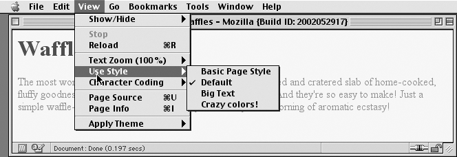
Should a browser be able to use alternate style
sheets,
it will use the values of thelinkelements'titleattributes to generate a list of style alternatives. So you could
write the
following:
 title="Default" />
href="bigtext.css" title="Big Text" />
href="zany.css" title="Crazy colors!" />
Users
could then pick the style they want to use, and the browser would switch from the
first one (labeled "Default" in this case) to whichever the user picked.
Figure 1-6
shows one way in which this
selection mechanism is accomplished.

Figure 1-6. A browser offering alternate style sheet selection
Alternate style sheets are supported in most Gecko-based browsers like
Mozilla and Netscape 6+, and in Opera 7. They can be supported in Internet
Explorer through the use of JavaScript but are not natively supported by those
browsers.
It is also possible to group alternate style sheets together by giving
them the sametitlevalue. Thus, you make it
possible for the user to pick a different presentation for your site in both
screen and print media. For
example:
 title="Default" media="screen" />
href="print-sheet1.css" title="Default" media="print" />
href="bigtext.css" title="Big Text" media="screen" />
href="print-bigtext.css" title="Big Text" media="print" />
If
a user selects "Big Text" from the alternate style sheet selection mechanism in a
conforming user agent, then
bigtext.css
will be used to style
the document in the screen medium, and
print-bigtext.css
will
be used in the print medium. Neither
sheet1.css
nor
print-sheet1.css
will be used in any
medium.
Why is that? Because if you give alinkwith arelofstylesheeta title, then you are designating that
style sheet as a
preferred style sheet
. This means that its
use is preferred to alternate style sheets, and it will be used when the document
is first displayed. Once you select an alternate style sheet, however, the
preferred style sheet will
not
be
used.
Furthermore, if you designate a number of style sheets as
preferred, then all but one of them will be ignored.
Consider:
 title="Default layout" />
href="sheet2.css" title="Default text sizes" />
href="sheet3.css" title="Default colors" />
All
threelinkelements now refer to preferred
style sheets,
thanks to the
presence of atitleattribute on all three, but
only one of them will actually be used in that manner. The other two will be
ignored completely. Which two? There's no way to be certain, as neither HTML nor
XHTML provide a method of determining which preferred style sheets should be
ignored or which should be used.
If you simply don't give a style
sheet a title, then it becomes a
persistent style sheet
and
is always used in the display of the document. Often, this is exactly what an
author wants.

