B0041VYHGW EBOK (56 page)
Authors: David Bordwell,Kristin Thompson

It’s hard to think of the shot as simply two-dimensional, though. We instinctively see it as portraying a space that we could move around in. Claudia seems closer to us because her body masks things farther away, a spatial cue called
overlap.
She’s also somewhat larger in the frame than Sandro, which reinforces our sense that she’s closer. The rope slices across the bottom third of the frame, separating her from him (overlap again). Sandro himself overlaps the railing, which in turn overlaps the sky and the town. We get a sense of distinct planes of space, layers lying closer to or farther from us. Elements of mise-en-scene like costume, lighting, setting, and figure placement create this sense of a three-dimensional arena for the action.
Antonioni has used mise-en-scene to emphasize his characters and their interaction. But that interaction unfolds in time, and it gives him an opportunity to guide our attention while building up suspense and expressing emotion. Claudia is turned away from us when Sandro presses her to marry him, and the rope is taut between them (
4.110
). How will she respond?
Antonioni starts by giving Claudia a bit of business. She twists the rope around her arms and slips it over her back. This could be a hint that she’s drawn to Sandro’s proposal. At the same time, she hesitates. For as soon as he presses her, she turns away from him (
4.111
).
We know that faces give us access to characters’ thoughts and emotions. Another filmmaker might have had Claudia already facing us when Sandro asked, so we’d see her response immediately. Antonioni instead makes things uncertain for a moment. He has concealed Claudia’s reaction and then lets her turn toward us. To make sure that we watch her and not Sandro at this moment, Antonioni has him turn away when she gestures and speaks (“I’d like to see things clearly”). Our attention is riveted on her.
Soon enough, Sandro turns back toward the camera, so we can see his reaction, but already Claudia’s anxiety has flashed out at us. Her complex relation to Sandro—attraction (sliding under the bell rope) and uncertainty (turning away tensely)—has been presented to us concretely.
This is only one moment in a complex scene, but it shows how various elements of mise-en-scene can cooperate to create a specific effect—the delayed revelation of a character’s emotion. That revelation couldn’t have occurred without the director’s choices about what to show us at particular points. When we look at an image, we look purposefully. What we notice is guided by our expectations about what might be significant.
Often the form of the whole film sets up our expectations. If a shot shows a crowd, we will tend to scan it looking for a character we recognize from earlier scenes. In
4.112
, although there are several people in the foreground of this shot from
Tootsie,
we will likely notice Julie (Jessica Lange) and Dorothy Michaels (Dustin Hoffman) quickly, since they are our main characters. Similarly, we notice Les, seen here for the first time, because he and Dorothy are exchanging smiles. Similarly, sound can become an important factor controlling our attention, as we shall see in
Chapter 7
. In addition to the film’s story context, there are several ways directors can guide our expectations about what to notice. In the spirit of trying to grasp all the options on the mise-en-scene menu, let’s look in more detail at the spatial and temporal possibilities.
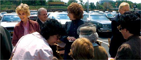
4.112 Narrative expectations guide our eye to the main characters in
Tootsie.
Screen Space
In many respects, a film shot resembles a painting. It presents a flat array of colors and shapes. Before we even start to read the image as a three-dimensional space, mise-en-scene offers many cues for guiding our attention and emphasizing elements in the frame.
“The audience is only going to look at the most overriding thing in the frame. You must take charge of and direct their attention. It’s also the principle of magic: what is the single important thing? Make it easy for them to see it, and you’re doing your job.”
— David Mamet, director
Take something as simple as balancing the shot. Filmmakers often try to distribute various points of interest evenly around the frame. They assume that viewers will concentrate more on the upper half of the frame, probably because that’s where we tend to find characters’ faces. Since the film frame is a horizontal rectangle, the director usually tries to balance the right and left halves. The extreme type of such balancing is bilateral symmetry. In the battle scene in
Life on a String,
Chen Kaige stages one shot symmetrically
(
4.113
).
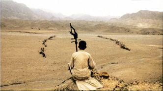
4.113 A limited palette emphasizes this symmetrical composition in
Life on a String.
More common than such near-perfect symmetry is a loose balancing of the shot’s left and right regions. The simplest way to achieve compositional balance is to center the frame on the human body. Filmmakers often place a single figure at the center of the frame and minimize distracting elements at the sides, as in
4.114
. Many of our earlier illustrations display this flexible balance. Other shots may counterweight two or more elements, encouraging our eye to move back and forth, as in
4.115
and our
L’Avventura
dialogue (
4.110
,
4.111
).
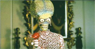
4.114
Mars Attacks!:
centering a single character …
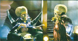
4.115 … and balancing two.
Balanced composition is the norm, but unbalanced shots can also create strong effects. In
Bicycle Thieves,
the composition emphasizes the father’s new job by massing most of the figures on the right. They don’t balance the son, but he seems even more vulnerable by being such an ineffective counterweight
(
4.116
).
A more drastic example occurs in Michelangelo Antonioni’s
Il Grido
(
4.117
),
where two strong elements, the hero and a tree trunk, are grouped on the right side of the shot. One could argue that the shot creates a powerful urge for the audience to see the woman’s hidden face.
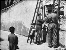
4.116 This composition from
Bicycle Thieves
emphasizes the father’s new job by massing most of the figures on the right.
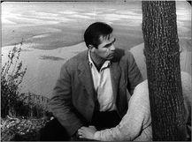
4.117 In
Il Grido,
instead of balancing the couple, the composition centers the man. If there were no tree in the frame, the shot would still be somewhat weighted to the right, but the unexpected vertical of the trunk makes that side even heavier.
Sometimes the filmmaker will leave the shots a little unbalanced, in order to prime our expectation that something will change position in the frame. The cinema of the 1910s offers intriguing examples. Very often a doorway in the back of the set allowed the director to show that new characters were entering the scene, but then figures closer to the camera had to be rearranged to permit a clear entrance. The result was a subtle unbalancing and rebalancing of the composition
(
4.118
–
4.121
).
In
Chapter 6
, we’ll see how cutting can create a balance between two shots with relatively unbalanced compositions.
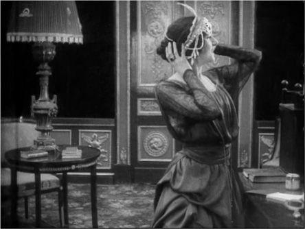
4.118 From quite early in cinema history, filmmakers used unbalanced compositions to prepare the viewer for new narrative developments. In Yevgenii Bauer’s
The Dying Swan
(1916), the young ballerina receives a tiara from an admirer.
